Density Preservation in a Gaussian Mixture Dataset
One of the benefit benefits of estimating local distortion is that it shows how the interpretation of embedding distances may not be comparable across different parts of the plot. In one region distances can be compressed, in others they might be dilated. This is potentially useful if an embedding distort densities. In our paper, we show how these local metrics can be used to evaluate the difference between plain dimensionality reduction methods and density-aware versions -- see also the C. elegans article here. But for now, this article will just show that this local distortion information can help in a very simple example of two clusters with differential densities.
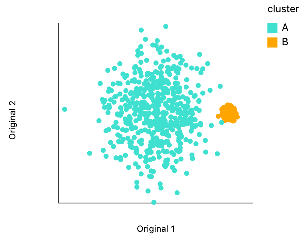
The block below generates two Gaussian clusters, one with variance 10 the other with variance 1 and centered at (30, 0). These two clusters are adjacent to one another, but don't really overlap.
import numpy as np
import pandas as pd
np.random.seed(20250702)

def two_clusters_differential(n):
    """Two 2D clusters of different sizes."""
    points = []
    for _ in range(n):
        points.append([10 * np.random.normal(), 10 * np.random.normal()])
        points.append([30 + np.random.normal(), np.random.normal()])
    return np.array(points)
Data Generation and Embedding
Below we generate a data sample using this function, and we use scanpy to obtain a UMAP embedding. There are 1000 points total 500 in each cluster.
M = 500
n_neighbors = 50
data = two_clusters_differential(M)
Let's visualize this raw data. While we could use any visualization package we want. Let's try using our own distortions package. This requires two columns for the singular values that defined the length of each of the ellipse axis. Since for this initial plot will be happy to have plain circles, let's manually set those lengths to one.
data_df = pd.DataFrame(data)
data_df["cluster"] = ["A", "B"] * M
data_df.columns = ["x", "y", "cluster"]
data_df["s0"] = 1
data_df["s1"] = 1
The code below makes the visualization. The .mapping call is analogous to aes() in ggplot2 and .encode() in Altair. This plot backs up will be initially claimed about the relative sizes and overlap.
from distortions.visualization import dplot

plots = {}
plots["two_clusters"] = dplot(data_df, width=450, height=350, labelFontSize=14)\
    .mapping(x="x", y="y", color="cluster")\
    .scale_color(scheme=["turquoise", "orange"])\
    .geom_ellipse(radiusMax=6, radiusMin=1)\
    .labs(x = "Original 1", y = "Original 2")
plots["two_clusters"]
dplot(dataset=[{'x': -10.53549603766011, 'y': -1.8629896720824943, 'cluster': 'A', 's0': 1, 's1': 1}, {'x': 29…
Below, we've applied UMAP with fifty neighbors and all other parameters are set to their scanpy defaults.
from anndata import AnnData
import scanpy as sc

adata = AnnData(X=data, obs=pd.DataFrame(range(2 * M)))
sc.pp.neighbors(adata, n_neighbors=n_neighbors)
sc.tl.umap(adata)
embedding = adata.obsm["X_umap"].copy()
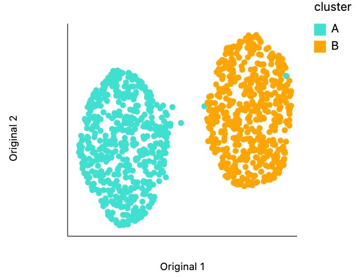
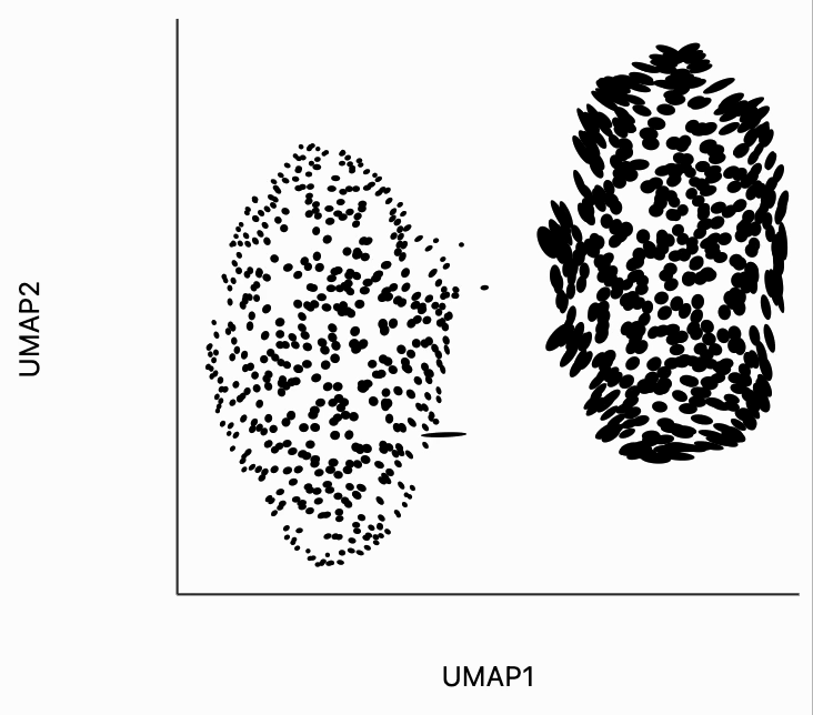
We can visualize the embedding using distortions in the same way that we visualize the raw data. Despite having very different variances/densities, the clusters have been laid out to view of comparable size. The extent to which this fails is quite remarkable, but it's also very well-documented that nonlinear dimensionality reduction methods cannot be trusted to preserve density across clusters [1, 2].
embedding_df = pd.DataFrame(embedding, columns=["x", "y"])
embedding_df["s0"] = 1
embedding_df["s1"] = 1
embedding_df["cluster"] = data_df["cluster"]

plots["plain_embedding"] = dplot(embedding_df, width=450, height=350, labelFontSize=14)\
    .mapping(x="x", y="y", color="cluster")\
    .scale_color(scheme=["turquoise", "orange"])\
    .geom_ellipse(radiusMax=6, radiusMin=1)\
    .labs(x = "Original 1", y = "Original 2")
plots["plain_embedding"]
dplot(dataset=[{'x': -7.3624162673950195, 'y': 5.324365139007568, 's0': 1, 's1': 1, 'cluster': 'A'}, {'x': 6.1…
Distortion Estimation
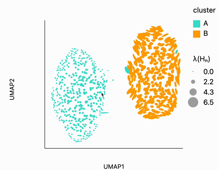
Next we estimate local distortions. These are estimates of how the embedding warps geometry locally. The resulting ellipses are the images of unit circles (with respect to the original space's distances) after having been transformed by the embedding. We've slightly post processed the estimated metrics to avoid some outlying values that would otherwise dominate the plot (or at least make the interactions less smooth). The function bind_metric puts these estimated distortion metrics (an array of length N samples) into the original embedding DataFrame we computed above.
from distortions.geometry import Geometry, bind_metric, local_distortions

radius = np.mean(adata.obsp["distances"].data)
geom = Geometry("brute", laplacian_method="geometric", affinity_kwds={"radius": radius}, adjacency_kwds={"n_neighbors": n_neighbors}, laplacian_kwds={"scaling_epps": 1})
H, Hvv, Hs = local_distortions(embedding, data, geom)

# postprocessing
Hs[Hs > 5] = 5
Hs /= Hs.mean()
for i in range(len(H)):
    H[i] = Hvv[i] @ np.diag(Hs[i]) @ Hvv[i].T

embedding = bind_metric(embedding, Hvv, Hs)
embedding["cluster"] = data_df["cluster"]
Below we plot the singular values associated with each of these local metrics. The closer these are to the point, the less the embedding method distorts the original distances (because the point one, one corresponds to the identity). Notice that the first singular value is always larger than the second singular value, which is why all points lie below the dashed line.
Surprisingly, we can see that the metrics very clearly distinguish between the two clusters, even though this information was not passed in the distortion estimation procedure. The singular values for cluster a tend to be smaller than those for this corresponds to the fact that those distances have been compressed. This is exactly consistent with the visualization from above. The UMAP seems to have made the two clusters appear of comparable size even though we know that the Cluster A has larger variance. The only way this can be achieved is by compressing the distances in this region of the plot.
from distortions.visualization import eigenvalue_plot

lambda_plot = eigenvalue_plot(Hs, embedding["cluster"])\
    .configure_axis(labelFontSize=12, titleFontSize=22)\
    .configure_range(category=["#40e0d0", "#ff9d06"])

#lambda_plot.save("two_clusters_lambda.svg")
lambda_plot
Interactive Visualizations
Even the static ellipse visualizations are giving us a sense of the differences between these two clusters (a difference that would've been invisible if we had relied on the UMAP alone). We can go a little bit further via applying some interactivity. These interactive visualizations will allow us to dig into a little bit more detail around the current mouse interactions than we could show in the static views alone (This approach is inspired by the focus plus context principle in data visualization).
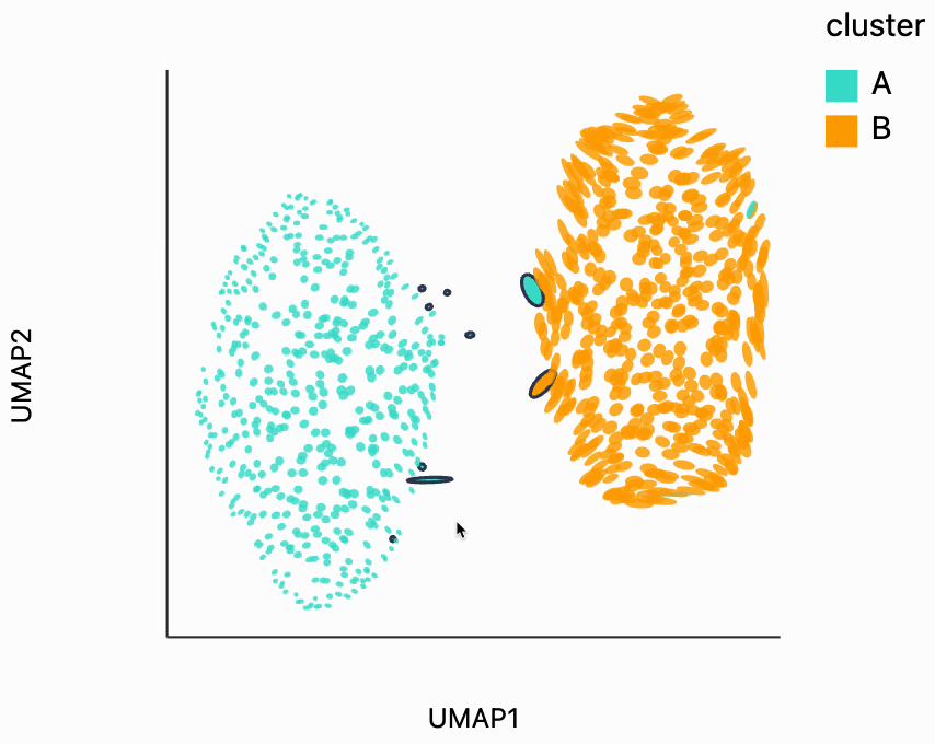
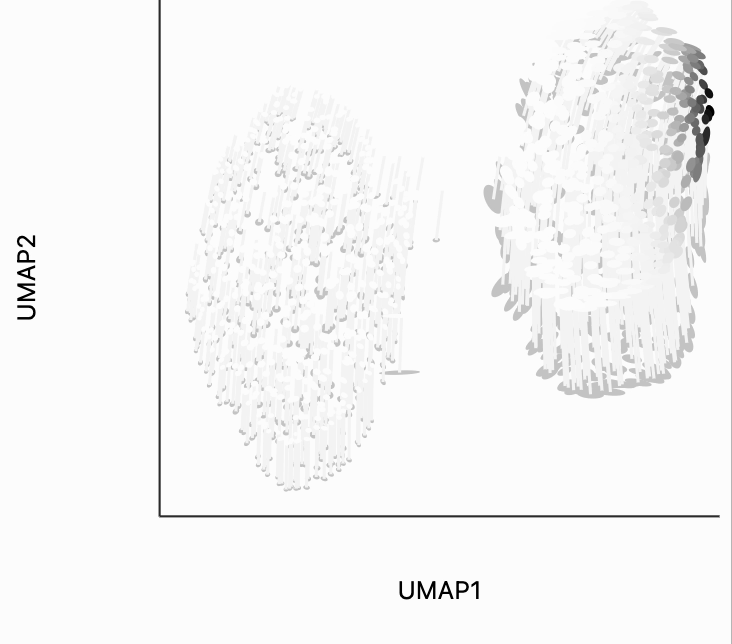
First, let's look for the fragmented neighborhoods. These are the points that have a large fraction of their close neighbors that are far away from them in the embedding space. Unsurprisingly many of these points lie on the boundary between the two clusters. This is consistent with what we know about the original data. The two clusters are actually adjacent to one another, even though in this UMAP they're shown very clearly separated. One of the orange neighborhoods is considered fragmented, even though most of its neighbors are in the orange cluster. The issue with this point seems to be that it's neighbors are on different sides of the cluster.
from distortions.geometry import neighborhoods

N = neighborhoods(adata, threshold=0.1, outlier_factor=3)
plots["two_clusters_links"] = dplot(embedding, width=450, height=350, labelFontSize=14)\
    .mapping(x="embedding_0", y="embedding_1", color="cluster")\
    .inter_edge_link(N=N, threshold=1, backgroundOpacity=0.8)\
    .scale_color(scheme=["turquoise", "orange"])\
    .geom_ellipse(radiusMax=10, radiusMin=1)\
    .labs(x = "UMAP1", y = "UMAP2")
plots["two_clusters_links"]
dplot(dataset=[{'embedding_0': -7.3624162673950195, 'embedding_1': 5.324365139007568, 'x0': -0.061769458747554…
Next, we can make the isometry visualization. On the hosted notebook, you will only be able to see the recording that we've made below, but if you're running this locally, you should be able to hover over points and see the plot respond. The main point here is that when you hover over the blue cluster, it gets larger while if you hover over the orange cluster it slightly shrinks. The magnitude of the correction isn't enough to compensate for the extreme difference in variances that we see in the original data, but the estimated effects are at least in the right direction. It's worth keeping in mind that even the distortion estimates we have our estimates -- they have to be learned from data. Like in this example, we might have an indication that there is a difference in density without being able to precisely estimate its magnitude.
metrics = {k: H[k] for k in range(len(H))}
plots["two_clusters_isometry"] = dplot(embedding, width=450, height=350, labelFontSize=14)\
    .mapping(x="embedding_0", y="embedding_1", color="cluster")\
    .geom_ellipse(radiusMin=1, radiusMax=10)\
    .inter_isometry(metrics=metrics, metric_bw=1, transformation_bw=.1, stroke="#f7f7f7")\
    .scale_color(scheme=["turquoise", "orange"])\
    .scale_size()\
    .labs(x="UMAP1", y="UMAP2")
plots["two_clusters_isometry"]
dplot(dataset=[{'embedding_0': -7.3624162673950195, 'embedding_1': 5.324365139007568, 'x0': -0.061769458747554…
To understand what exactly this visualization is doing, let's analyze the kernels. There are two types of similarity that are used by the isometry visualization. The first type decides which point should contribute in estimating the local metric around the mouse position. That's what we're showing in the plot below. The width of the points that are considered can be controlled by changing the metric_bw parameter -- smaller values will allow more points to contribute.
plots["two_clusters_metric"] = dplot(embedding, width=450, height=350, labelFontSize=14)\
    .mapping(x="embedding_0", y="embedding_1", color="kernel_metric")\
    .geom_ellipse(radiusMin=1, radiusMax=10)\
    .inter_isometry(metrics=metrics, metric_bw=1, transformation_bw=.1, stroke="#f7f7f7")\
    .scale_color(scheme=["turquoise", "orange"])\
    .scale_size()\
    .labs(x="UMAP1", y="UMAP2")
plots["two_clusters_metric"]
dplot(dataset=[{'embedding_0': -7.3624162673950195, 'embedding_1': 5.324365139007568, 'x0': -0.061769458747554…
The second kind of kernel controls the region of points that are transformed after each interaction. We've included this because in more complicated em beddings, we may only want to update the region around the mouse position. We've chosen the kernel bandwidth here so that when hovering over one cluster, the other cluster won't be moved to so dramatically. You can change the transformation_bw parameter to adjust how responsive the entire plot is to any localized mousemove.
plots["two_clusters_transform"] = dplot(embedding, width=450, height=350, labelFontSize=14)\
    .mapping(x="embedding_0", y="embedding_1", color="kernel_transform")\
    .geom_ellipse(radiusMin=1, radiusMax=10)\
    .inter_isometry(metrics=metrics, metric_bw=1, transformation_bw=.1, stroke="#f7f7f7")\
    .scale_color(scheme=["turquoise", "orange"])\
    .scale_size()\
    .labs(x="UMAP1", y="UMAP2")
plots["two_clusters_transform"]
dplot(dataset=[{'embedding_0': -7.3624162673950195, 'embedding_1': 5.324365139007568, 'x0': -0.061769458747554…
#[p.save(f"../paper/figures/{k}.svg") for k, p in plots.items()]
[display(p) for p in plots.values()]
dplot(dataset=[{'x': -10.53549603766011, 'y': -1.8629896720824943, 'cluster': 'A', 's0': 1, 's1': 1}, {'x': 29…
dplot(dataset=[{'x': -7.3624162673950195, 'y': 5.324365139007568, 's0': 1, 's1': 1, 'cluster': 'A'}, {'x': 6.1…
dplot(dataset=[{'embedding_0': -7.3624162673950195, 'embedding_1': 5.324365139007568, 'x0': -0.061769458747554…
dplot(dataset=[{'embedding_0': -7.3624162673950195, 'embedding_1': 5.324365139007568, 'x0': -0.061769458747554…
dplot(dataset=[{'embedding_0': -7.3624162673950195, 'embedding_1': 5.324365139007568, 'x0': -0.061769458747554…
dplot(dataset=[{'embedding_0': -7.3624162673950195, 'embedding_1': 5.324365139007568, 'x0': -0.061769458747554…
[None, None, None, None, None, None]