Comparing t-SNE Hyperparameters in the Hydra Atlas
This notebook illustrates how hyperparameter choices in t-SNE can influence distortions in the final embedding. It turns out that different hyperparameter settings can lead to qualitatively different types of distortion -- the distortions package can help us understand those differences. We use the Hydra stem cell differentiation dataset, originally published in DOI: 10.1126/science.aav9314, whose hyperparameter effects were evaluated in DOI: 10.1038/s41467-024-45891-y. The block below loads in the data.
Data Preparation
import random
import scanpy as sc
import numpy as np
import urllib.request
import tempfile
random.seed(20250409)

temp_file = tempfile.mktemp(suffix=".h5ad")
urllib.request.urlretrieve("https://uwmadison.box.com/shared/static/gp1d9akvyq5r7a0rzxw27n86zlqe0d7f.h5ad", temp_file)
adata = sc.read_h5ad(temp_file)
adata.X = adata.X.todense()
We apply some standard preprocessing steps, including log transformation and highly variable gene filtering. We then run t-SNE with a perplexity of 500. The corresponding results for a perplexity of 80 are included in our accompanying paper for comparison. You can replace the perplexity argument in line 9 and rerun the notebook to see that panel.
sc.pp.normalize_total(adata)
sc.pp.log1p(adata)
sc.pp.highly_variable_genes(adata, n_top_genes=1000)

n_neighbors = 50
ix = np.random.choice(len(adata), 2000, replace=False)
adata = adata[ix, adata.var.highly_variable]
sc.pp.neighbors(adata, n_neighbors=n_neighbors)
sc.tl.tsne(adata, n_pcs=31, perplexity=80)
After this, we apply our distortion estimation routine. To compute local distortions, we must first estimate the Graph Laplacian. This is a summary of the graph structure in the original data space, and the graph construction depends on both the radius used to measure node-noe similarity (more precisely, it is the radius for an underlying geometric graph) and a maximum number of neighbors considered. For the second hyperparameter, we use the same number of neighbors as in t-SNE; this is our usual default. For the radius choice, we set the radius to three times the average pairwise distance computed during t-SNE.
from distortions.geometry import Geometry, bind_metric, local_distortions

embedding = adata.obsm["X_tsne"].copy()
radius = 3 * np.mean(adata.obsp["distances"].data)
geom = Geometry("brute", laplacian_method="geometric", affinity_kwds={"radius": radius}, adjacency_kwds={"n_neighbors": n_neighbors}, laplacian_kwds={"scaling_epps": 5})
H, Hvv, Hs = local_distortions(embedding, adata.X, geom)
embedding = bind_metric(embedding, Hvv, Hs)
embedding["ident"] = adata.obs["ident"].str.split("-").str[1].values
Visualization
If we were not visualizing distortion, we could simply make a scatterplot. The result is shown below. There appear to be several diffuse clusters and many smaller threads extending from a more central core. Compared to the perplexity = 80 setting, you can already see qualitative differences in the overall shape of the embedding. This scatterplot seems to spread the core points out more, but without overlaying distortion information, it’s not obvious why these differences arise.
import altair as alt
alt.data_transformers.enable("vegafusion")

alt.Chart(embedding).mark_circle(opacity=1).encode(
    x=alt.X("embedding_0"),
    y=alt.Y("embedding_1")
).properties(width=400, height=400)
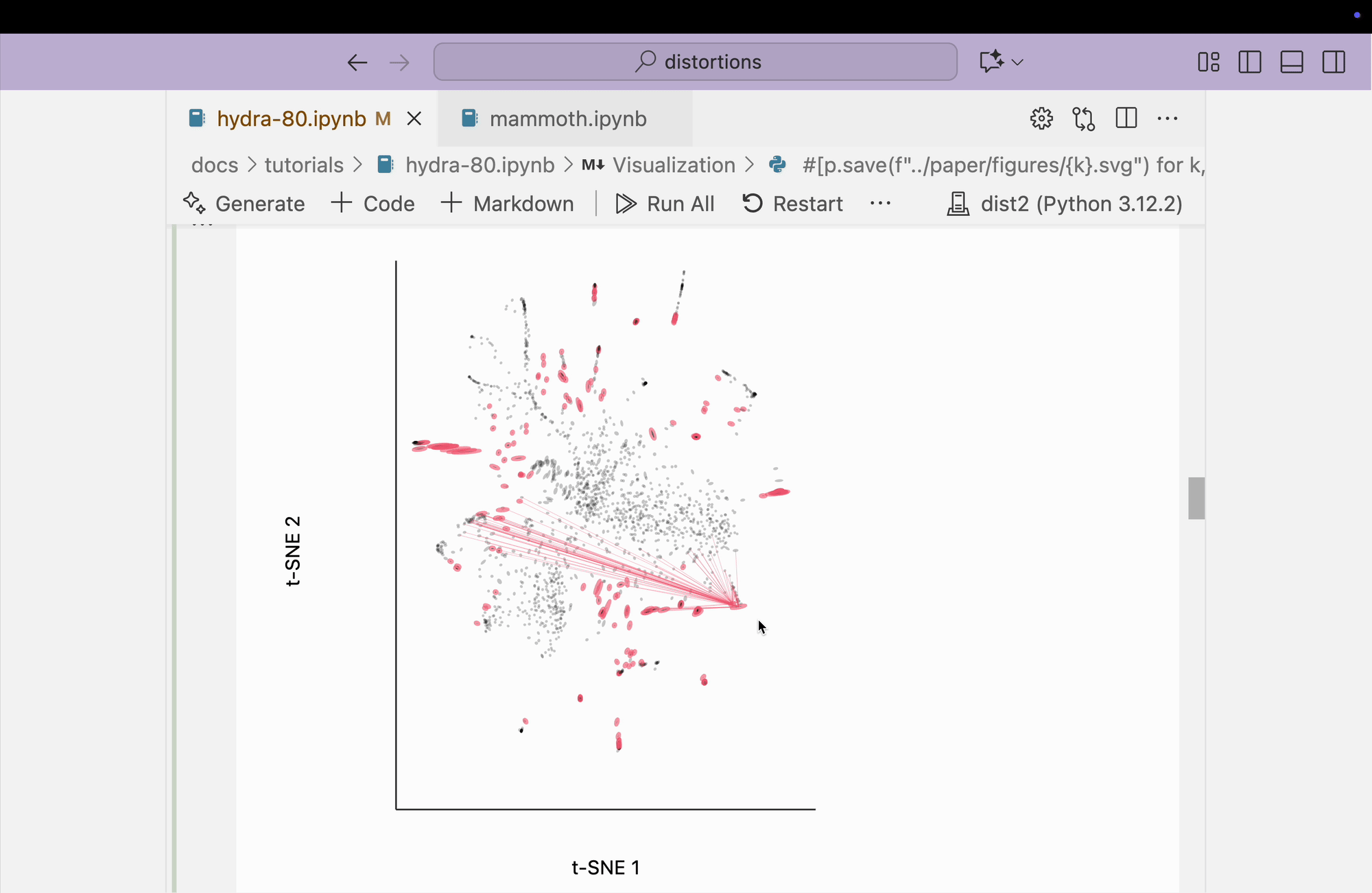
Next, we visualize the fragmented neighborhoods on top of the scatterplot. We observe that some connections exist between threads on opposite sides of the plot. Even though the core is better preserved, these peripheral embeddings are less trustworthy than in the perplexity = 80 case.
from distortions.visualization import dplot
from distortions.geometry import neighborhoods

plots = {}
N = neighborhoods(adata, threshold=.2, outlier_factor=3, embed_key="X_tsne", frame=[100, 100], method="window")
plots["hydra_link_80"] = dplot(embedding, width=440, height=440)\
   .mapping(x="embedding_0", y="embedding_1")\
   .inter_edge_link(N=N, threshold=3, stroke="#F25E7A", highlightColor="#F25E7A", backgroundOpacity=0.2, strokeWidth=0.2, opacity=0.6)\
   .geom_ellipse(radiusMax=10, radiusMin=.8)\
   .labs(x="t-SNE 1", y="t-SNE 2")
plots["hydra_link_80"]
dplot(dataset=[{'embedding_0': -2.5069398880004883, 'embedding_1': -0.9895334243774414, 'x0': -0.9769256129522…
The block below explores the isometry interaction. There is such a large range in the metrics across different regions of the plot that this ends up not being so useful. When we move the mouse near regions with highly contracted metrics, the rest of the embedding "blows up." But the fact that there is such a wide range in local distances is useful information on its own and keeps us aware of the need to interpret different subsets of the embedding plot separately.
metrics = {k: H[k] / H.mean() for k in range(len(H))}
plots["hydra_isometry"] = dplot(embedding, width=440, height=440)\
    .mapping(x="embedding_0", y="embedding_1")\
    .inter_isometry(metrics=metrics, metrics_bw=.05, transformation_bw=.1, stroke="#dcdcdc")\
    .geom_ellipse(radiusMax=10, radiusMin=.8)\
    .labs(x="t-SNE 1", y="t-SNE 2")
plots["hydra_isometry"]
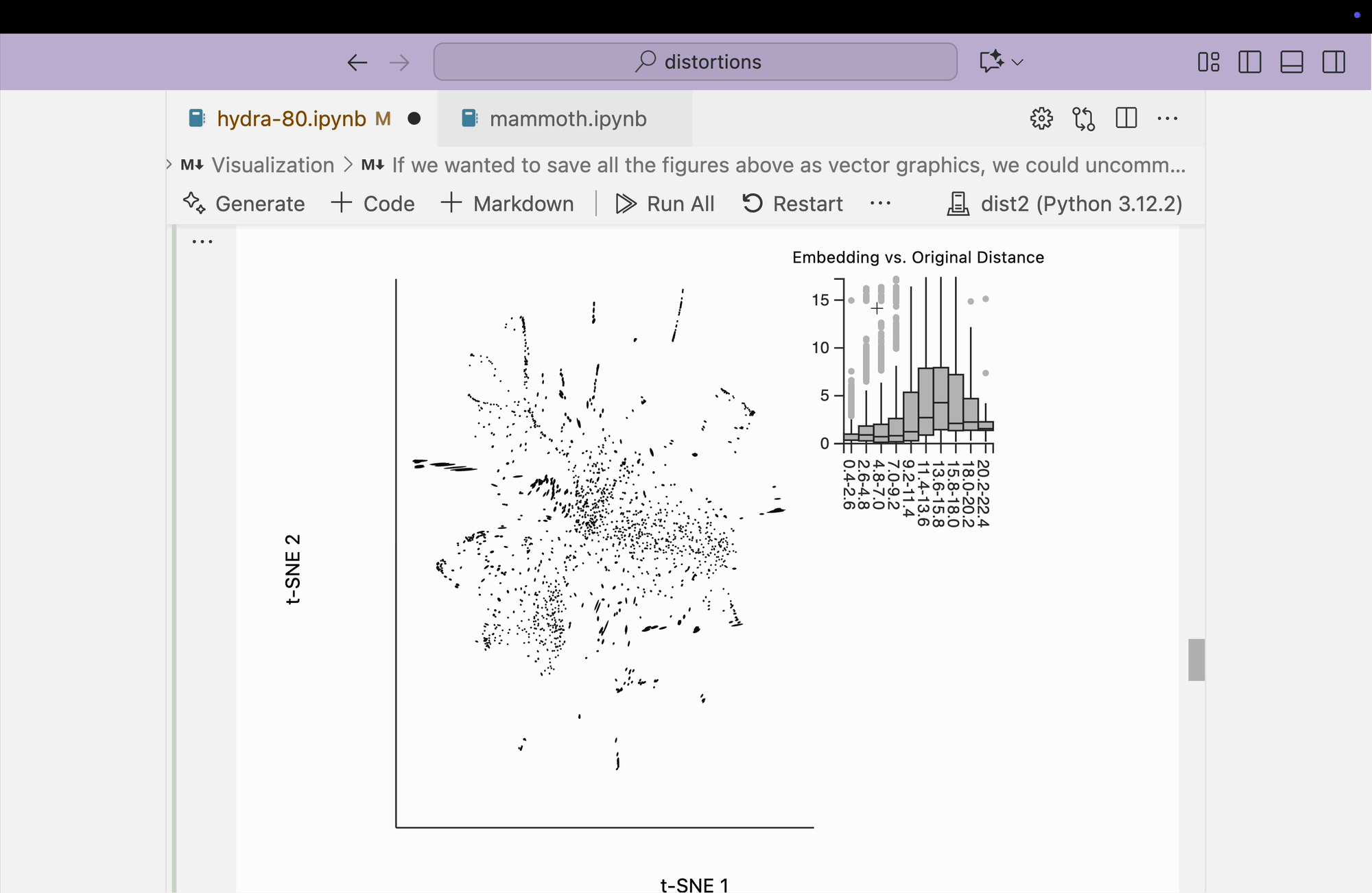
Finally, we create the boxplot-based visualization by brushing over points that have small distances in the original space but large distances in the embedding space. We find that many pairs from opposite peripheral clusters are highlighted, consistent with the broken-neighborhood patterns seen in our earlier block.
from distortions.geometry import neighborhood_distances

dists = neighborhood_distances(adata, embed_key="X_tsne")
plots["hydra_boxplot"] = dplot(embedding, width=550, height=440)\
    .mapping(x="embedding_0", y="embedding_1")\
    .geom_ellipse(radiusMax=8, radiusMin=.5)\
    .inter_boxplot(dists=dists, strokeWidth=0.2)\
    .labs(x = "t-SNE 1", y = "t-SNE 2")
plots["hydra_boxplot"]
If we wanted to save all the figures above as vector graphics, we could uncomment and run the block below.
#save_dir = "./"
#[p.save(f"{save_dir}/{k}-80.svg") for k, p in plots.items()]
[display(p) for p in plots.values()]