PBMC Atlas
This notebook looks at the scanpy classic dimensionality reduction tutorial
from the distortion estimation point of view. We'll apply the UMAP and cell type
clustering routines and then create some interactive figures that show how cell
types can have systematically different distortion properties. If you want to see what this looks like in scanpy's new plotting workflow
just replace the sc.datasets.pbmc3k_processed() call below with sc.datasets.pbmc68k_reduced().
import scanpy as sc

adata = sc.datasets.pbmc3k_processed()
save_dir = "/Users/krissankaran/Desktop/collaborations/distortions-project/distortions-dev/paper/figures/"
Run UMAP
The block below looks like a lot of code, but it's mostly because we need to hard code the labels for different self clusters. The first four lines are the most important they run a new map with 50 nearest neighbors after PCA denoising. We then cluster those UMAP embeddings with the Leiden algorithm. We can get some more interpretable cell type annotations by referring to well known marker genes. This is what the marker_gene_dict and cluster2annotation variables contain. None of these steps are really necessary for distortion estimation, but they'll allow us to put names on the differences between cell types, that will see below.
import random
import scanpy as sc
random.seed(20250410)

n_neighbors = 10
sc.pp.neighbors(adata, n_neighbors=n_neighbors, n_pcs=50)
sc.tl.umap(adata, init_pos = "spectral") # set to "random" for random initialization
sc.tl.leiden(
    adata,
    key_added="clusters",
    resolution=0.5,
    n_iterations=2,
    flavor="igraph",
    directed=False,
)
marker_genes_dict = {
    "B-cell": ["CD79A", "MS4A1"],
    "Dendritic": ["FCER1A", "CST3"],
    "Monocytes": ["FCGR3A"],
    "NK": ["GNLY", "NKG7"],
    "Other": ["IGLL1"],
    "Plasma": ["IGJ"],
    "T-cell": ["CD3D"],
}

cluster2annotation = {
    "0": "Monocytes",
    "1": "NK",
    "2": "T-cell",
    "3": "Dendritic",
    "4": "Dendritic",
    "5": "Plasma",
    "6": "B-cell",
    "7": "Dendritic",
    "8": "Other",
}

adata.obs["cell_type"] = adata.obs["clusters"].map(cluster2annotation).astype("category")
Estimate Distortion
Now that we have the embedding, we can estimate the associated distortion. The array H below stores, the local distortion information associated with every single cell. The estimates come from the geometry function, which is exactly copied from the megaman package and which implement the algorithms described in this paper. This function unfortunately has a few hyperparameters, and that's because to estimate distortion we need to estimate a graph Laplacian. This provides a kind of ground truth manifold distance information -- in fact, there is strong theory to support the use of this object in estimating manifolds when the sample size increases to infinity. Unfortunately, with any finite amount of data, the estimate can depend on the hyper parameters in the function. We generally recommend setting the number of neighbors to be the same as the number of neighbors in the original embedding function, in this case 50. From there, we can set the radius to the a small multiple of the average distance between neighbors. The scaling epsilon parameter is usually a small number from one to 10 and it's purpose is to stabilize the values H. You might want to tinker it with it in case you're noticing an extreme range of ellipse sizes.
from distortions.geometry import Geometry, local_distortions
import numpy as np

embedding = adata.obsm["X_umap"].copy()
radius = 3 * np.mean(adata.obsp["distances"].data)
geom = Geometry("brute", laplacian_method="geometric", laplacian_kwds={"scaling_epps": 5}, adjacency_kwds={"n_neighbors": n_neighbors}, affinity_kwds={"radius": radius})
H, Hvv, Hs = local_distortions(embedding, adata.X, geom)
Next would do some light postprocessing on the local distortion estimates. This is only necessary in this notebook because we want to illustrate the isometrization routine. Since the raw output H has a few outliers will try truncating them. This will make sure that those outliers don't dominate the visualization. We also re-normalize the singular values Hs according to their mean. This ensures that we aren't always contracting or always dilating regions of the visualization when we interact with it. Again this step is only necessary for the inter_isometry function below that implements isometrization.
# postprocessing
#Hs[Hs > 8] = 8 # for random plot
Hs[Hs > 2.5] = 2.5
Hs /= Hs.mean()
for i in range(len(H)):
    H[i] = Hvv[i] @ np.diag(Hs[i]) @ Hvv[i].T
Next, we add that local distortion information into our original embedding output. There's nothing really fancy going on in bind_metric. It's really just a wrapper of some pandas concatenation calls.
from distortions.geometry import bind_metric

embedding = bind_metric(embedding, Hvv, Hs)
embedding["cell_type"] = adata.obs["cell_type"].values
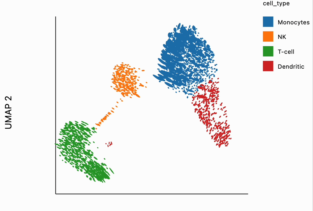
Static Visualizations
Before we do anything interactive, let's build some intuition about these outputs using some static visualizations. Our first is a plot is just a scatter pot of the UMAP embeddings. We see some clear structure that differentiates between different types of blood cells. The question is -- how reliable are these embeddings for making specific distance comparisons? From the raw output, we had no idea about house distances might be stretched or compressed locally, or whether distances between clusters accurately preserve the distances observed in the original high-dimensional data.
import altair as alt

sort_order = ["Monocytes", "NK", "T-cell", "Dendritic", "Plasma", "B-cell", "Other"]
alt.Chart(embedding).mark_circle().encode(
    x=alt.X("embedding_0"),
    y=alt.Y("embedding_1"),
    color=alt.Color("cell_type", sort=sort_order).scale(scheme="category10")
).properties(width=400, height=400)\
 .configure_axis(grid=False)
Let's now look at a less standard (but still static) plot. We'll compare the singular values from the local metrics estimated above. Please give a sense of the dilation and compression induced by the embedding locally around a cell. Ideally these would all be close to the identity of line meaning that no one direction along the true manifold is stretched more than any another. Here, though we noticed that often the x-axis (first singular value, $\lambda_1$) is quite a bit larger than the y-axis (second singular value, $\lambda_2$). The directions with the larger $\lambda_{1}$ relative to $\lambda_{2}$ have been stretched. We also noticed that the T-cells and some NK cells have the more severe distortion, since their x-axis values can be much larger than their y-axis values.
from distortions.visualization import eigenvalue_plot

lambda_plot = eigenvalue_plot(
    Hs, embedding["cell_type"],
    sort_order=["Monocytes", "NK", "T-cell", "Dendritic", "Plasma", "B-cell", "Other"]
).configure_axis(labelFontSize=12, titleFontSize=22)\
 .configure_range(category=['#1f77b4', '#ff7f0e', '#2ca02c', '#d62728', '#9467bd'])

lambda_plot.save(f"{save_dir}/pbmc_lambda_random.svg")
lambda_plot
compression_mask = (Hs[:, 0] < 5) & (Hs[:, 1] < 2.5)
Hs_zoom = Hs[compression_mask]
cell_types_zoom = embedding["cell_type"].iloc[compression_mask]

lambda_plot_zoom = eigenvalue_plot(
    Hs_zoom, cell_types_zoom,
    sort_order=["Monocytes", "NK", "T-cell", "Dendritic", "Plasma", "B-cell", "Other"]
).configure_axis(labelFontSize=12, titleFontSize=22)\
 .configure_range(category=['#1f77b4', '#ff7f0e', '#2ca02c', '#d62728', '#9467bd'])

lambda_plot_zoom.save(f"{save_dir}/pbmc_lambda_zoom_random.svg")
lambda_plot_zoom
Interactive Visualizations
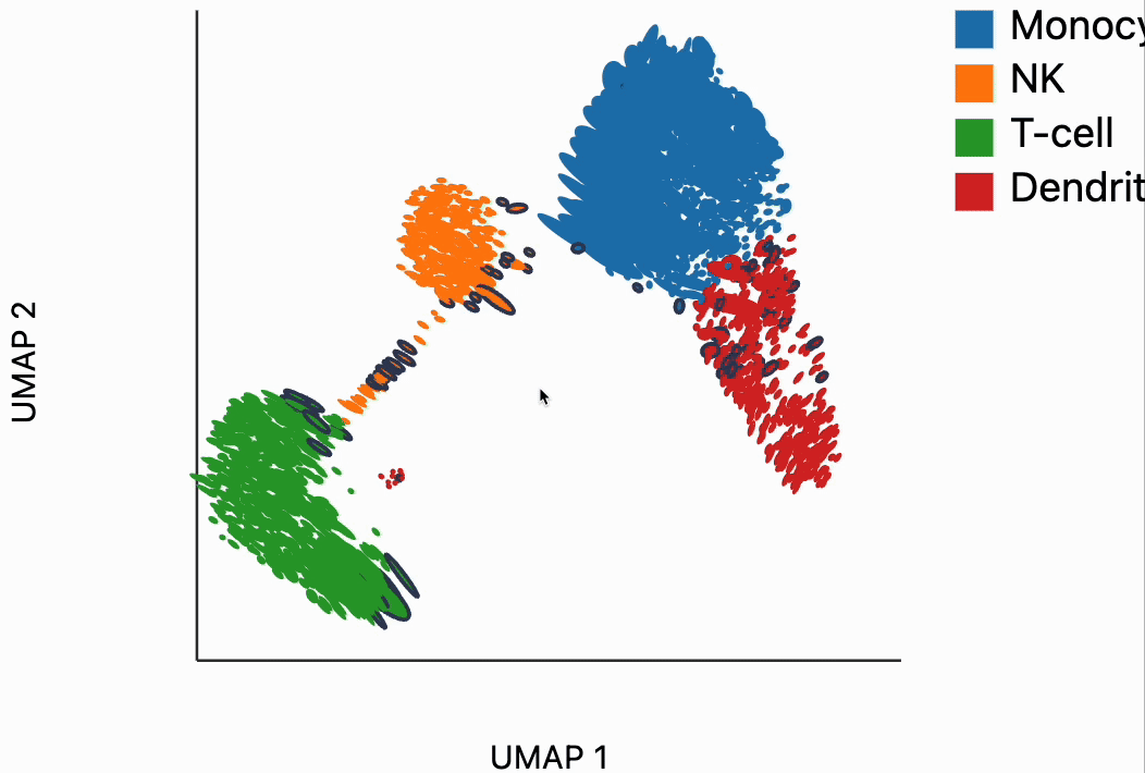
Now we're ready to make some interactive visualizations. Our first looks for fragmented neighborhoods. These neighborhoods are centered around cells that have a large fraction of neighbors that are placed very far away in the embedding space relative to their true distances in gene expression space. The intuition is that algorithms like UMAP, and $t$-SNE are known to "tear" the data. In extreme cases, cells that might have been not that far apart in their gene expression patterns can be placed on opposite sides of the visualization. This phenomenon is relatively well documented theoretically as well -- nonlinear dimensionality reduction sometimes resorts to introducing discontinuities in order to achieve their overall embedding objective.
In the block below, the object N and is just a dictionary where the keys are the centers of the distorted neighborhoods and the values are the 50 nearest neighbors to that center cell. We interactively visualize these neighborhoods, using the dplot code. The layering syntax should feel familiar to ggplot2 or altair users (granted with much less functionality). The mapping object takes columns of the input DataFrame to the graphical properties in the marks below. The inter_edge_link command, add interactivity so that when we place our mouse close to one of the fragmented neighborhoods, we see edges emanating to all their neighbors. The fragmented neighborhoods themselves are highlighted with a thick border. The threshold argument controls how close the mouse needs to be before the links are drawn, and strokeWidth gives the associated line width.
from distortions.geometry import neighborhoods
from distortions.visualization import dplot

N = neighborhoods(adata, threshold=.2, outlier_factor=3)
plots = {}
plots["pbmc_links"] = dplot(embedding, width=440, height=340)\
    .mapping(x="embedding_0", y="embedding_1", color="cell_type")\
    .geom_ellipse(radiusMax=15, radiusMin=1)\
    .inter_edge_link(N=N, threshold=.1, strokeWidth=0.4)\
    .scale_color(legendTextSize=15)\
    .labs(x="UMAP 1", y="UMAP 2")
plots["pbmc_links"]
dplot(dataset=[{'embedding_0': -2.0258066654205322, 'embedding_1': 5.2196149826049805, 'x0': -0.88568621556657…
#plots["pbmc_links"].save(f"{save_dir}/pbmc_links.svg")
Unfortunately, the way these notebooks are hosted, you won't be able to directly interact with the output from the call, even though if you were following along in your own notebook, the output should be interactive. We've copied a small recording of our interacting with this visualization in case you just want to have an idea of what this package gives without running it yourself.
Our next interactive plot compares the embedding versus original expression distances. Instead of flagging entire neighborhoods that have been fragmented, it can be used to find individual links that are poorly preserved in the embedding compared to the original data. We accomplish this by extracting the distance between neighbors and the original and embedding spaces with the neighborhood_distances function and then passing that to inter_boxplot layer. You can now drag a brush over the boxplot widget, and it will highlight the neighboring pairs that lie under the brush. For example, when we draw our brush over the top points above the leftmost box, we're highlighting, neighbors that are very close to one another in expression space but which have been placed far apart in the embedding
from distortions.geometry import neighborhood_distances

dists = neighborhood_distances(adata)
plots["pbmc_boxplot"] = dplot(embedding, width=540, height=340)\
    .mapping(x="embedding_0", y="embedding_1", color="cell_type")\
    .geom_ellipse(radiusMax=15, radiusMin=1)\
    .inter_boxplot(dists=dists, strokeWidth=0.4, legendOffset=100)\
    .labs(x="UMAP 1", y="UMAP 2")
plots["pbmc_boxplot"]
dplot(dataset=[{'embedding_0': -2.0258066654205322, 'embedding_1': 5.2196149826049805, 'x0': -0.88568621556657…
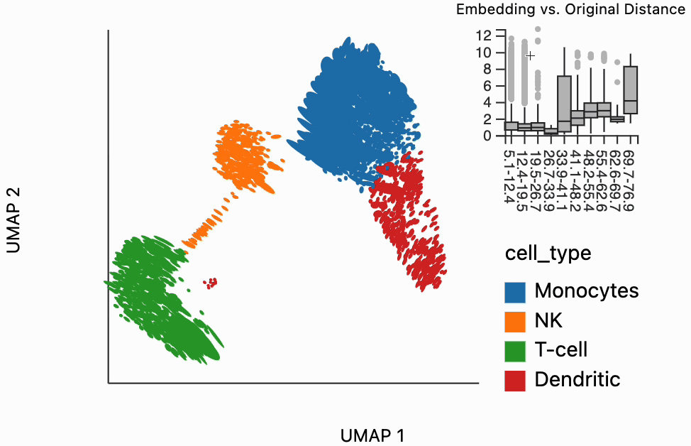
#plots["pbmc_boxplot"].save(f"{save_dir}/pbmc_boxplot.svg")
Next let's apply our isometrization function. This allows us to reverse the distortion locally around query regions. Formally it applies the inverse of the distortion metrics H that were estimated above. The intuition is that this serves as a kind of compromise. Even though we can't ensure that our overall visualization is an isometry, we can at least try to achieve isometries locally around an area of interest. We have set a few hyperparameters here -- they are explained in a bit more detail in the blocks below. For example, we can see that many of the T cells are quite eccentric (this is consistent with the singular values scatterplot above). When we hover over them, they are compressed to be more circular. The directions of dilation have been compressed slightly so that the artificial spread introduced by the inventing algorithm is removed.
metrics = {k: H[k] for k in range(len(H))}
plots["pbmc_isometry"] = dplot(embedding, width=440, height=340)\
    .mapping(x="embedding_0", y="embedding_1", color="cell_type")\
    .geom_ellipse(radiusMin=.7, radiusMax=8)\
    .inter_isometry(metrics=metrics, metric_bw=0.5, transformation_bw=0.2, strokeWidth=0.2)\
    .scale_color(legendTextSize=8)\
    .labs(x="UMAP 1", y="UMAP 2")
plots["pbmc_isometry"]
dplot(dataset=[{'embedding_0': -2.0258066654205322, 'embedding_1': 5.2196149826049805, 'x0': -0.88568621556657…
The metric and transformation bandwidth (bw) parameters set in the above visualization are necessary to formalize the isomerization step. The metric bandwidth parameter determines how many of the neighboring ellipses should be used when learning the inverse transformation. Smaller values mean that more neighbors can contribute to the inverse. This can make the output, more stable, but has the downside that it averages over metrics that might not actually be that similar to ones near the mouse. The transformation bandwidth parameter controls how much of a plot gets changed whenever we move our mouse. It can be a bit unwieldy to transform all samples in the plot just to see the isometric embedding within the region of interest. The two plots below highlight the similar ellipses according to both parameters as we move on us over the plot -- similar points appear in black.
plots["pbmc_transform"] = dplot(embedding, width=440, height=340)\
    .mapping(x="embedding_0", y="embedding_1", color="kernel_transform")\
    .geom_ellipse(radiusMin=.7, radiusMax=8)\
    .inter_isometry(metrics=metrics, metric_bw=1, transformation_bw=0.2, strokeWidth=0.2)\
    .scale_color(legendTextSize=8)\
    .labs(x="UMAP 1", y="UMAP 2")

plots["pbmc_metric"] = dplot(embedding, width=440, height=340)\
    .mapping(x="embedding_0", y="embedding_1", color="kernel_metric")\
    .geom_ellipse(radiusMin=.7, radiusMax=8)\
    .inter_isometry(metrics=metrics, metric_bw=1, transformation_bw=0.2, strokeWidth=0.2)\
    .scale_color(legendTextSize=8)\
    .labs(x="UMAP 1", y="UMAP 2")
The block below appears only so that we can save the state of our interactive plots into an SVG file. This is how we got the plots for our paper. You can read more about saving SVGs from the output of the distortion package by reading the "Saving Interactions as SVG " tutorial on this site.
#[p.save(f"{save_dir}/{k}.svg") for k, p in plots.items()]
[display(p) for p in plots.values()]
dplot(dataset=[{'embedding_0': -2.0258066654205322, 'embedding_1': 5.2196149826049805, 'x0': -0.88568621556657…
dplot(dataset=[{'embedding_0': -2.0258066654205322, 'embedding_1': 5.2196149826049805, 'x0': -0.88568621556657…
dplot(dataset=[{'embedding_0': -2.0258066654205322, 'embedding_1': 5.2196149826049805, 'x0': -0.88568621556657…
dplot(dataset=[{'embedding_0': -2.0258066654205322, 'embedding_1': 5.2196149826049805, 'x0': -0.88568621556657…
dplot(dataset=[{'embedding_0': -2.0258066654205322, 'embedding_1': 5.2196149826049805, 'x0': -0.88568621556657…
[None, None, None, None, None]