Analyzing Fragmentation in a Flattened Mammoth
This notebook considers a famous wooly mammoth dataset, which has been used to show the types of artifacts that can be introduced by UMAP [1, 2]. Each row of the data set below corresponds to a readout from a 3D point cloud scan of a woolly mammoth skeleton. Since the data are only three-dimensional, we can visualize the raw data. Nonetheless for being relatively low dimensional, it can still be challenging for UMAP to both (1) preserve the global geometry of the skeleton and (2) capture subtleties in the relationship between individual bones.
import numpy as np
import pandas as pd
data = pd.read_json("https://raw.githubusercontent.com/krisrs1128/distortions-data/main/data/mammoth_3d.json")
data.columns = ["x", "y", "z"]
Data Preparation
We first run a new map with the 50 nearest neighbor graph. We are using the scanpy package just for consistency with the other notebooks. In principle, we could've also used the ordinary umap package.
from anndata import AnnData
import scanpy as sc
n_neighbors = 50
adata = AnnData(X=data, obs=pd.DataFrame(index=data.index))
sc.pp.neighbors(adata, n_neighbors=n_neighbors)
sc.tl.umap(adata)
embedding = adata.obsm["X_umap"].copy()
In the block below, we estimate the local distortion associated with each point in the point cloud. This estimation step hinges on the geometry object. This is exactly like the geometry objects defined in the megaman package, and it is used to define the intrinsic geometry of the manifold from which the data are assumed to be sampled. This depends on hyperparameters. We have set the number of neighbors to equal the number of neighbors in UMAP, and we have set the radius to be a small multiple of the typical neighborhood distance. We have found these to be reasonable defaults, but still encourage you to test sensitivity, especially to the radius and $\epsilon$ scaling parameter.
from distortions.geometry import Geometry, bind_metric, local_distortions
radius = 3 * np.mean(adata.obsp["distances"].data)
geom = Geometry("brute", laplacian_method="geometric", affinity_kwds={"radius": radius}, adjacency_kwds={"n_neighbors": n_neighbors}, laplacian_kwds={"scaling_epps": 5})
H, Hvv, Hs = local_distortions(embedding, data, geom)
embedding = bind_metric(embedding, Hvv, Hs)
Static Visualizations
Before visualizing distortion, let's visualize the 3D skeleton and analyze the output of dimensional reduction without any overlays. The block below is partly to draw a 3D scatterplot of the mammoth skeleton. Notice some of the subtleties. The tusks don't have even sampling density. The feet are slightly offset. There are small gaps on the left-hand side ribs near the back legs. On the legs, they're more points, sampled near the feet and the knees, then on the longer bones. There are also seem to be more points on the front legs compared to the back. The skull has a kind of bump near the top that's made of relatively few points. These are the kinds of details that exist in real data that we hope nonlinear dimensionality reduction should be able to capture.
import plotly
import plotly.express as px
plotly.offline.init_notebook_mode()
fig = px.scatter_3d(data, x='x', y='z', z='y')
fig.update_traces(marker_size=1, marker_color="black")
fig
In the block below, we are visualizing the results of UMAP applied to these 3D data. The correspondence is relatively clear we can see that the algorithm has preserved the global relationships between the parts of the mammoth. It's impressive that we still seem to preserve the ribs and even the distinction between some toes at least on the front legs. But we can also immediately recognize some distortion. The tasks are uneven lengths here, even though they're relatively even in the original data. The tail looks like it's contained inside of the pelvis. The symmetry between the ribs seems a bit off. Indeed, the entire shoulder area appears to be a bit "broken."
import altair as alt
alt.data_transformers.enable("vegafusion")
alt.Chart(embedding).mark_circle(color="black").encode(
x=alt.X("embedding_0"),
y=alt.Y("embedding_1")
).properties(width=450, height=350)
We can get a sense of the global distortion by plotting the embedding distance between points against the original distances in 3D. What we see here -- and it's relatively common across many examples we've studied -- is that the embedding distances are quite skewed to the right. The embedding pairwise distance is due increase with the original pairwise distances, but there's a long tail of outliers. These are points that are far apart in the embedding, but which close in the original data. This visualization is static, but we'll see how we can query the specific outliers in our interactive pots.
from distortions.geometry import neighborhood_distances
distances = neighborhood_distances(adata)
alt.Chart(distances).mark_boxplot(outliers=True).encode(
x=alt.X('true', bin={"maxbins": 20}),
y=alt.Y('embedding')
)
Interactive Visualizations
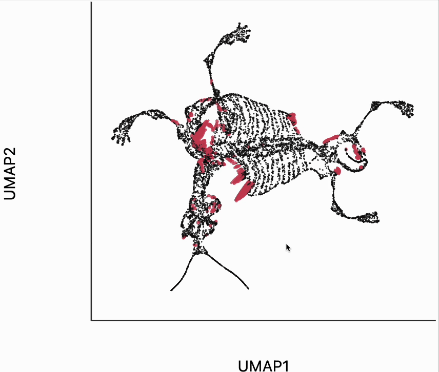
We now move to the interactive visualizations specific to the distortions package. Our first plot will highlight the fragmented neighborhoods. These are points that are highly separated from their neighbors in the embedding space. The intuition roughly correspondence to the boxplot from above. Roughly, for any point, we evaluate the fraction of its neighbors whose distances are outlying in those box plots, and if a large enough fraction or outliers, we consider the neighborhood around that point to be fragmented. More formally in the code below we look for points where at least 30% of its neighbors are three IQRs away from the median embedding distance across the bins associated with those neighbors. Moving your mouse close to any of these neighborhoods will draw edges to the original neighbors used to define the UMAP. This interactivity is defined by the inter_edge_link layer. The other layers are used should define the static ellipse visualization.
from distortions.geometry import neighborhoods
from distortions.visualization import dplot
plots = {}
N = neighborhoods(adata, threshold=.1, outlier_factor=3)
plots["mammoth_links"] = dplot(embedding, height = 350, width=450)\
.mapping(x="embedding_0", y="embedding_1")\
.inter_edge_link(N=N, strokeWidth=.2, opacity=0.7, threshold=10, stroke="#F25E7A", highlightColor="#C83F58")\
.geom_ellipse(opacity=0.8, radiusMin=.5, radiusMax=10)\
.labs(x="UMAP1", y="UMAP2")
plots["mammoth_links"]
dplot(dataset=[{'embedding_0': 8.870267868041992, 'embedding_1': 0.8856074810028076, 'x0': -0.8852808565067297…
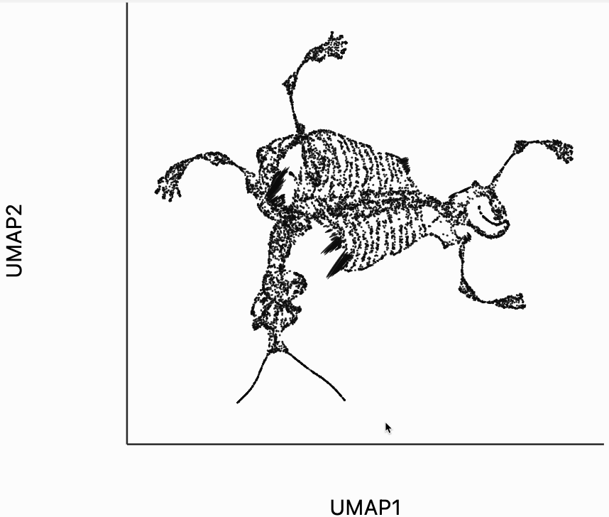
Next let's make an isometry visualization. As we hover our mouse over neighborhoods of the skeleton, the embedding resizes itself, so that distances are relatively balanced across all directions. The ellipses also change in size, those close to the mouse become more and more like circles. The main idea of this visualization is that even though all embedding must distort distances in order to reduce dimension, we can try to locally reduce distortion around the region of a mouse query. One thing to be careful of is that sometimes the singular values of each can be quite small. This can lead to the interaction, causing areas to enlarge dramatically. In our manuscript, we sometimes windsorize the singular values. For simplicity, we've avoided this step here, but the PBMC and two clusters examples both show how to do that transformation.
metrics = {k: H[k] / H.std() for k in range(len(H))}
plots["mammoth_isometry"] = dplot(embedding, height=350, width=450)\
.mapping(x="embedding_0", y="embedding_1")\
.inter_isometry(metrics=metrics, transformation_bw=.5, metric_bw=.1)\
.geom_ellipse(opacity=0.8, radiusMin=.5, radiusMax=10)\
.labs(x="UMAP1", y="UMAP2")
plots["mammoth_isometry"]
dplot(dataset=[{'embedding_0': 8.870267868041992, 'embedding_1': 0.8856074810028076, 'x0': -0.8852808565067297…
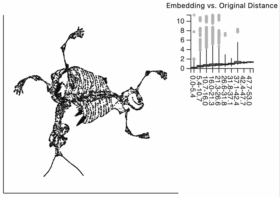
Finally, let's make an interactive version of the boxplot that we had before. The widget on the top right allows us to select edges that are outlying in the boxplot by drawing a brush over them (click and draw this region). The corresponding neighbors light up whenever the edge connecting them is covered by the brush. The points near the top left of the box plot are the most distorted edges. These should be very close to each other, according to their original distances but have been placed for the embedding. To change the number of outliers is that are available for selection, you can change the outlier_iqr argument of the inter_boxplot layer. Larger values will make it so that fewer points appear for selection.
plots["mammoth_box"] = dplot(embedding, height=350, width=530)\
.mapping(x="embedding_0", y="embedding_1")\
.geom_ellipse(radiusMax=10, radiusMin=.5)\
.inter_boxplot(dists=distances, outlier_iqr=10, highlightColor="#F25E7A", strokeWidth=0.4)\
.labs(x="UMAP1", y="UMAP2")
plots["mammoth_box"]
dplot(dataset=[{'embedding_0': 8.870267868041992, 'embedding_1': 0.8856074810028076, 'x0': -0.8852808565067297…
[display(p) for p in plots.values()]
dplot(dataset=[{'embedding_0': 8.870267868041992, 'embedding_1': 0.8856074810028076, 'x0': -0.8852808565067297…
dplot(dataset=[{'embedding_0': 8.870267868041992, 'embedding_1': 0.8856074810028076, 'x0': -0.8852808565067297…
dplot(dataset=[{'embedding_0': 8.870267868041992, 'embedding_1': 0.8856074810028076, 'x0': -0.8852808565067297…
[None, None, None]
#[p.save(f"../paper/figures/{k}.svg") for k, p in plots.items()]
len(N)
425