In the vignette “Disentangling Composition and Spatial Effects,” we ask whether it’s possible to recover sample-level spatial features from protein expression measurements Here, we ask a more challenging question – is it possible to identify spatial features associated with individual cells, just from the expression measurements As before, our motivation is that characteristics of cell ecosystems are interesting, but cheaper, expression-based proxies would be practically useful.
This is a more far fetched possibility, but there are some reasons it could happen. For example, perhaps when an immune cell is surrounded by cancer cells, it has a different protein expression profile than when it is surrounded by other immune cells
A theme that unifies the two vignettes is that the notion of “the” sampling unit is not so straightforwards when working with spatial data– we can reasonably analyze the data at several levels of resolution. This vignette considers the cell-resolution analog of the sample-level questions before.
Setup
These are the packages used in this analysis.
knitr::opts_chunk$set(message = FALSE, warning = FALSE)
library("SummarizedExperiment")
library("dplyr")
library("forcats")
library("ggplot2")
library("keras")
library("raster")
library("reshape2")
library("stars")
library("stringr")
library("tibble")
library("tidyr")
library("umap")
library("viridis")
library("BIRSBIO2020.scProteomics.embeddings")
theme_set(theme_bw() + theme(panel.grid=element_blank()))
We download the data if it’s not already present. We’re filtering to just 10 samples in this run, since we want the vignettes to compile relatively quickly. That said, to run the full analysis, replace the params$max_sample with 41 (the number of raster files we have).
data_dir <- file.path(Sys.getenv("HOME"), "Data")
get(load(file.path(data_dir, "mibiSCE.rda")))
## class: SingleCellExperiment
## dim: 49 201656
## metadata(0):
## assays(1): mibi_exprs
## rownames(49): C Na ... Ta Au
## rowData names(4): channel_name is_protein hgnc_symbol wagner_overlap
## colnames: NULL
## colData names(36): SampleID cellLabelInImage ...
##   Survival_days_capped_2016.1.1 Censored
## reducedDimNames(0):
## altExpNames(0):download_data(data_dir)
## [[1]]
## [1] "/github/home/Data/mibiSCE.rda"
##
## [[2]]
## [1] "/github/home/Data/masstagSCE.rda"
##
## [[3]]
## [1] "/github/home/Data/TNBC_shareCellData"
loaded_ <- load_mibi(data_dir, params$max_samples)
We’ll loop over all the tiffs and extract the 100 \(\times\) 100 top-left quadrant from each image, also to speed up computation in these experiments.
subsample <- spatial_subsample(loaded_$tiffs, loaded_$mibi)
## [1] "cropping 1/10"
## [1] "cropping 2/10"
## [1] "cropping 3/10"
## [1] "cropping 4/10"
## [1] "cropping 5/10"
## [1] "cropping 6/10"
## [1] "cropping 7/10"
## [1] "cropping 8/10"
## [1] "cropping 9/10"
## [1] "cropping 10/10"
ims <- subsample$ims mibi_sce <- subsample$exper
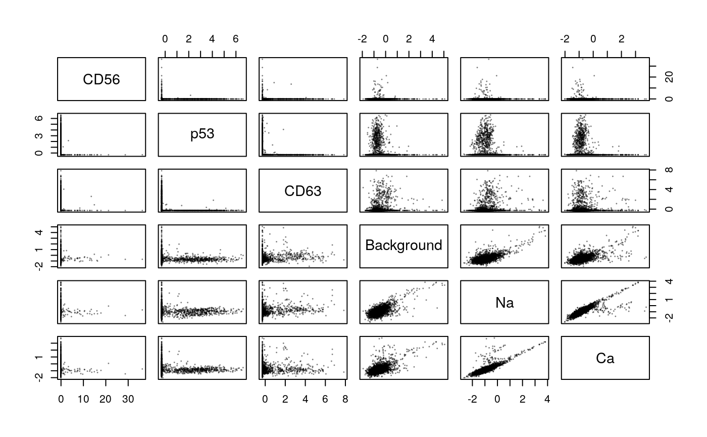
Now, let’s extract some features on which to perform the joint embedding. We’ll transform and reweight the columns, to make the two sets of features more comparable. First, for transformation, we’ll convert protein expression values to ranks and then threshold.
x <- t(assay(mibi_sce))
x_order <- hclust(dist(t(x)))$order
pairs(x[, x_order[1:6]], col = rgb(0, 0, 0, 0.5), cex=0.1)
Next, we’ll extract some features from the spatial data. Note that some cells seem to appear in the raster but not in the colData. This seems weird, and is worth looking into, but for now I’m going to just innerJoin to ignore that.
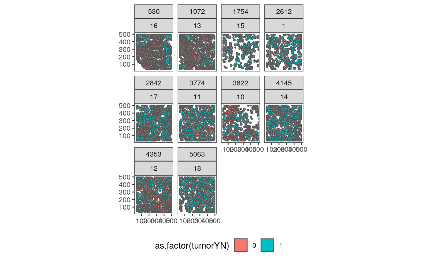
# polygonize each raster
col_df <- as.data.frame(colData(mibi_sce)) %>%
  mutate(
    cell_type = cell_type(mibi_sce),
    cell_group = fct_lump(cell_type, prop = 0.05),
  )

polys <- list()
for (i in seq_along(ims)) {
  cur_sample <- names(ims)[i]
  cur_cols <- col_df %>%
    filter(SampleID %in% cur_sample)
  polys[[i]] <- polygonize(ims[[i]]) %>%
    mutate(SampleID = as.numeric(cur_sample)) %>%
    unite(sample_by_cell, SampleID, cellLabelInImage, remove=FALSE) %>%
    inner_join(cur_cols, by = c("SampleID", "cellLabelInImage"))
}

polys <- polys[sapply(polys, nrow) > 0]
col_df <- col_df %>%
  unite(sample_by_cell, SampleID, cellLabelInImage, remove=FALSE)

# a little plot
polys_df <- do.call(rbind, polys)
ggplot(polys_df %>% filter(!is.na(cellSize))) +
  geom_sf(aes(fill = as.factor(tumorYN))) +
  facet_wrap(Survival_days_capped_2016.1.1~SampleID) +
  theme(legend.position = "bottom")
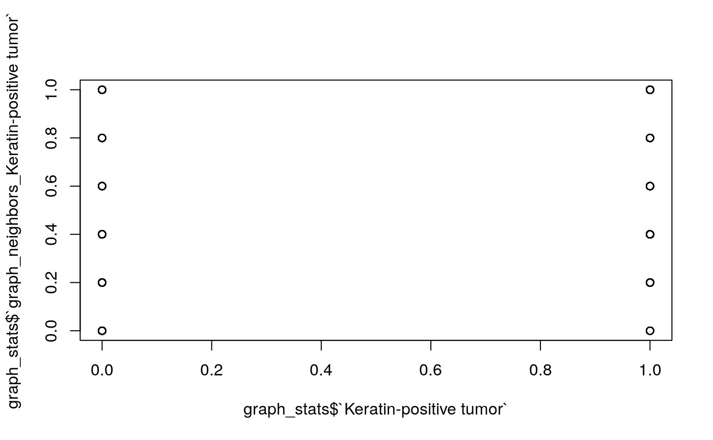
# some features that don't need graph construction
cell_stats <- polys_df %>%
  dplyr::select(sample_by_cell, cell_type, cellSize) %>%
  mutate(
    log_size = log(cellSize),
    value = 1
  ) %>%
  spread(cell_type, value, 0) %>%
  as.data.frame() %>%
  dplyr::select(-cellSize, -geometry)

# extract basic graph features
graph_stats <- list()
for (i in seq_along(polys)) {
  print(paste0("processing sample ", i, "/", length(polys)))
  cell_ids <- unique(polys[[i]]$cellLabelInImage)
  G <- extract_graph(polys[[i]])
  graph_stats[[i]] <- loop_stats(cell_ids, "graph", G, polys[[i]], type_props) %>%
    mutate(cellType = paste0("graph_neighbors_", cellType)) %>%
    spread(cellType, props, 0) %>%
    mutate(SampleID = first(polys[[i]]$SampleID))
}
## [1] "processing sample 1/10"
## [1] "processing sample 2/10"
## [1] "processing sample 3/10"
## [1] "processing sample 4/10"
## [1] "processing sample 5/10"
## [1] "processing sample 6/10"
## [1] "processing sample 7/10"
## [1] "processing sample 8/10"
## [1] "processing sample 9/10"
## [1] "processing sample 10/10"
graph_stats <- bind_rows(graph_stats) %>% mutate_all(replace_na, 0) %>% unite(sample_by_cell, SampleID, cellLabelInImage) %>% left_join(as.data.frame(cell_stats)) # example plot: what are the neighborhoods of tumors? plot(graph_stats$`Keratin-positive tumor`, graph_stats$`graph_neighbors_Keratin-positive tumor`)
Now, we’ll standardize these features and learn a set of cell-level embeddings.
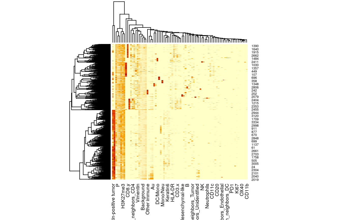
# standardize features between the two tables
x <- t(assay(mibi_sce)) %>%
  as_tibble()

x <- x %>%
  mutate_all( function(u) (u - min(u)) / diff(range(u))) %>%
  mutate_all(function(u) u / sqrt(ncol(x))) %>%
  dplyr::select_if(function(u) !all(is.na(u))) %>%
  mutate(sample_by_cell = col_df$sample_by_cell)

y <- graph_stats %>%
  mutate_at(vars(-sample_by_cell), function(u) (u - min(u)) / diff(range(u))) %>%
  mutate_at(vars(-sample_by_cell), function(u) u / sqrt(ncol(graph_stats) - 1)) %>%
  select_if(function(u) !all(is.na(u)))

z <- x %>% inner_join(y, by = "sample_by_cell")
z_mat <- z %>%
  dplyr::select(-sample_by_cell) %>%
  as.matrix()
heatmap(z_mat)
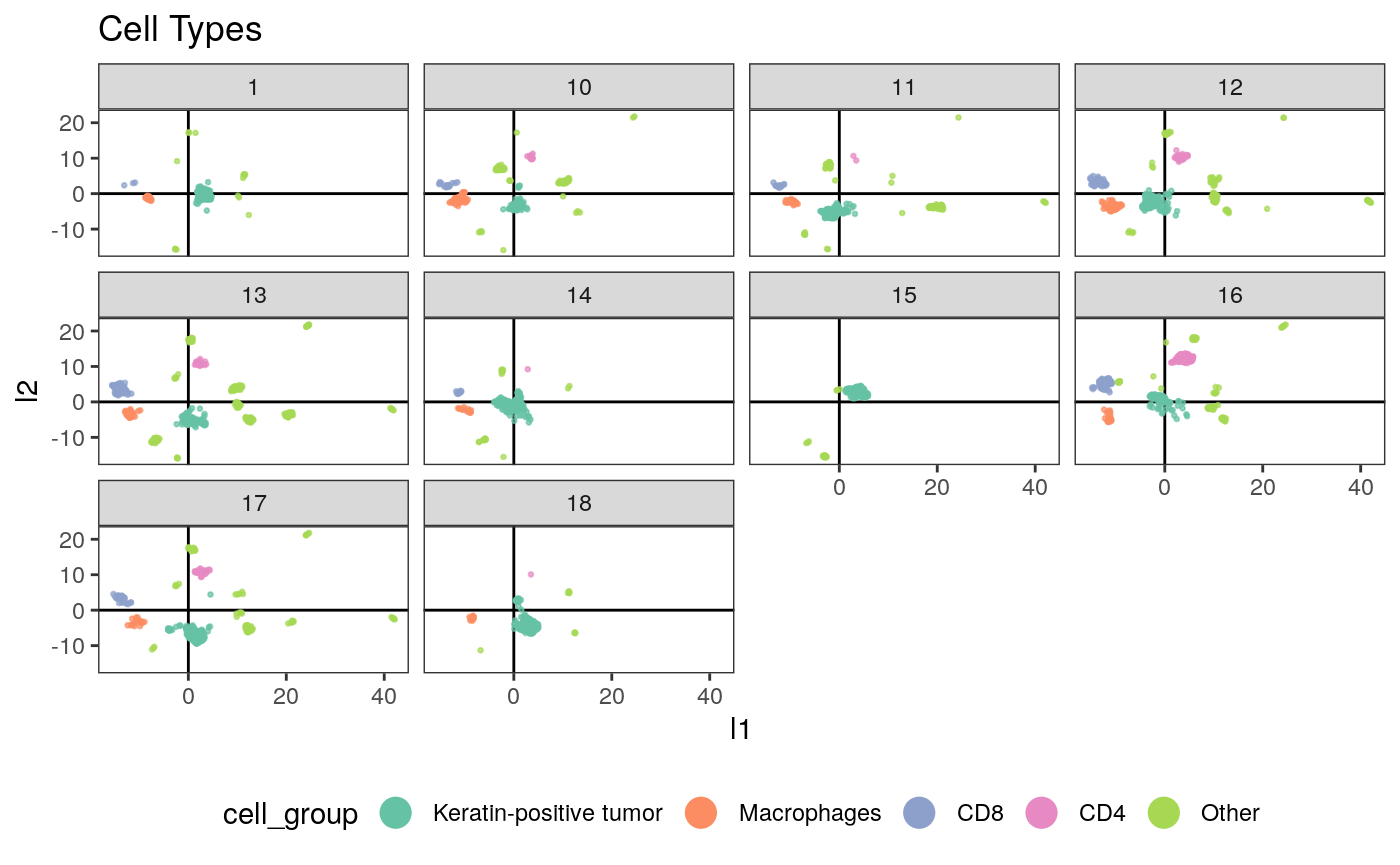
# learning embeddings across the two tables
conf <- umap.defaults
conf$min_dist <- 0.8
embeddings <- umap(z_mat, conf)
embeddings_df <- embeddings$layout %>%
  as_tibble(.name_repair = "universal") %>%
  rename("l1" = `...1`, "l2" = `...2`) %>%
  mutate(sample_by_cell = z$sample_by_cell) %>%
  left_join(col_df) %>%
  left_join(z)
Next we plot the embeddings we just made, against some of the derived features.
ggplot(embeddings_df) +
  geom_hline(yintercept = 0) +
  geom_vline(xintercept = 0) +
  geom_point(
    aes(x = l1, y = l2, col = cell_group),
    size = 0.5, alpha = 0.7
  ) +
  facet_wrap(~SampleID) +
  scale_color_brewer(palette = "Set2") +
  guides(col = guide_legend(override.aes = list(alpha = 1, size = 5))) +
  ggtitle("Cell Types") +
  theme(legend.position = "bottom")
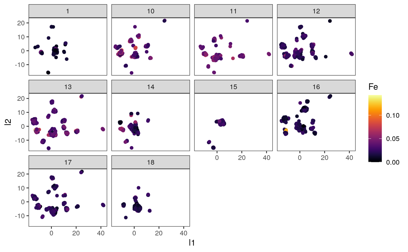
ggplot(embeddings_df) +
  geom_point(aes(x = l1, y = l2, col = Fe)) +
  facet_wrap(~ SampleID) +
  scale_color_viridis(option = "inferno")
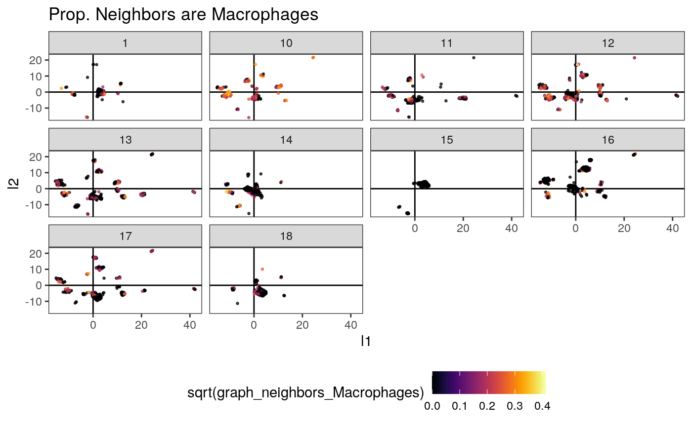
ggplot(embeddings_df) +
  geom_hline(yintercept = 0) +
  geom_vline(xintercept = 0) +
  geom_point(
    aes(x = l1, y = l2, col = sqrt(graph_neighbors_Macrophages)),
    size = 0.5, alpha = 0.7
  ) +
  scale_color_viridis(option = "inferno") +
  facet_wrap(~ SampleID) +
  theme(legend.position = "bottom") +
  ggtitle("Prop. Neighbors are Macrophages")
Cells \(\to\) Samples
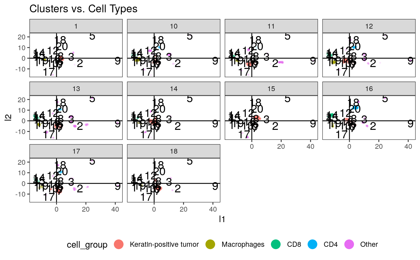
Now that we have embeddings at the cell level, we can try to summarize samples by how many of their cells lie in different regions of the embedding space. First, we’ll cluster using an arbitrary \(K = 20\).
clusters <- kmeans(embeddings$layout, centers = params$cluster_K)

# plot the clusters
ggplot(embeddings_df) +
  geom_point(
    aes(x = l1, y = l2, col = cell_group),
    size = 0.5, alpha = 0.1
  ) +
  geom_text(
    data = data.frame(clusters$centers, cluster = seq_len(nrow(clusters$centers))),
    aes(x = X1, y = X2, label = cluster), size = 5
  ) +
  geom_hline(yintercept = 0) +
  geom_vline(xintercept = 0) +
  guides(col = guide_legend(override.aes = list(alpha = 1, size = 5))) +
  facet_wrap(~SampleID) +
  ggtitle("Clusters vs. Cell Types") +
  theme(legend.position = "bottom")
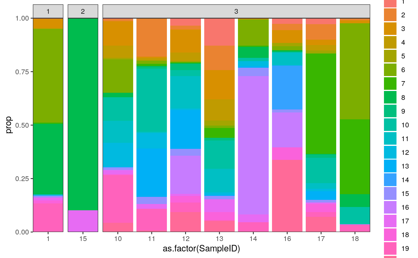
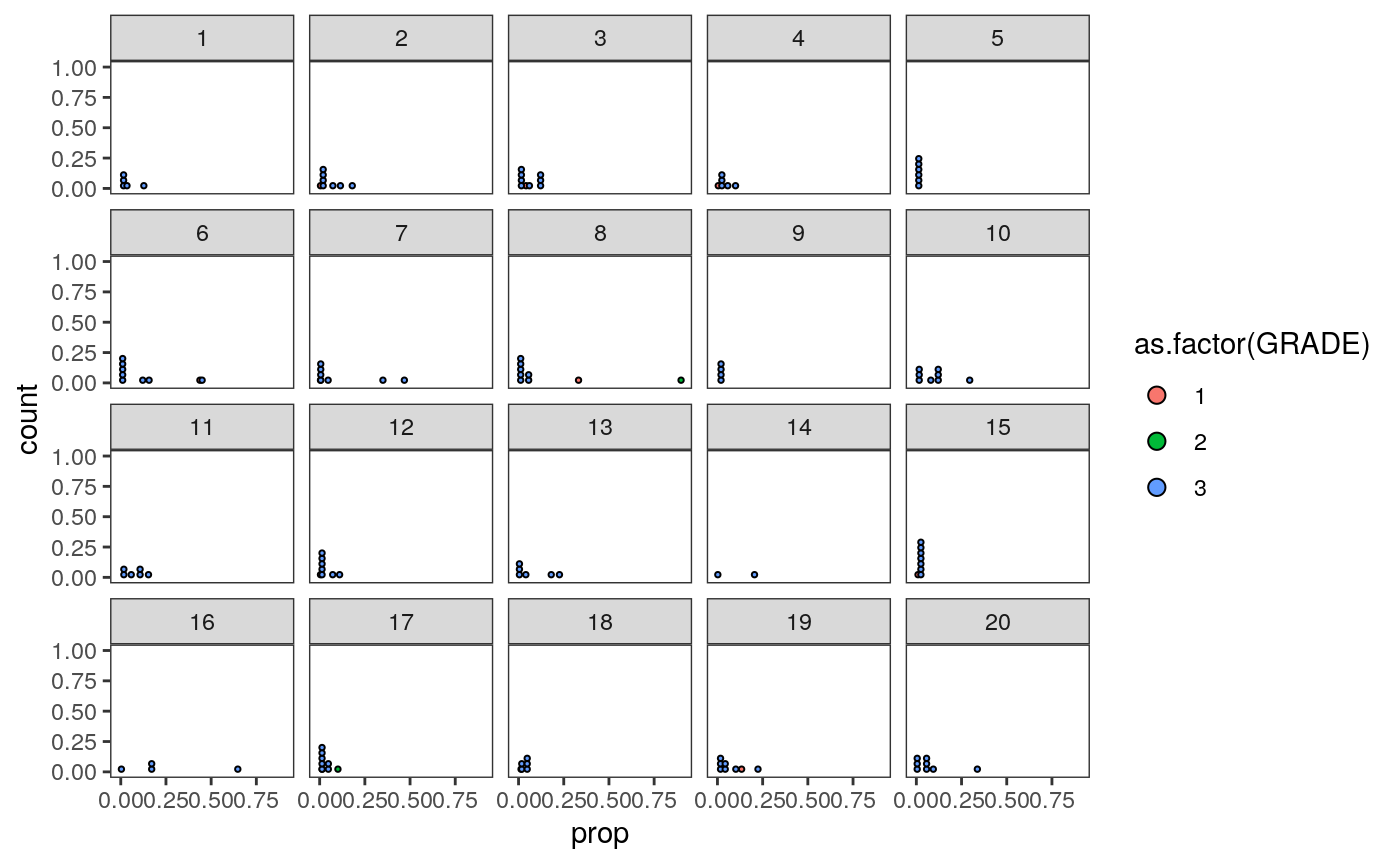
# summarize the samples
embeddings_df$cluster <- as_factor(clusters$cluster)
cluster_props <- embeddings_df %>%
  group_by(SampleID, cluster) %>%
  summarise(count = n()) %>%
  group_by(SampleID) %>%
  mutate(
    total = sum(count),
    prop = count / total
    ) %>%
  left_join(
    col_df %>%
      dplyr::select(SampleID, GRADE) %>%
      unique()
  )

ggplot(cluster_props) +
  geom_bar(
    aes(x = as.factor(SampleID), y = prop, fill = cluster),
    position = "stack", stat = "identity"
  ) +
  scale_y_continuous(expand = c(0, 0)) +
  scale_x_discrete(expand = c(0, 0)) +
  facet_grid(.~GRADE, scales="free_x", space="free_x")
Question: Can you map the different clusters back to the spatial patterns that we had noticed from before? E.g., are those in cluster “5” more spatially heterogeneous?
To answer this, let’s compare samples 23, 27, 2 with 10 and 12. These samples seem to have somewhat different cluster compositions, even though they all are Grade 3..
polys_q <- polys_df %>%
  filter(SampleID %in% c("23", "27", "2", "10", "12")) %>%
  mutate(compare = ifelse(SampleID %in% c("10", "12"), "group2", "group1"))

ggplot(polys_q) +
  geom_sf(aes(fill = as.factor(tumorYN))) +
  facet_wrap(compare ~ SampleID) +
  theme(legend.position = "bottom")
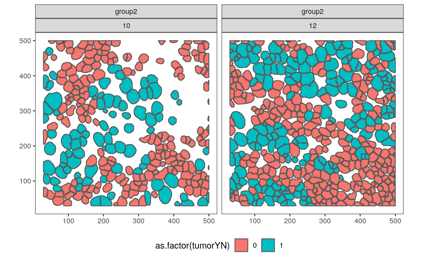
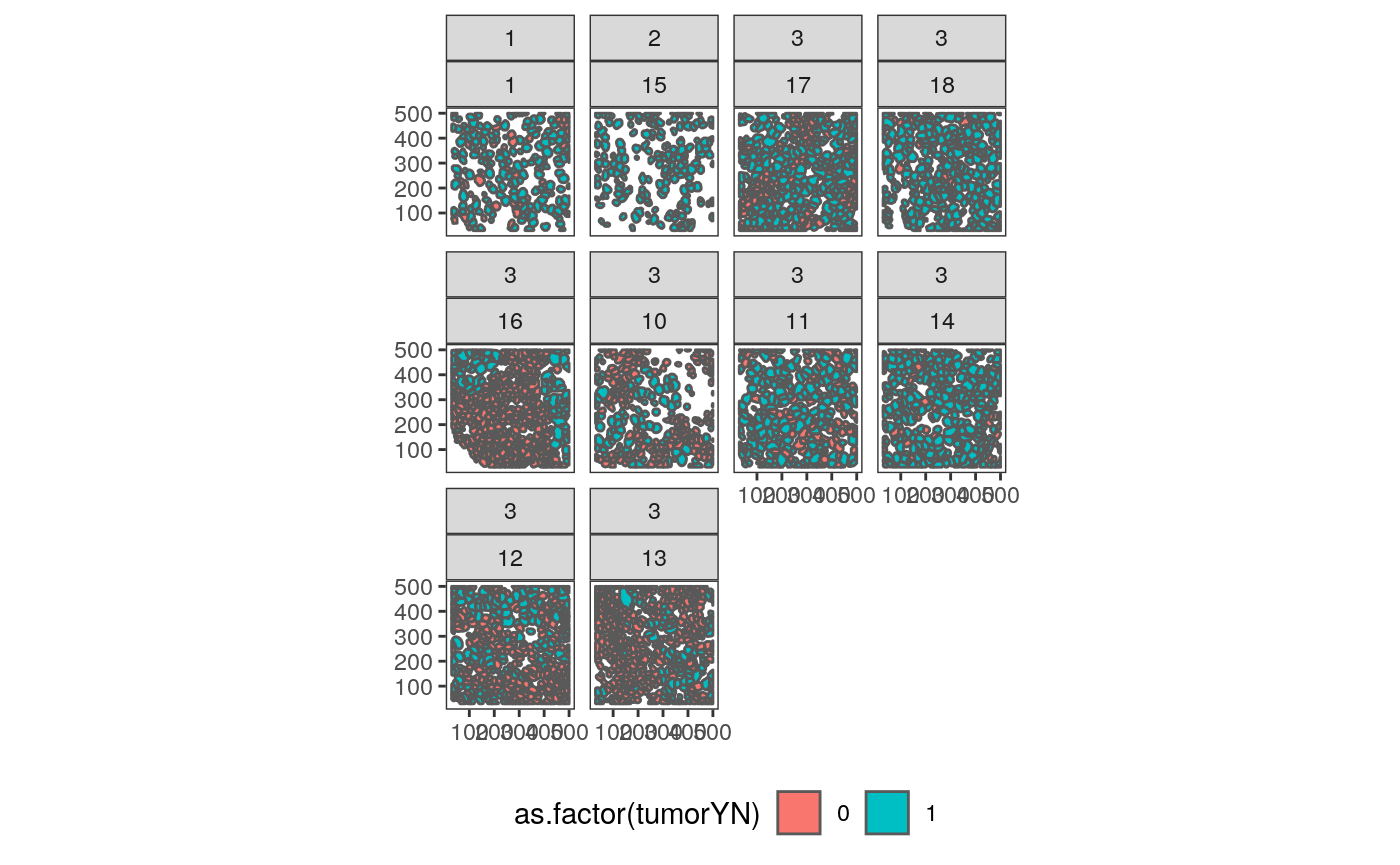
It is somewhat surprising that samples 10 and 12 are placed close to one another, since 10 has lots of empty space. However, the first three samples do seem qualitatively similar. In fact, we can compare many of the spatial images, based on the ordering we just defined.
cluster_props_wide <- cluster_props %>%
  dcast(SampleID ~ cluster, value.var = "prop", fill = 0)

 sample_order <- cluster_props_wide %>%
  dist() %>%
  hclust()
sample_order <- sample_order$order

polys_df <- polys_df %>%
  mutate(SampleID = factor(SampleID, levels = as.character(cluster_props_wide$SampleID[sample_order])))

ggplot(polys_df %>% filter(SampleID %in% levels(polys_df$SampleID)[1:12])) +
  geom_sf(aes(fill = as.factor(tumorYN))) +
  facet_wrap(GRADE ~ SampleID) +
  theme(legend.position = "bottom")
tmp <- cluster_props %>%
  left_join(
    col_df %>%
      dplyr::select(SampleID, GRADE) %>%
      unique()
  )

ggplot(tmp) +
  geom_dotplot(
    aes(fill = as.factor(GRADE), x = prop)
  ) +
  facet_wrap(~ cluster)
Guessing the Embedding
We’ll finally load the cytof data to identify shared features. Then, we’ll look at the relationship between those features and the above embeddings, to see if we could map the cytof data into the mibitof embedding space.
load(file.path(data_dir, "masstagSCE.rda"))
masstag <- data_list("sce")
common_proteins <- intersect(rownames(masstag$tcell.sce), rownames(mibi_sce))
I’ll learn a mapping at the cell level, using (1) cell identity and (2) levels of CD68, CD20, CD11b, CD4, CD16, CD163, CD3, CD11c, CD45 to identify the corresponding location in the embedding space. If this is accurate, we could then cluster the imputed cell embeddings, to come up with a new spatial summary of the mass spec data. Otherwise, we would report that the protein information on its own is not enough to determine the spatial characteristics of the sample.
This prepares the training data, which maps protein values and cell type indicators to embedding locations.
predictors <- x %>%
  left_join(
    y %>%
    dplyr::select(-starts_with("graph")) %>%
    rename_all(tolower),
    by = "sample_by_cell"
  )

response <- embeddings_df %>%
  dplyr::select(l1, l2) %>%
  as.matrix()

pred_mat <- predictors %>%
  dplyr::select(all_of(common_proteins)) %>%
  as.matrix()

model <- generate_model(ncol(pred_mat))
model %>%
  fit(pred_mat, response, epochs=200, batch_size=1024)
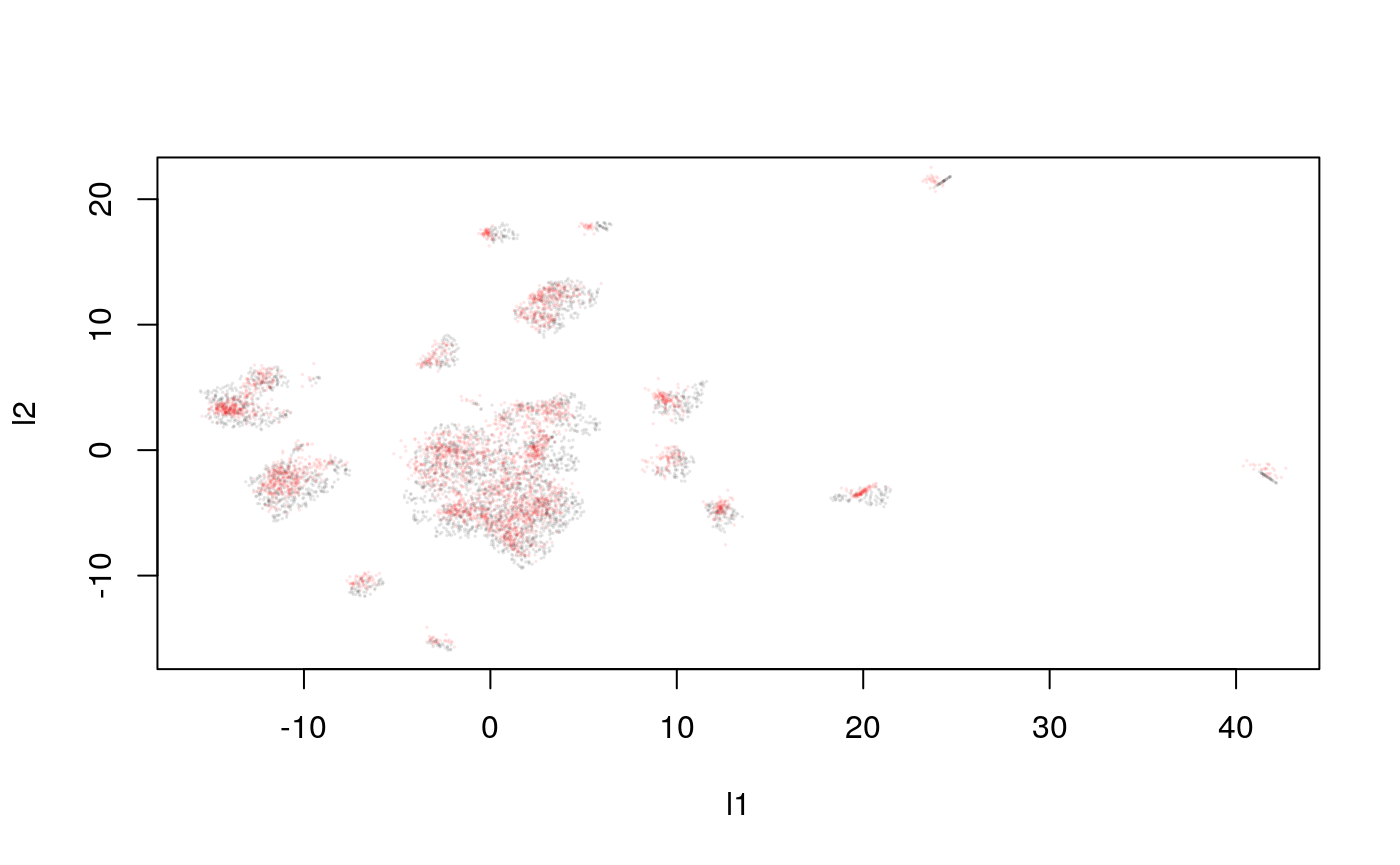
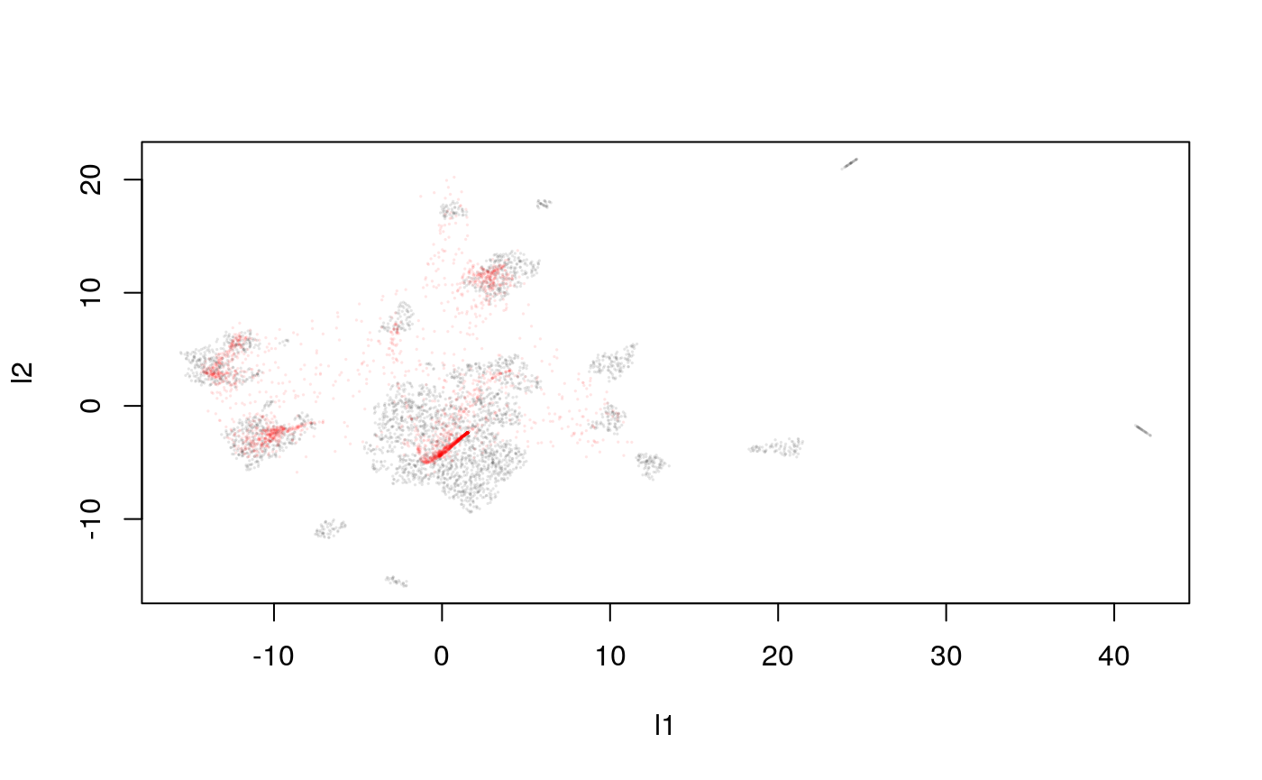
Let’s study teh quality of the trained approximator.
y_hat <- predict(model, pred_mat)
plot(response, cex=0.1, col = rgb(0, 0, 0, 0.1))
points(y_hat, cex=0.1, col = rgb(1, 0, 0, 0.1))
What happens when we summarize these samples by these predicted cluster memberships? Ideally, you would be able to recognize the original cluster compositions, which should reflect spatial expression patterns (if they don’t already). In the worst case, the imputed cluster compositions would be totally unrelated to the real (known, for the MIBI-ToF data) compositions.
We can compare this with what the predictions would have been if we had used all the proteins (but no explicit spatial information).
pred_mat <- predictors %>%
  dplyr::select(-sample_by_cell) %>%
  as.matrix()

model <- generate_model(ncol(pred_mat))
model %>%
  fit(pred_mat, response, epochs=200, batch_size=1024)
y_hat <- predict(model, pred_mat)
plot(response, cex=0.1, col = rgb(0, 0, 0, 0.1))
points(y_hat, cex=0.1, col = rgb(1, 0, 0, 0.1))