Reading, Recording, Rmarkdown, Observable
The choice of encodings can have a strong effect on (1) the types of comparisons that a visualization suggests and (2) the accuracy of the conclusions that readers leave with. With this in mind, it’s in our best interest to build a rich vocabulary of potential visual encodings. The more kinds of marks and encodings that are at your fingertips, the better your chances are that you’ll arrive at a configuration that helps you achieve your purpose.
So, let’s look at a few different types of marks and encodings in both ggplot2 and vega-lite. Before we get started, let’s load up the libraries that will be used in these notes.
Point Marks
Let’s read in the gapminder dataset that we used in the introduction to vega-lite.
Point marks can encode data fields using their \(x\) and \(y\) positions, color, size, and shape. Below, each mark is a country, and we’re using shape and the \(y\) position to distinguish between country clusters.
ggplot(gap2000) +
  geom_point(aes(x = fertility, y = cluster, shape = cluster))
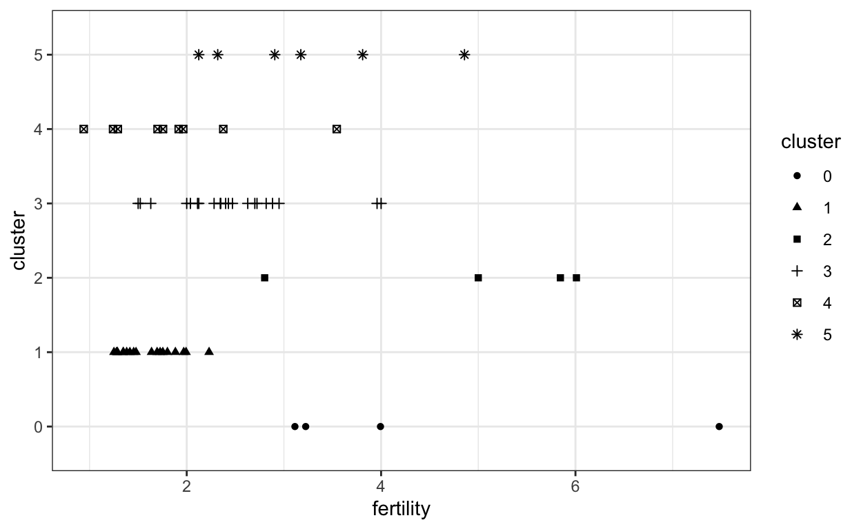
Aside from some small differences in the syntax and styling, the result is almost identical in vega-lite.
vl.markPoint()
  .data(data2000)
  .encode(
    vl.x().fieldQ('fertility'),
    vl.y().fieldN('cluster'),
    vl.shape().fieldN('cluster')
  )
.render()robservable("@krisrs1128/vocabulary-of-marks", include = 5, height = 170)
We can specify different types of shapes using the “shape” parameter outside of the aes encoding.
ggplot(gap2000) +
  geom_point(aes(x = fertility, y = cluster), shape = 15)
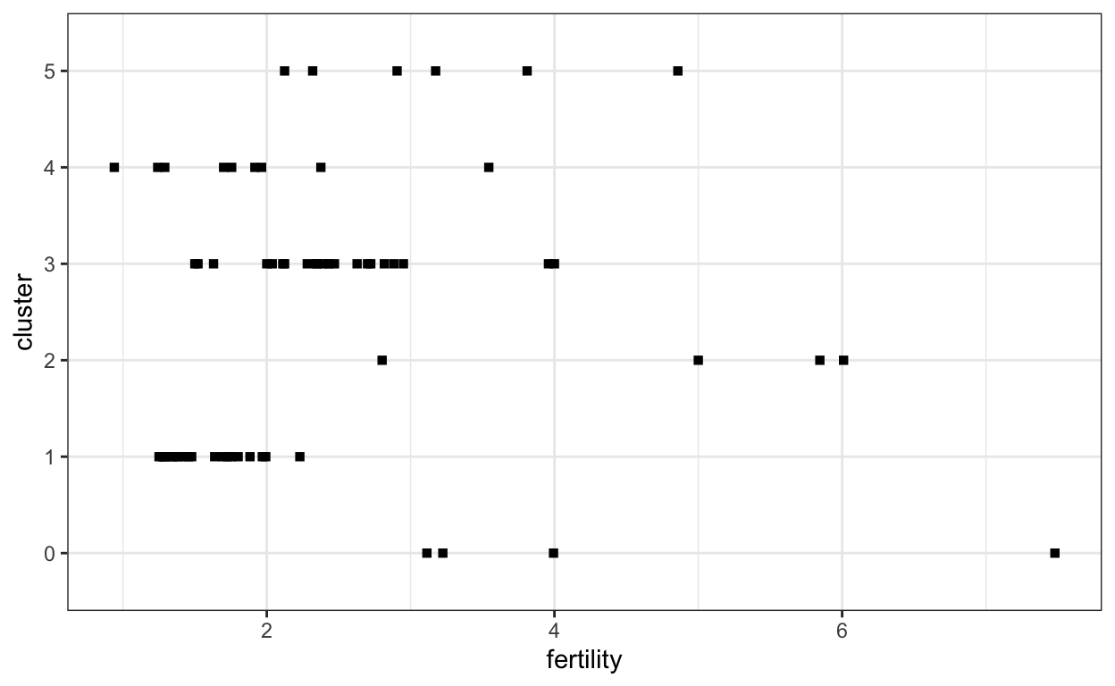
For the equivalent in vega-lite, use markSquare,
vl.markSquare({size: 100})
  .data(data2000)
  .encode(
    vl.x().fieldQ('fertility'),
    vl.y().fieldN('cluster')
  )
.render()robservable("@krisrs1128/vocabulary-of-marks", include = 6, height = 170)
Bar Marks
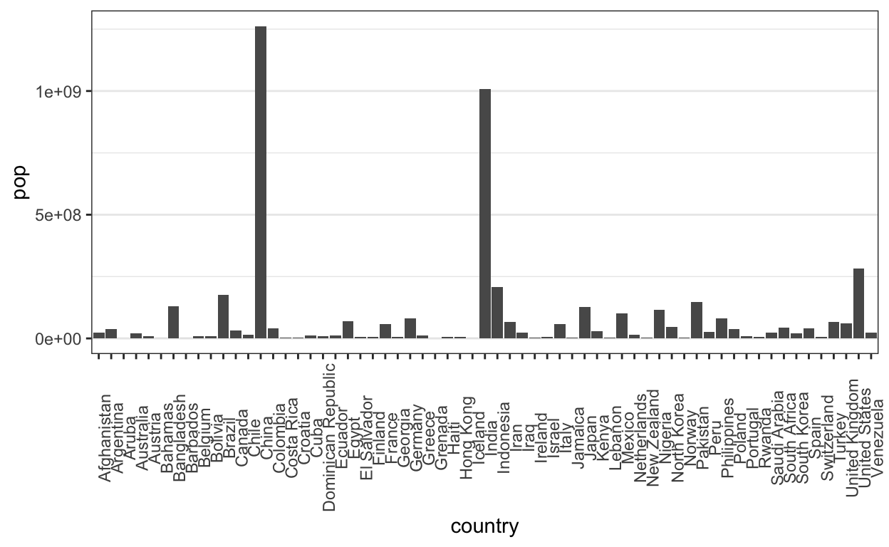
Bar marks let us associate a continuous field with a nominal one.
ggplot(gap2000) +
  geom_bar(aes(x = country, y = pop), stat = "identity") +
  theme(
    axis.text.x = element_text(angle = 90),
    panel.grid.major.x = element_blank()
  )
vl.markBar()
  .data(data2000)
  .encode(
    vl.x().fieldN('country'),
    vl.y().fieldQ('pop')
  )
.render()robservable("@krisrs1128/vocabulary-of-marks", include = 7)
To make comparisons between countries with similar populations easier, we can order them by population (alphabetical ordering is not that meaningful). To compare clusters, we can color in the bars.
ggplot(gap2000) +
  geom_bar(
    aes(x = reorder(country, -pop, mean), y = pop, fill = cluster),
    stat = "identity"
  ) +
  scale_fill_brewer(palette = "Set2") +
  scale_y_continuous(expand = c(0, 0, .1, .1)) +
  theme(
    axis.text.x = element_text(angle = 90, hjust = 1, vjust = 0.2, size = 8), # more readable axes
    panel.grid.major.x = element_blank()
  )
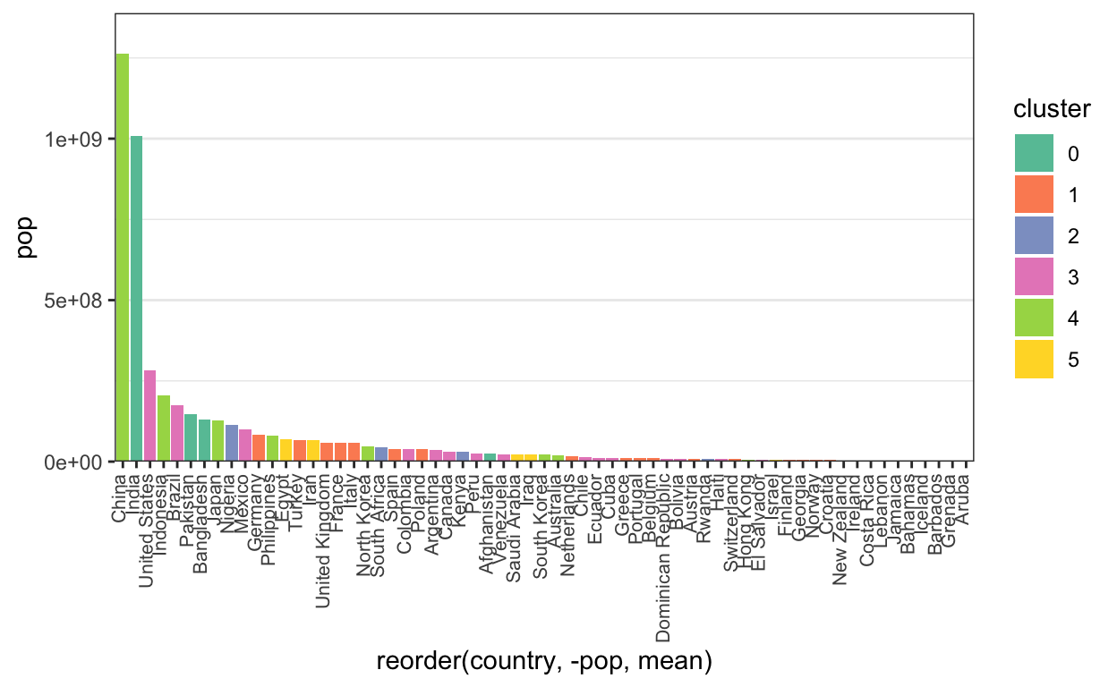
Here is the same plot in vega-lite.
vl.markBar()
  .data(data2000)
  .encode(
    vl.x().fieldN('country').sort("-y"),
    vl.y().fieldQ('pop'),
    vl.color().field("cluster").scale({"scheme": "set2"})
  )
  .width(500)
.render()robservable("@krisrs1128/vocabulary-of-marks", include = 8)
In the plot above, each bar is anchored at 0. Instead, we could have each bar encode two continuous values, a top and bottom. To illustrate, let’s compare the minimum and maximimum life expectancies within each country cluster.
vega-lite lets you compute summary statistics within the encoding step (see below). For ggplot2, we’ll need to create a new data.frame with just the summary information. For this, we group_by each cluster, so that a summarise call finds the minimum and maximum life expectancies restricted to each cluster.
# find summary statistics
life_ranges <- gap2000 %>%
  group_by(cluster) %>%
  summarise(
    min_life = min(life_expect),
    max_life = max(life_expect)
  )

# look at a few rows
head(life_ranges)
# A tibble: 6 x 3
  cluster min_life max_life
  <fct>      <dbl>    <dbl>
1 0           42.1     63.6
2 1           70.5     80.6
3 2           43.4     53.4
4 3           58.1     79.8
5 4           66.7     82
6 5           57.0     79.7
# plot them
ggplot(life_ranges) +
geom_segment(
aes(x = min_life, xend = max_life, y = cluster, yend = cluster),
size = 4
) +
xlim(0, 85)
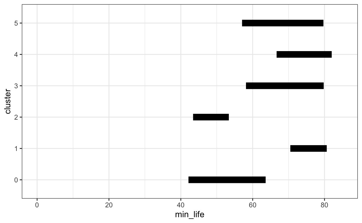
Notice here that we can just specify .min() and .max() within the encoding, rather than precomputing the summary statistics.
vl.markBar()
  .data(data2000)
  .encode(
    vl.x().min('life_expect'),
    vl.x2().max('life_expect'),
    vl.y().fieldN('cluster')
  )
.render()robservable("@krisrs1128/vocabulary-of-marks", include = 9, height = 170)
Line Marks
Line marks are useful for comparing changes. Our eyes naturally focus on rates of change when we see lines. Below, we’ll plot the fertility over time, colored in by country cluster.
ggplot(gapminder) +
  geom_line(
    aes(x = year, y = fertility, col = cluster, group = country),
      alpha = 0.7, size = 0.9
  ) +
  scale_color_brewer(palette = "Set2")
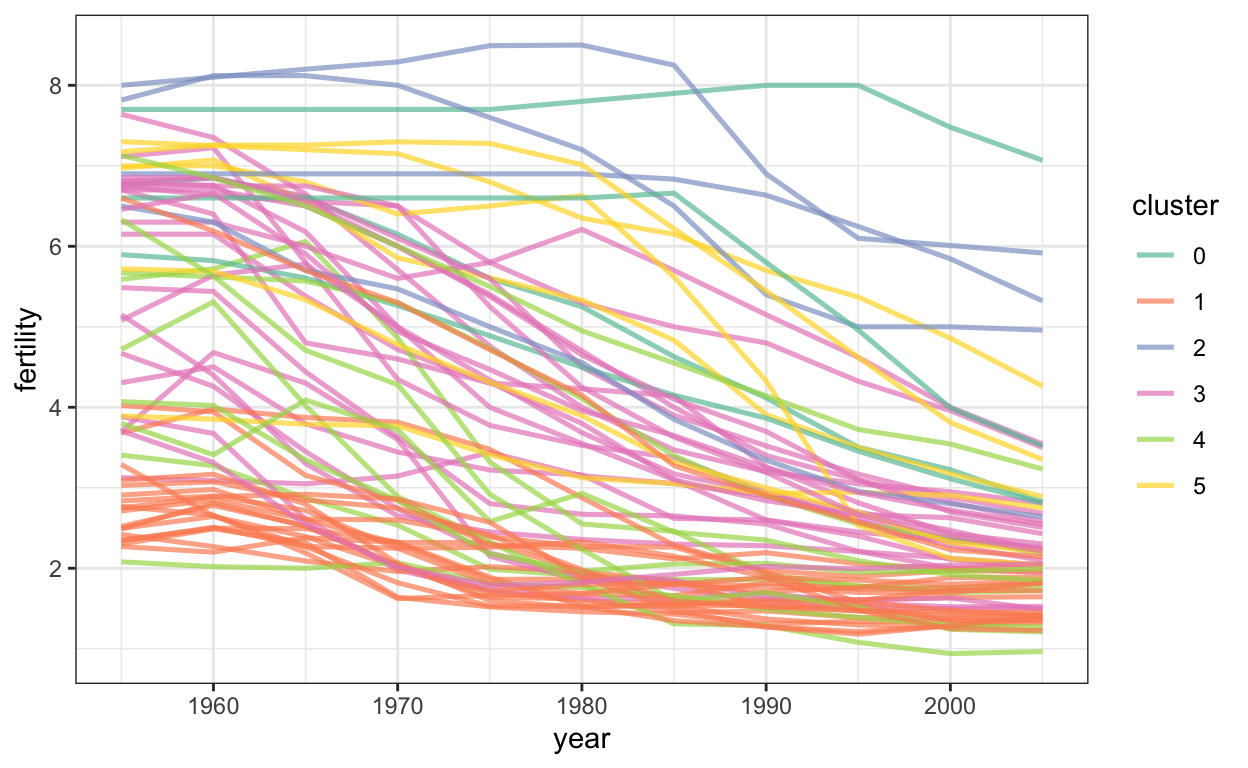
This is the equivalent code for vega-lite. You can get a country name by hovering over the lines.
vl.markLine({opacity: 0.7, size: 3})
  .data(data)
  .encode(
    vl.x().fieldO('year'),
    vl.y().fieldQ('fertility'),
    vl.color().fieldN('cluster').scale({"scheme": "set2"}),
    vl.detail().fieldN("country"),
    vl.tooltip().fieldN('country')
  )
  .width(500)
.render()robservable("@krisrs1128/vocabulary-of-marks", include = 10, height = 330)
Area Marks
Area marks have a flavor of both bar and line marks. The filled area supports absolute comparisons, while the changes in shape suggest derivatives.
population_sums <- gapminder %>%
  group_by(year, cluster) %>%
  summarise(total_pop = sum(pop))

head(population_sums)
# A tibble: 6 x 3
# Groups:   year [1]
   year cluster total_pop
  <dbl> <fct>       <dbl>
1  1955 0       495927174
2  1955 1       360609771
3  1955 2        60559800
4  1955 3       355392405
5  1955 4       854125031
6 1955 5 56064015ggplot(population_sums) +
geom_area(
aes(x = year, y = total_pop, fill = cluster)
) +
scale_fill_brewer(palette = "Set2") +
scale_y_continuous(expand = c(0, 0, .1, .1)) +
scale_x_continuous(expand = c(0, 0))
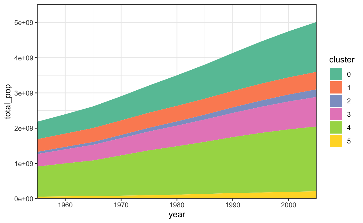
In the vega-lite version, we can add a tooltip that shows country names on mouseover. It’s not so clear where one country begins and another starts, though – it would be clearer if there were small lines demarcating the boundaries between countries.
vl.markArea()
  .data(data)
  .encode(
    vl.x().fieldO('year'),
    vl.y().sum('pop'),
    vl.color().fieldN('cluster').scale({"scheme": "set2"}),
    vl.detail().fieldN("country"),
    vl.tooltip().fieldN('country')
  )
  .width(600)
.render()robservable("@krisrs1128/vocabulary-of-marks", include = 11)
Just like in bar marks, we don’t necessarily need to anchor the \(y\)-axis at 0. For example, here the bottom and top of each area mark is given by the 30% and 70% quantiles of population within each country cluster.
population_ranges <- gapminder %>%
  group_by(year, cluster) %>%
  summarise(min_pop = quantile(pop, 0.3), max_pop = quantile(pop, 0.7))

head(population_ranges)
# A tibble: 6 x 4
# Groups:   year [1]
   year cluster   min_pop   max_pop
  <dbl> <fct>       <dbl>     <dbl>
1  1955 0       40880121. 83941368.
2  1955 1        4532940  25990229.
3  1955 2        6600426. 17377594.
4  1955 3        2221139   8671500
5  1955 4        9014491  61905422.
6 1955 5 3007625 12316126.ggplot(population_ranges) +
geom_ribbon(
aes(x = year, ymin = min_pop, ymax = max_pop, fill = cluster),
alpha = 0.8
) +
scale_fill_brewer(palette = "Set2") +
scale_y_continuous(expand = c(0, 0, .1, .1)) +
scale_x_continuous(expand = c(0, 0))
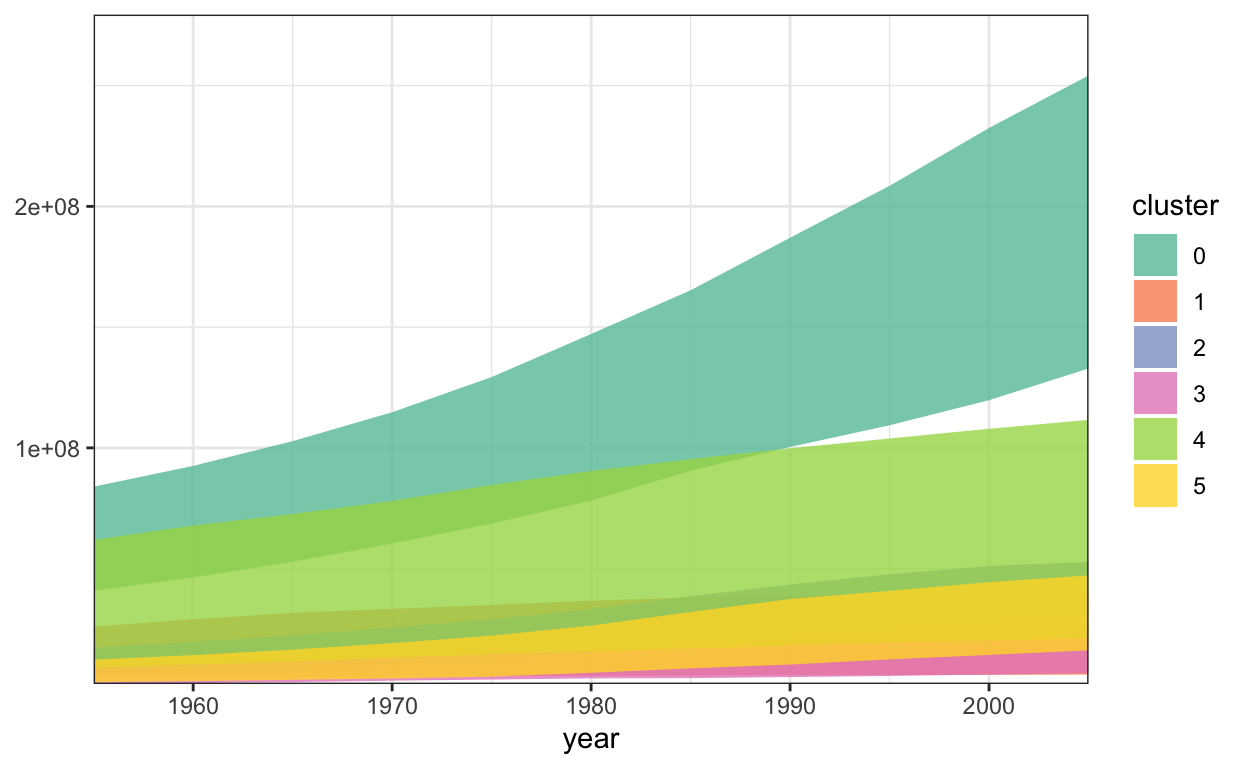
For these quantiles, we can’t use a built-in vega-lite summary functions, like the .min() and .max() from above. Instead, we need the javascript equivalent of dplyr’s group_by + summarise, which are called groupby and rollup.
population_ranges = data.groupby("year", "cluster")
  .rollup({ // equivalent of dplyr summarise
    pop_low: op.quantile("pop", 0.3),
    pop_high: op.quantile("pop", 0.7)
  })
These data can now be used to generate the equivalent vega-lite plot.
vl.markArea({"opacity": 0.7})
  .data(population_ranges)
  .encode(
    vl.x().fieldO('year'),
    vl.y().fieldQ('pop_low').title("Population"),
    vl.y2().fieldQ('pop_high'),
    vl.color().fieldN('cluster').scale({"scheme": "set2"})
  )
  .width(600)
.render()robservable("@krisrs1128/vocabulary-of-marks", include = 13)