Notes

A History of Data Visualization up to 1900
A look at the origins of the field.

Asking Better Questions
What is the purpose of data analysis?

Design Process Case Study
Tracing the refinement of questions and design.
Final Takeaways
Some major themes from STAT 479, in a nutshell.
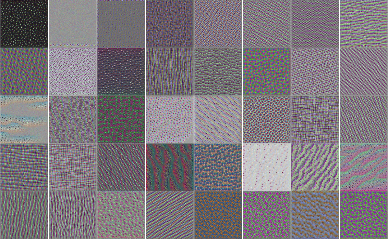
Optimizing Feature Maps
Interpreting neurons by finding optimal inputs
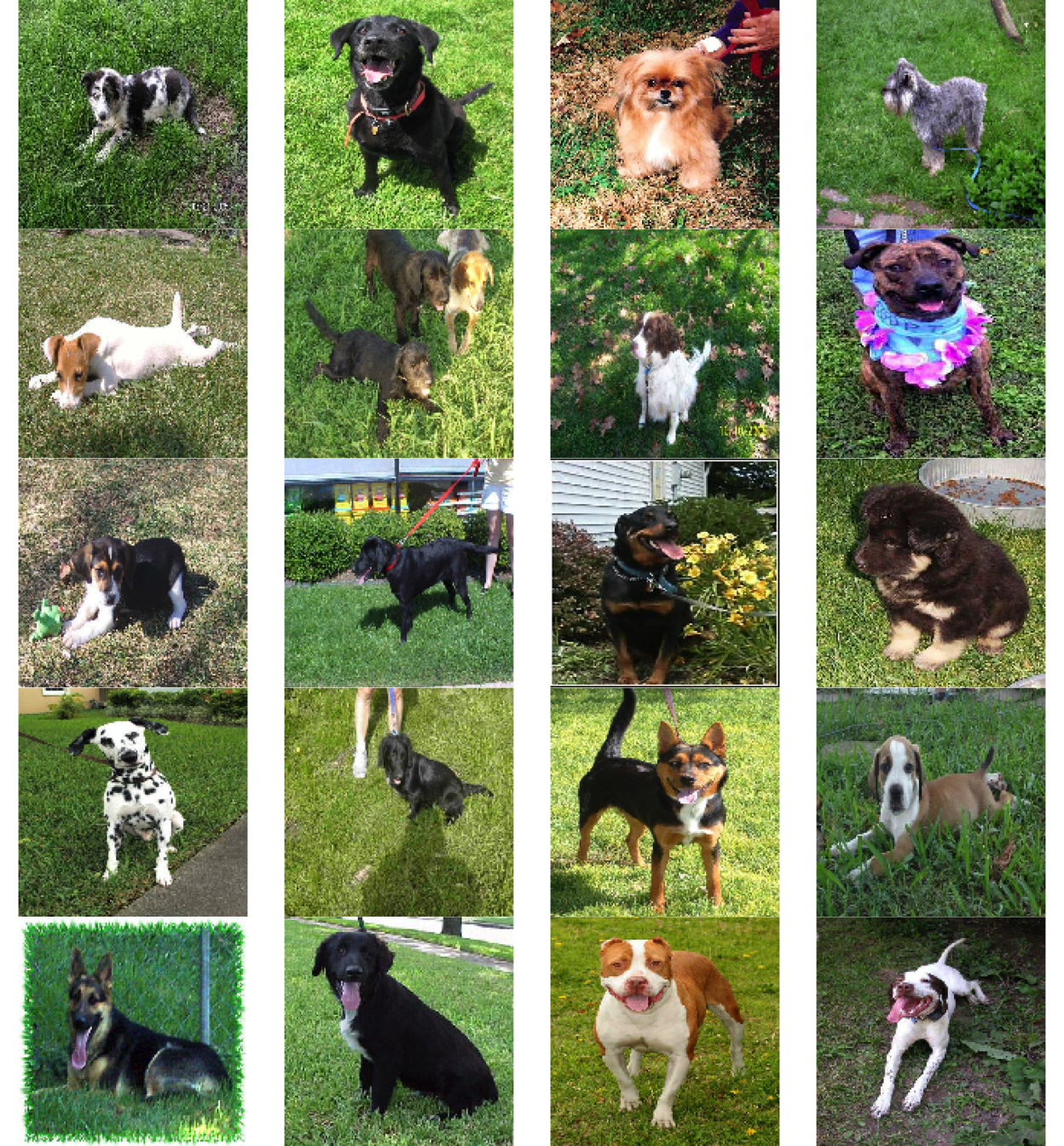
Collections of Features
Analyzing feature activations across datasets
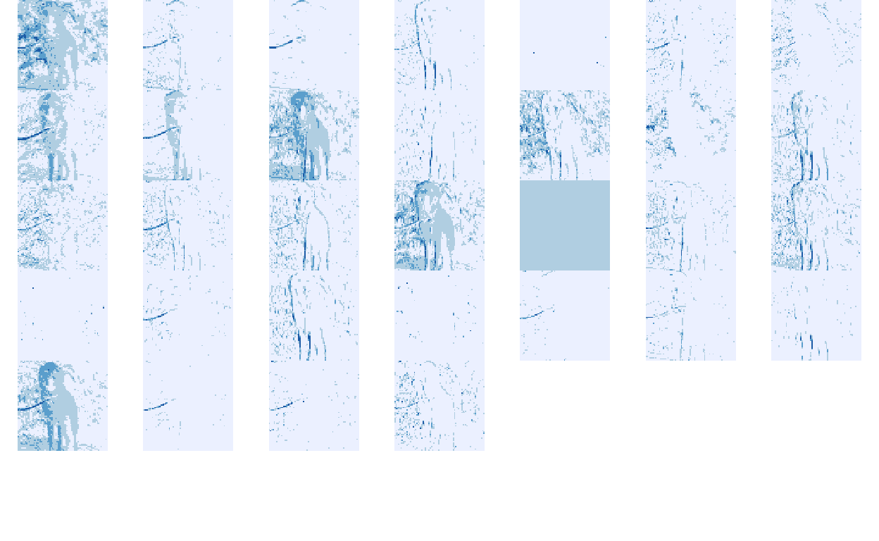
Visualizing Learned Features
A first look at activations in a deep learning model.

Introduction to Feature Learning
An introduction to compositional feature learning.
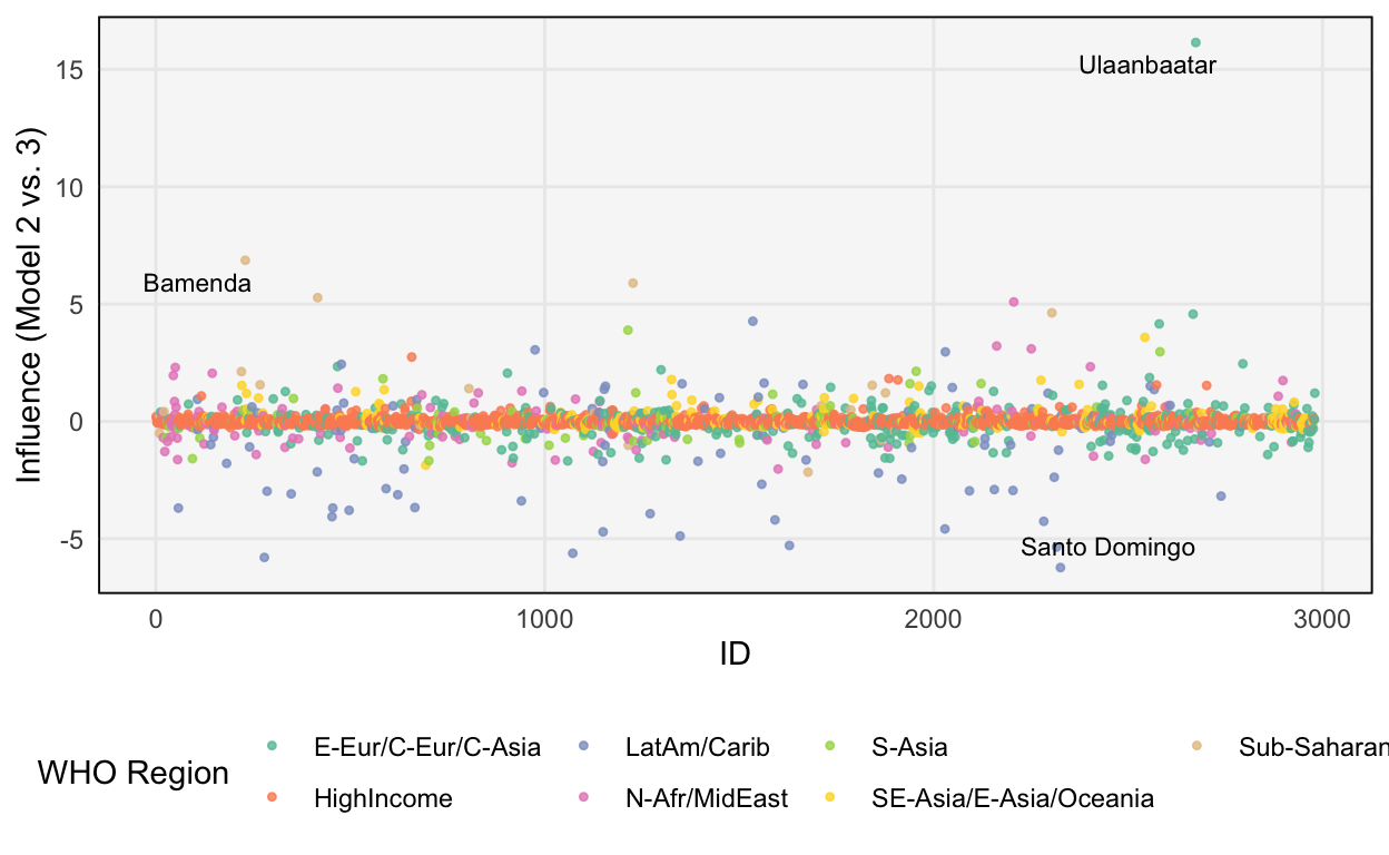
Pointwise Diagnostics
Evaluating the fit at particular observations in Bayesian models.
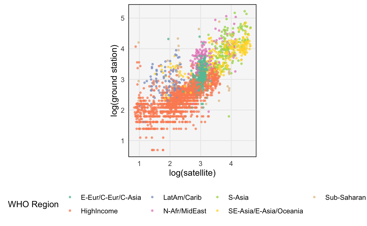
Prior and Posterior Predictives
Simulating data to evaluate model quality.
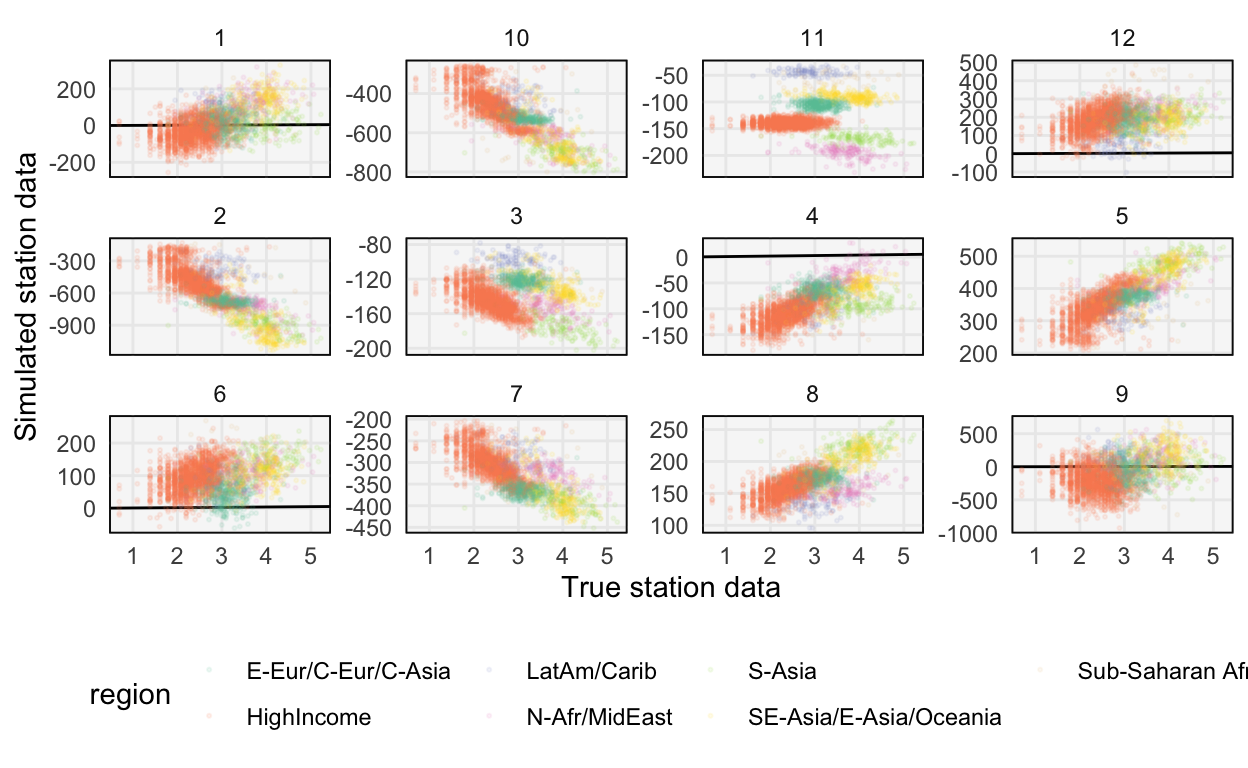
Visualization for Model Building
The relationship between exploratory analysis and model development.
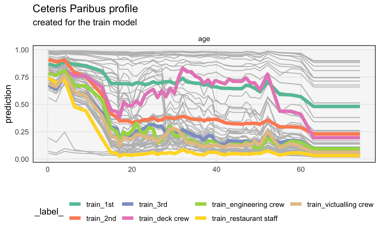
Partial Dependence Profiles II
Discovering richer structure in partial dependence profiles.

Partial Dependence Profiles I
An introduction to partial dependence profiles.
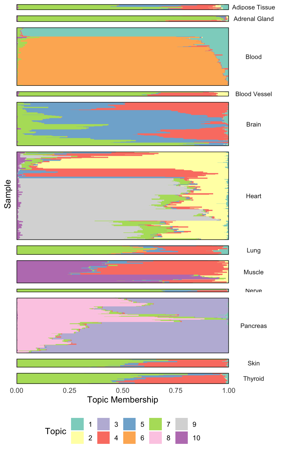
Topic Modeling Case Study
An application to a gene expression dataset.
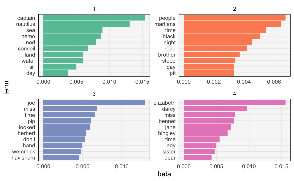
Visualizing Topic Models
Once we've fit a topic model, how should we inspect it?
Fitting Topic Models
Data preparation and model fitting code for topics.

Introduction to Topic Models
An overview of dimensionality reduction via topics.
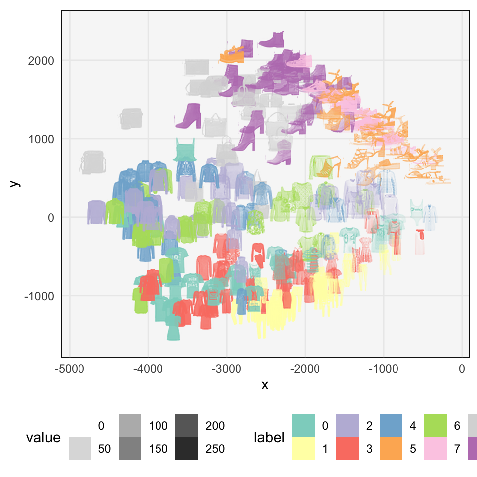
PCA and UMAP Examples
More examples of dimensionality reduction using PCA and UMAP.
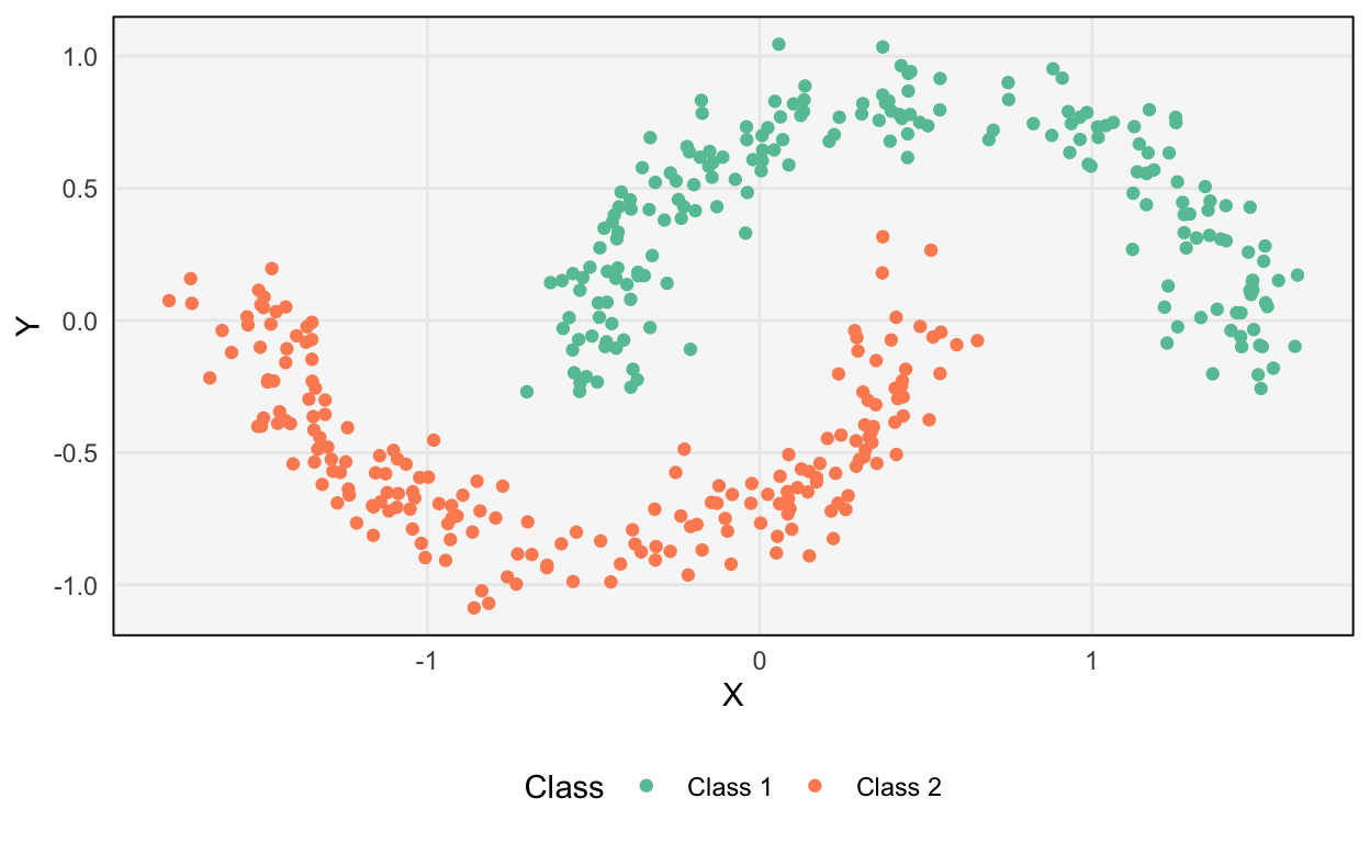
Uniform Manifold Approximation and Projection
An overview of the UMAP algorithm.
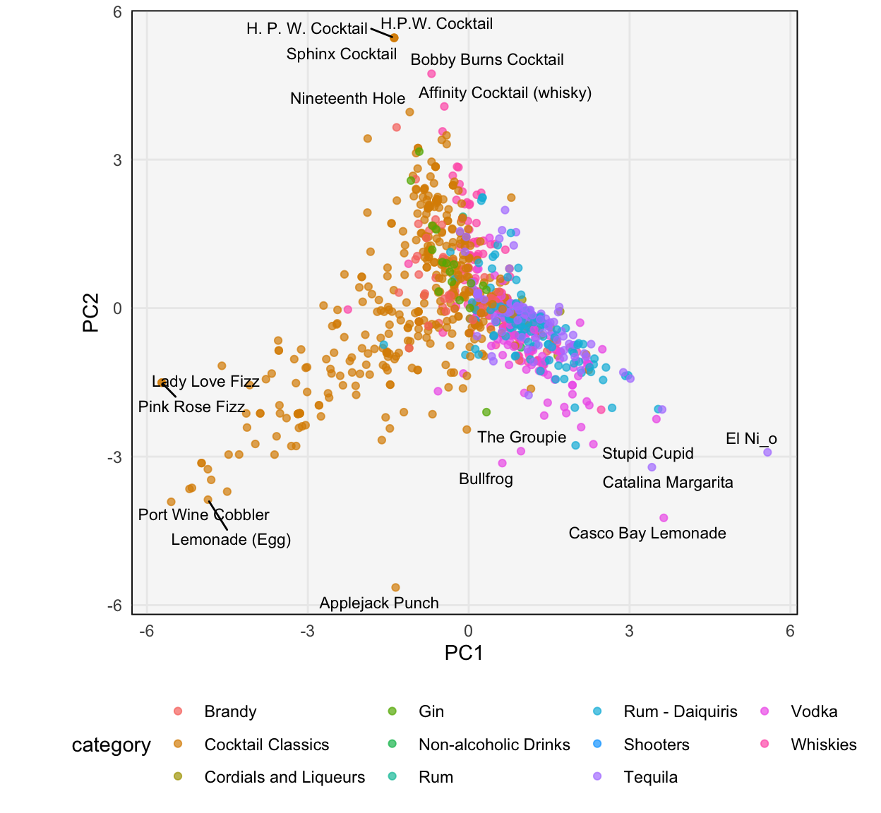
Principal Components Analysis II
Visualizing and interpreting PCA.

Principal Components Analysis I
Linear dimensionality reduction using PCA.
Introduction to Dimensionality Reduction
Examples of high-dimensional data.
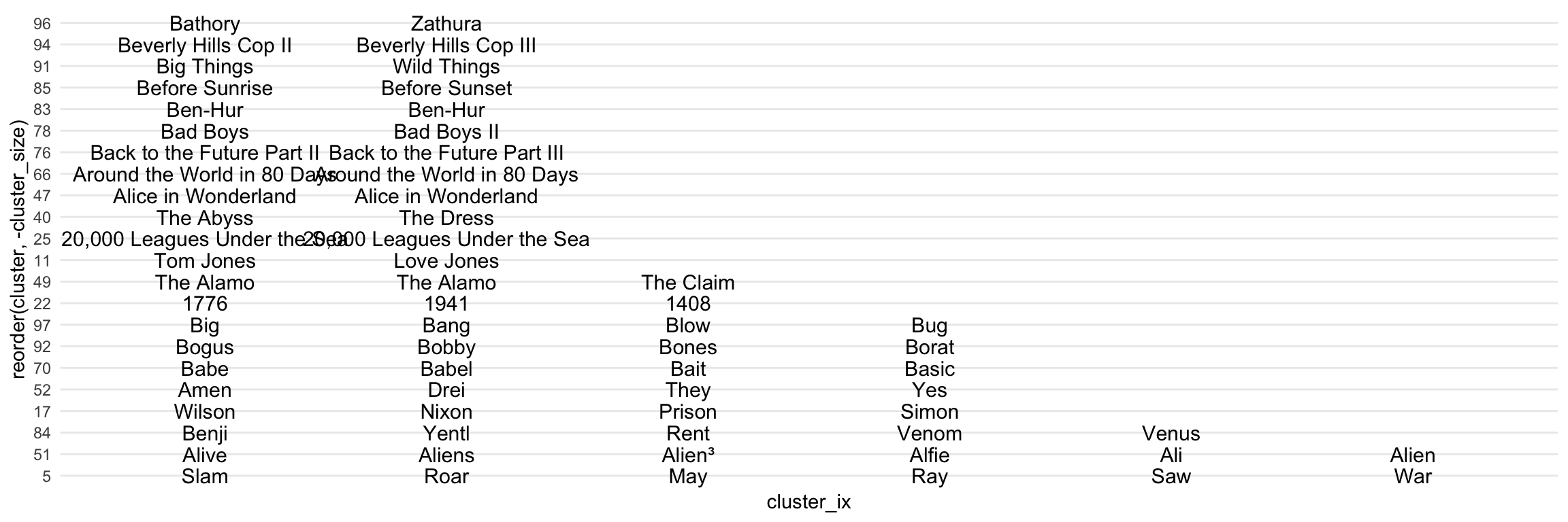
Cluster Stability
How reliable are the results of a clustering?
Silhouette Statistics
Diagnostics for the quality of a clustering.
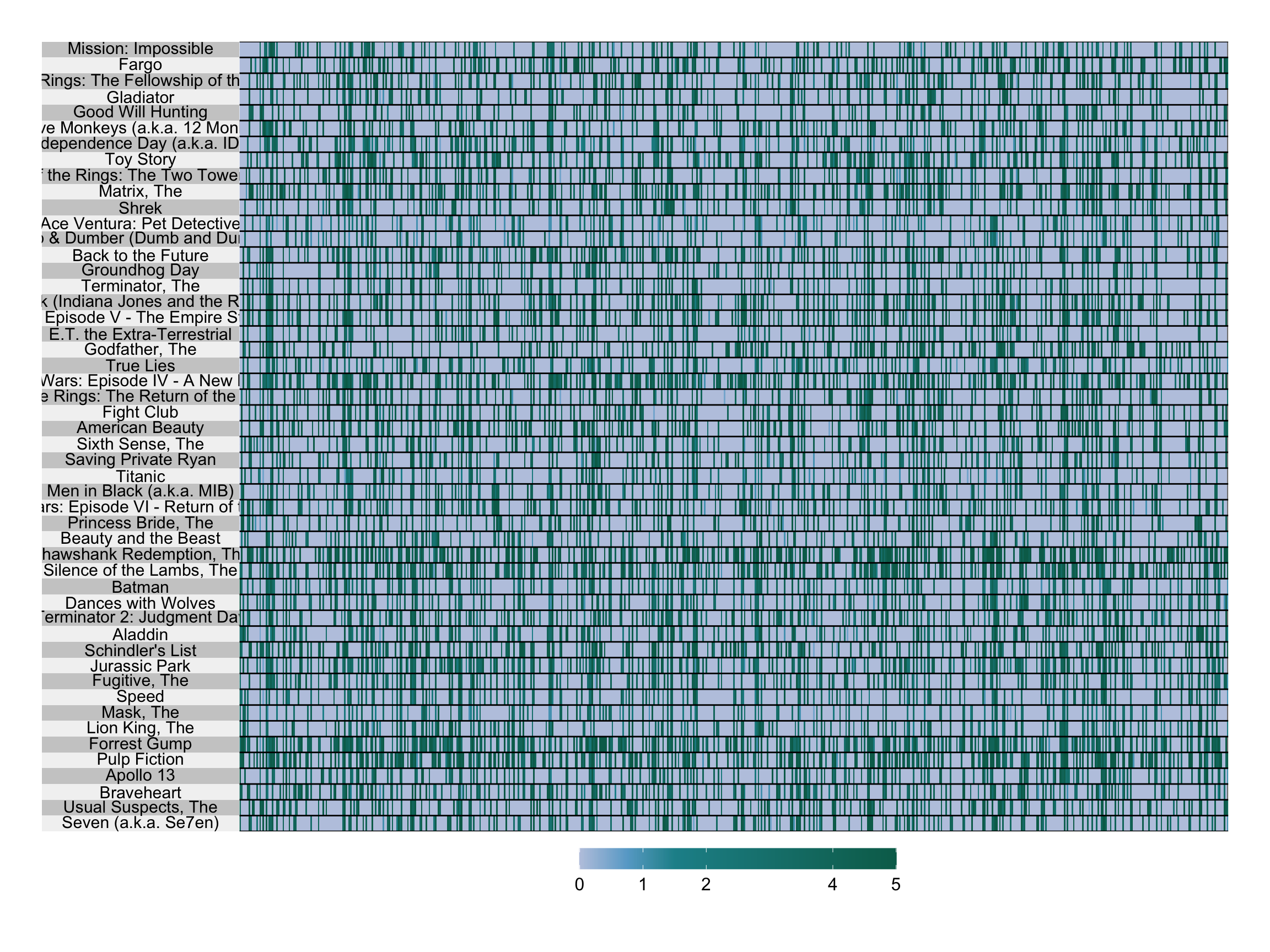
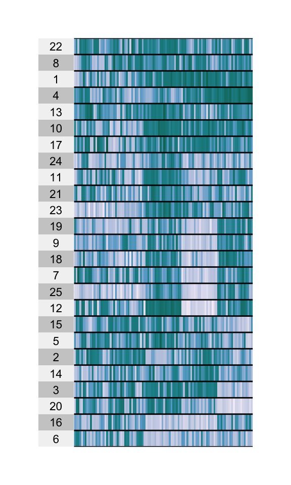
Heatmaps
Visualizing table values, ordered by clustering results.
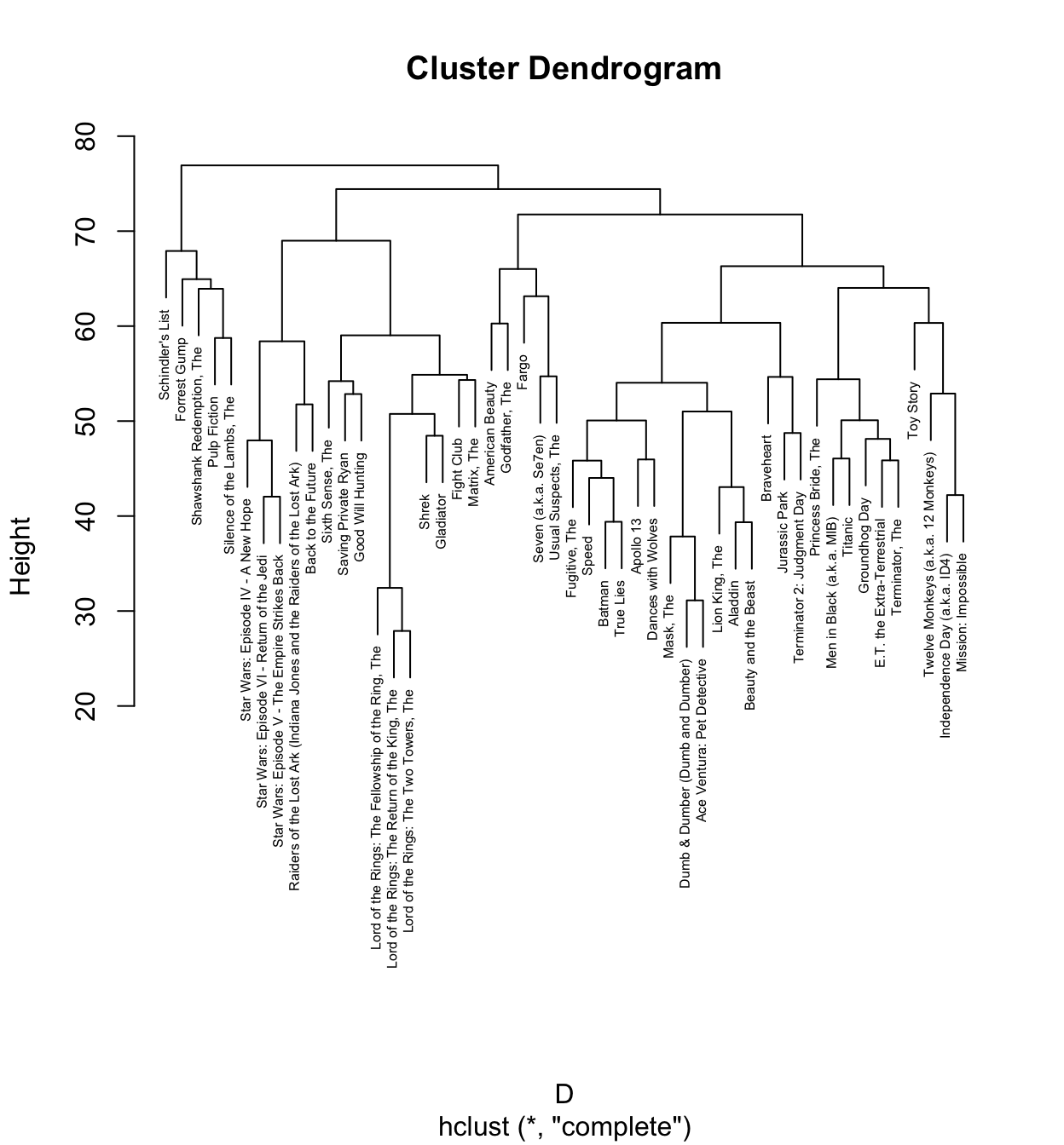
Hierarchical Clustering
Clustering data at multiple scales using trees.
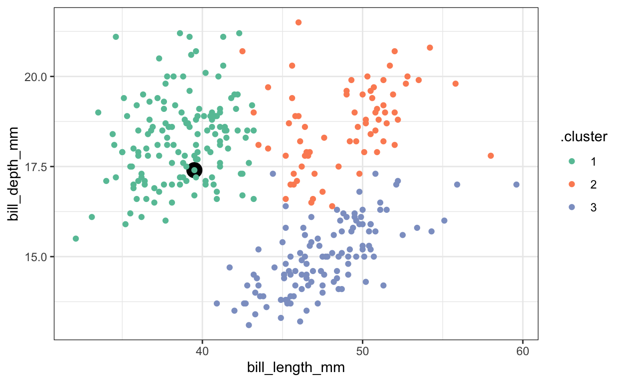
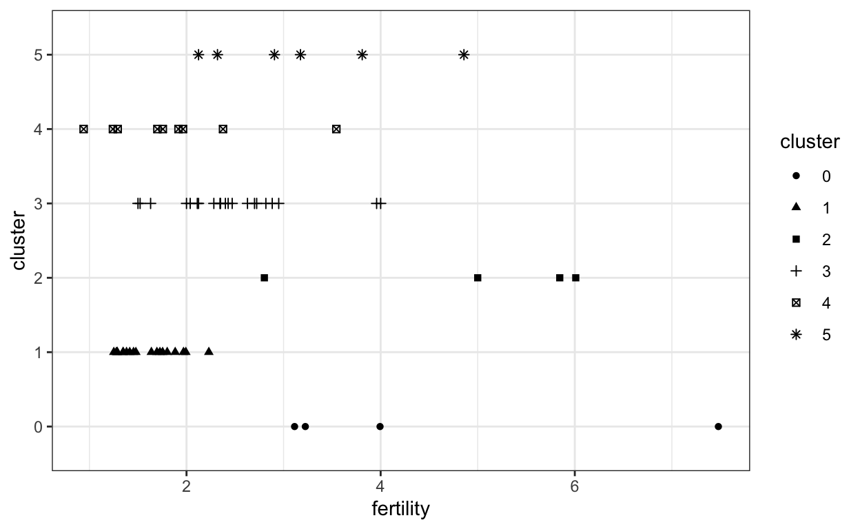
K-means
An introduction to clustering and how to manage its output.
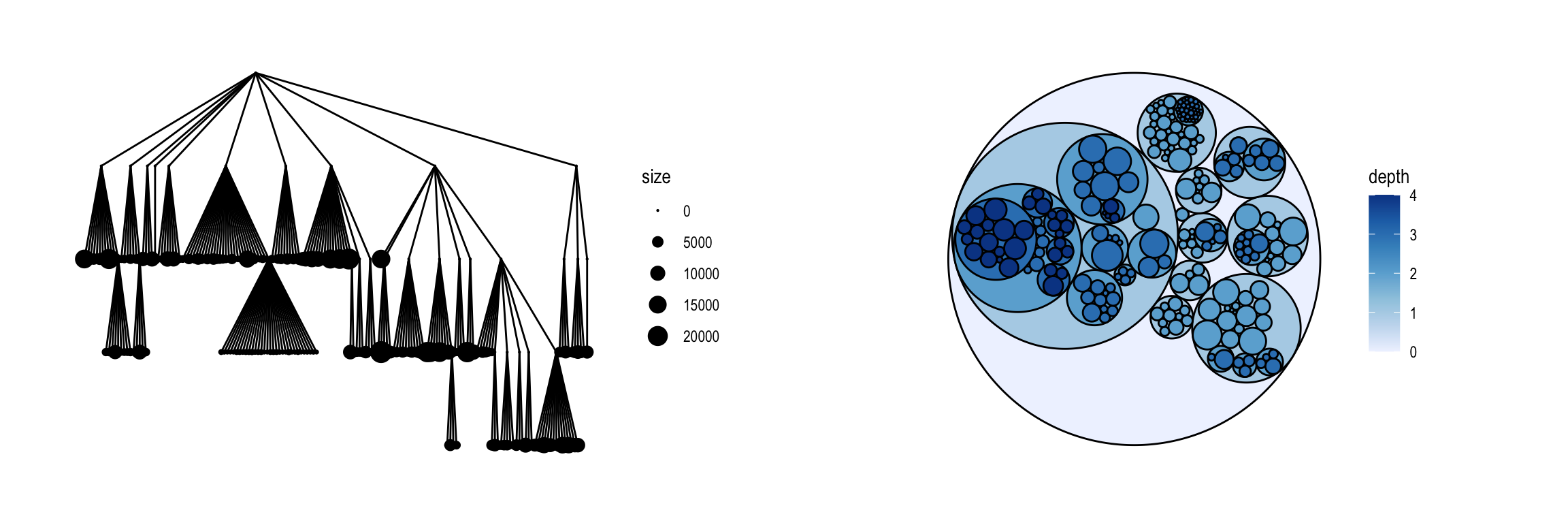
Enclosure
Visualization of hierarchical structure using containment.

Adjacency Matrix Views
A scalable network visualization strategy.
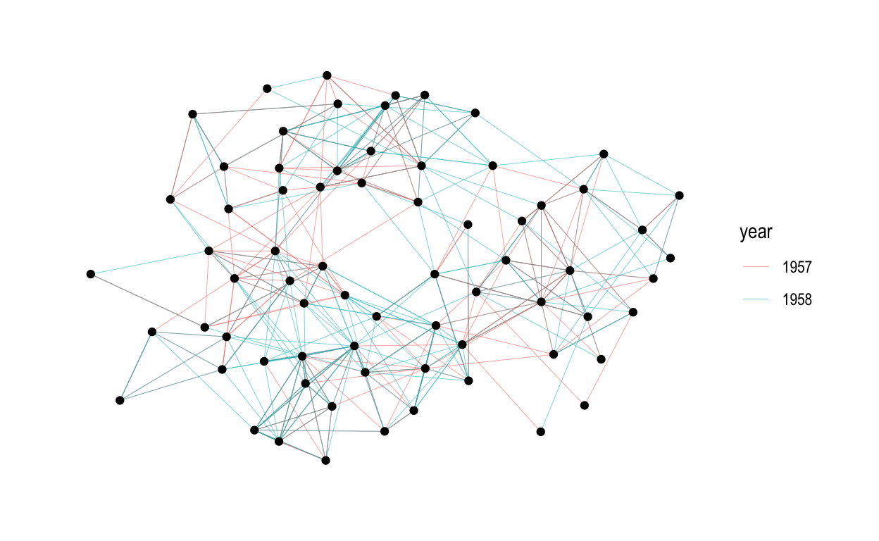
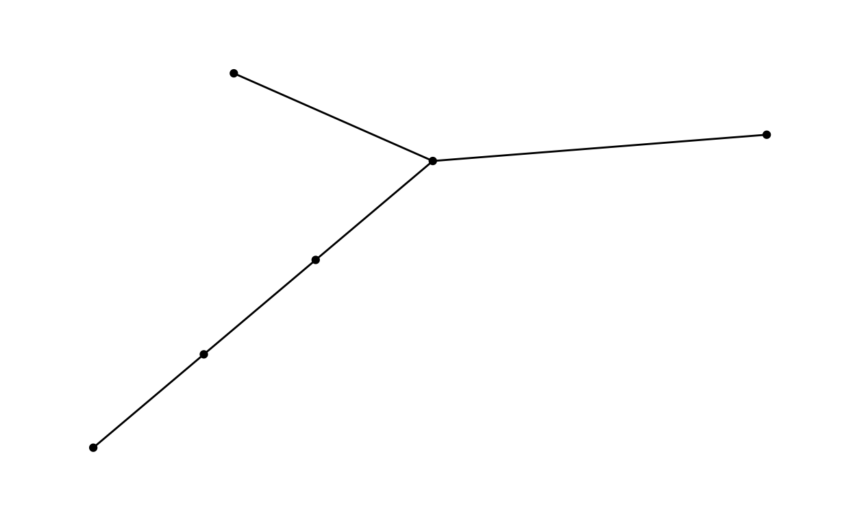
Node - Link Diagrams
The most common network visualization strategy.
Introduction to Networks and Trees
Typical tasks and example network datasets.
Spatial Data Interaction
Some strategies for interactively visualizing spatial data.
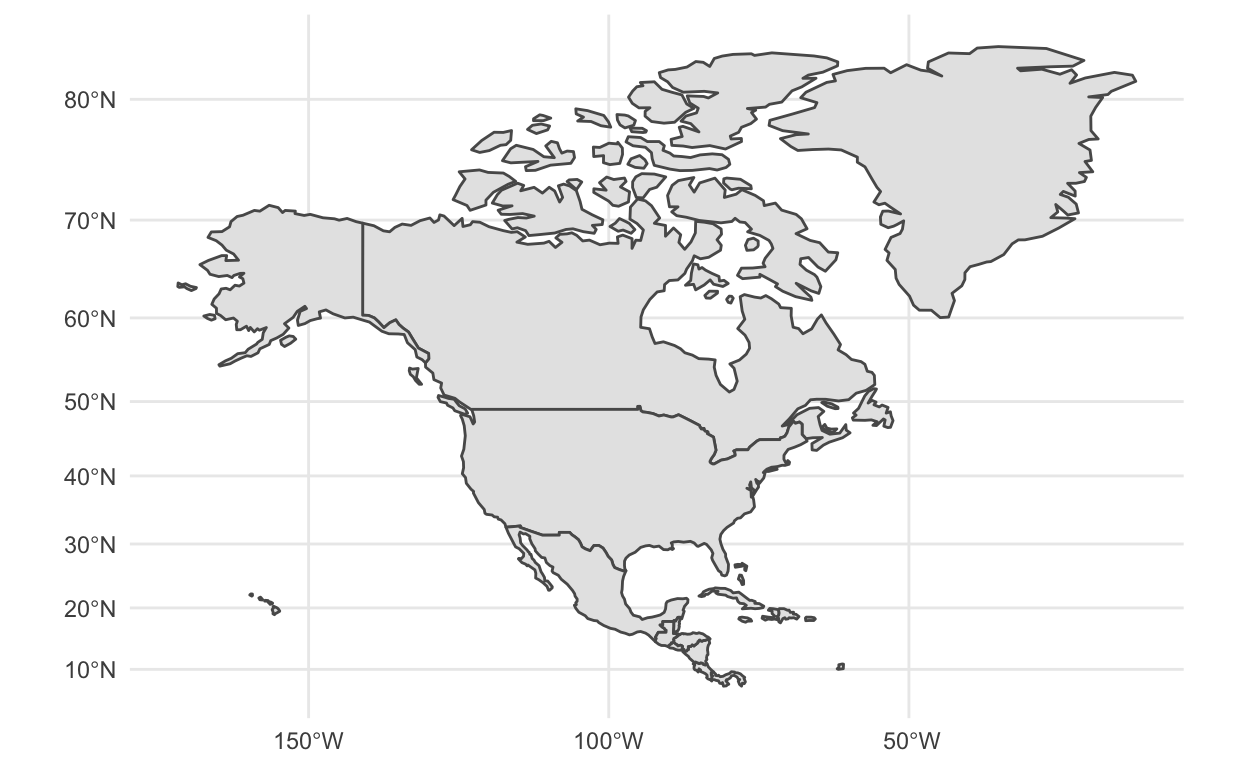
Coordinate Reference Systems
The projection problem, and how to check your CRS.
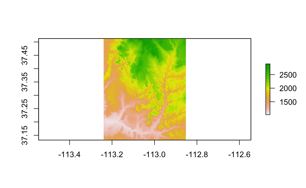
Raster Data
Storing spatially gridded information in rasters.
Vector Data
Manipulating and visualizing spatial vector data.
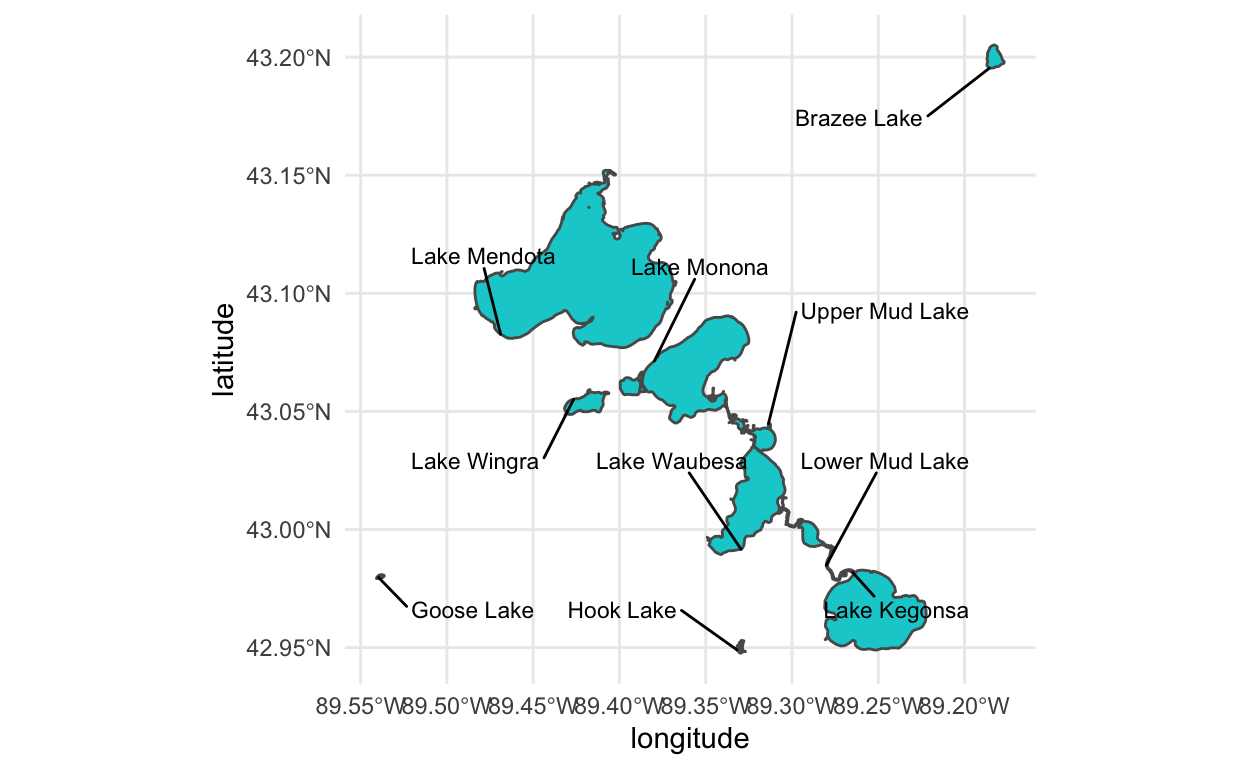
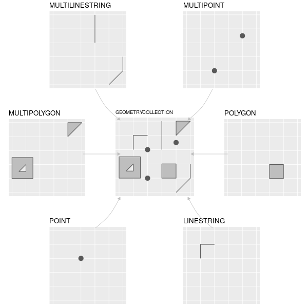
Spatial Data Formats
An overview of common formats, with illustrative examples.
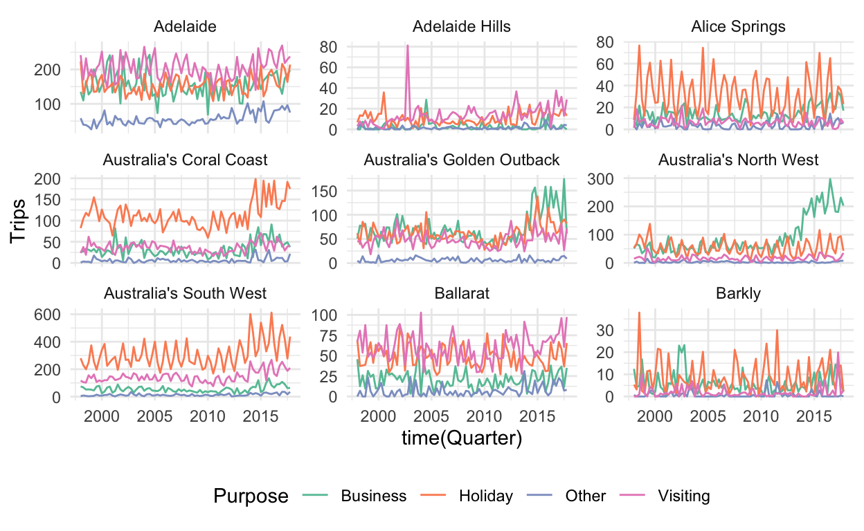
Collections of Time Series
Navigating across related time series.
Cross and Auto-Correlation
Summaries of relationships between and within time series.
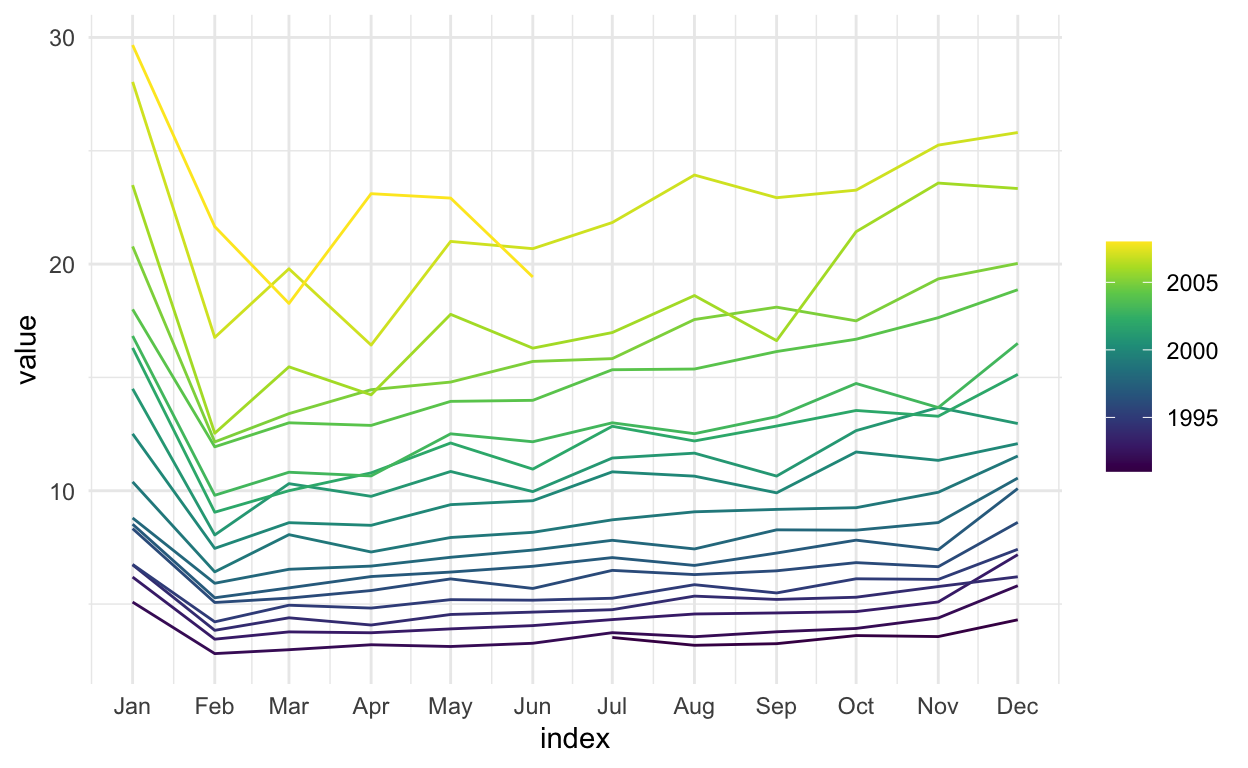
Seasonal Plots
Approaches for visualizing seasonality.
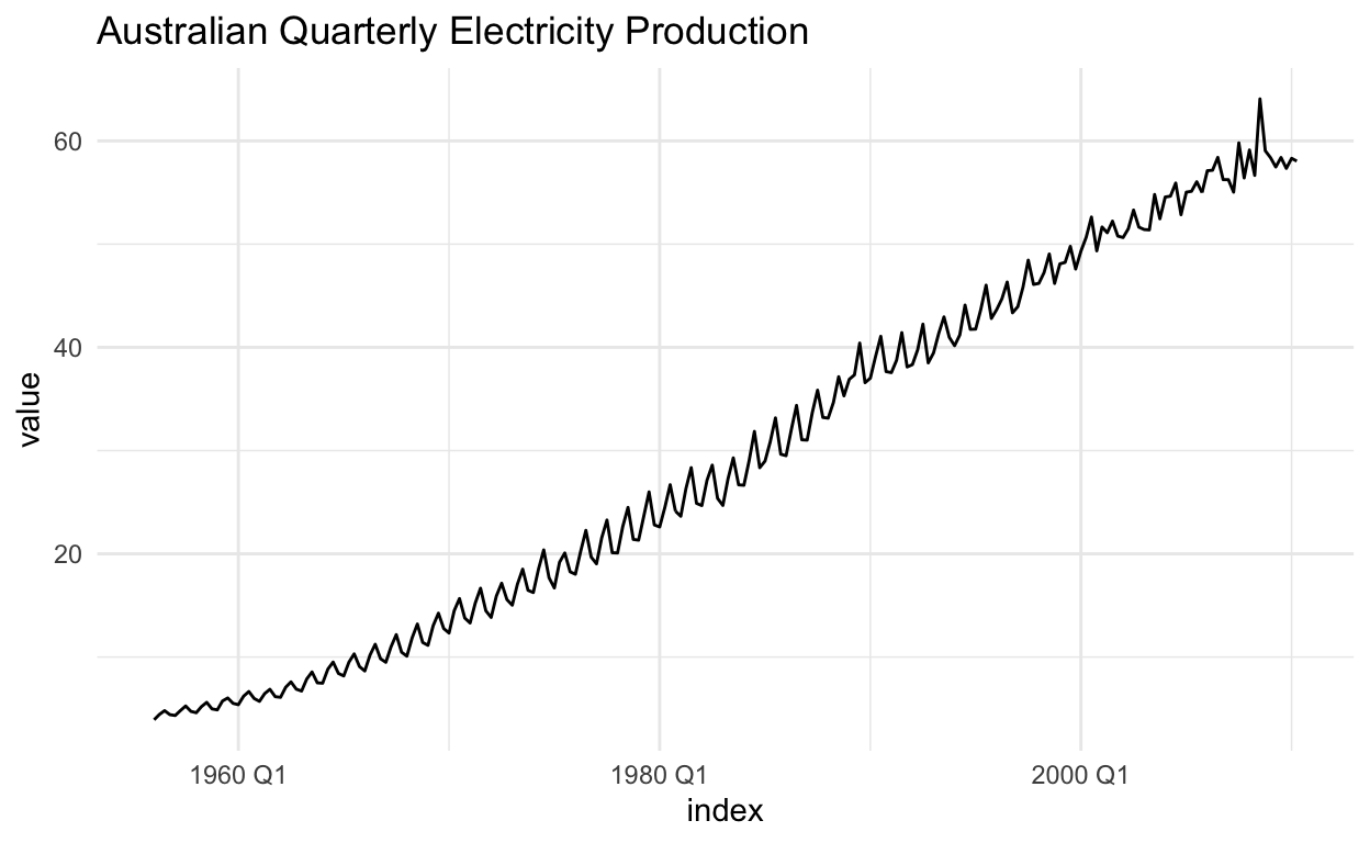
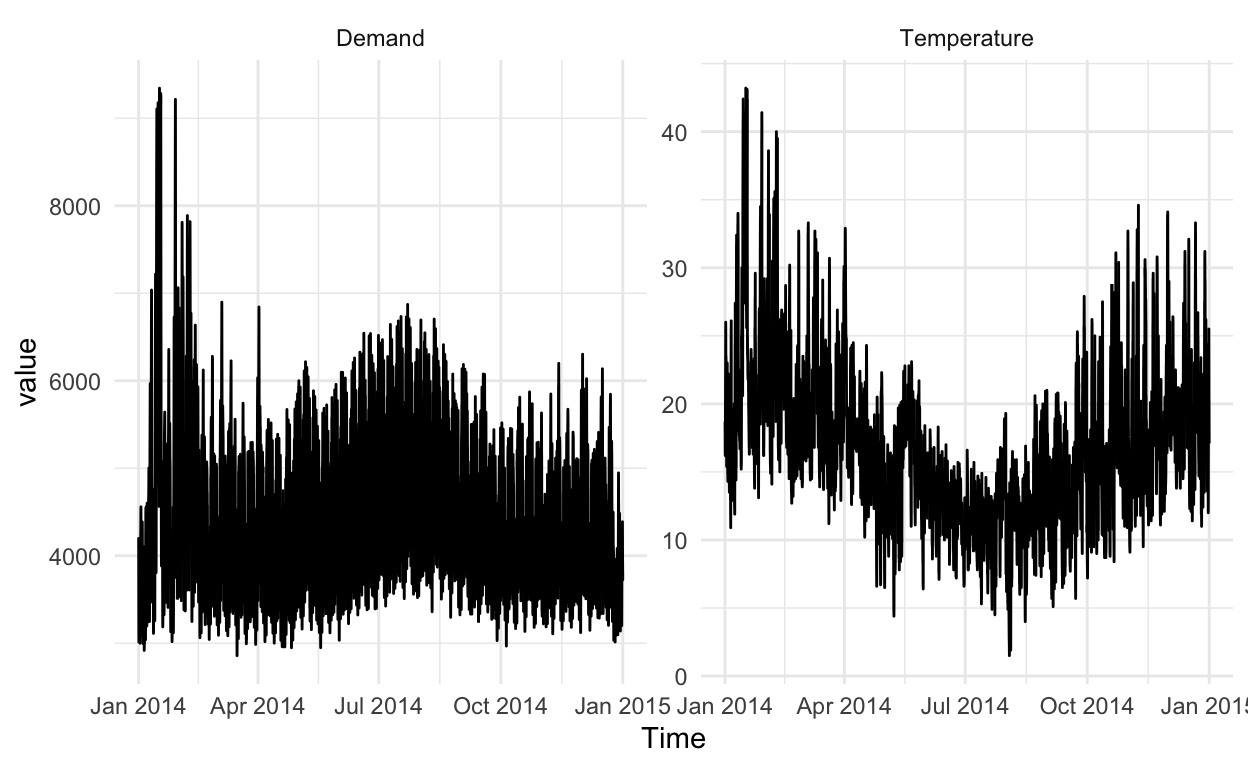
Time Series Patterns
Vocabulary for describing visual structure in time series.
tsibble Objects
A data structure for managing time series data.
Other Tricks from Profiler
A crash course on entity resolution, plus some other tips.
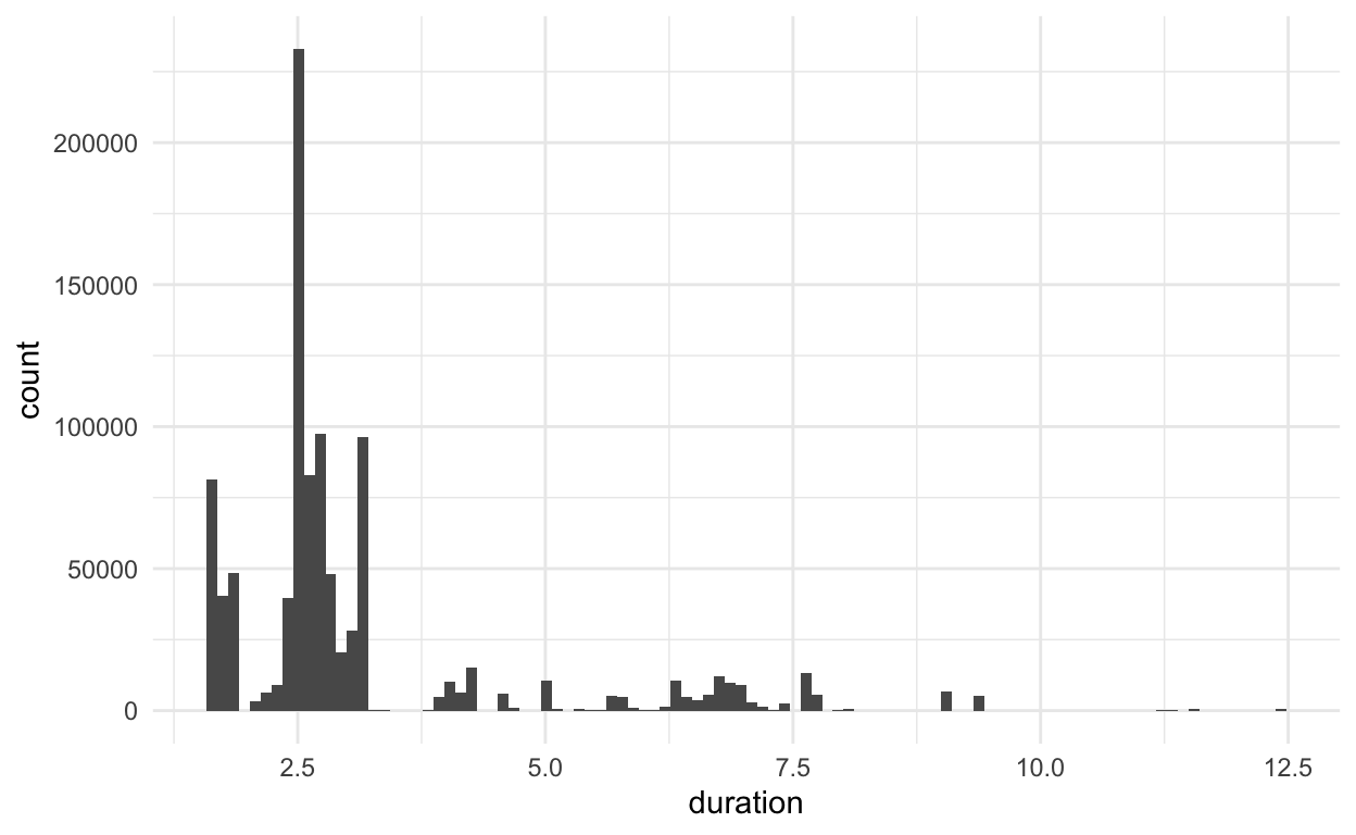
Characterizing Outliers
Which columns might help us understand extreme values?
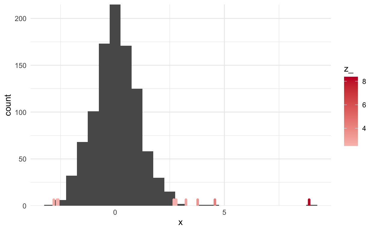
Detecting Outliers
Techniques to identify extreme values.
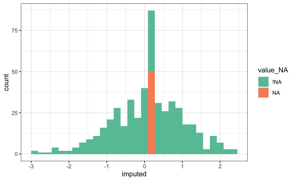
Missing Data (Part 2)
A deeper look at missing data, imputation, and characterization.
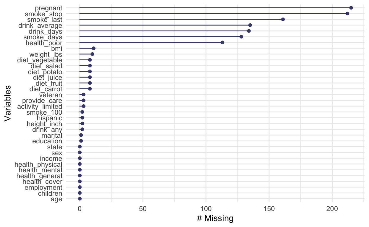
Missing Data (Part 1)
A look at how visualization can help characterize missing data.
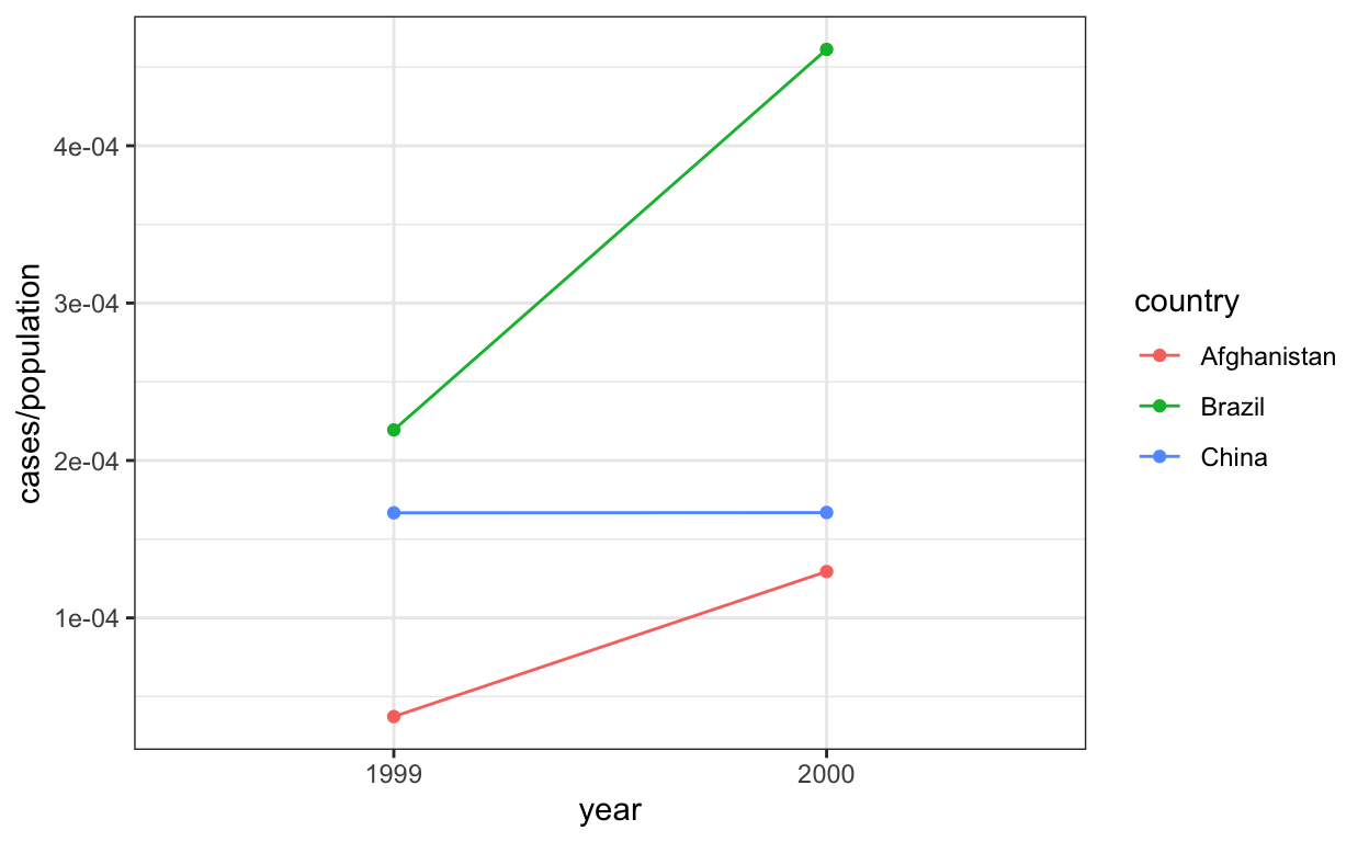
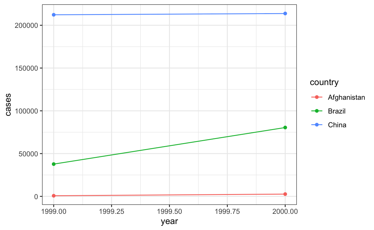
Tidy Data Example
An extended example of tidying a real-world dataset.
Deriving Variables
Using `separate`, `mutate`, and `summarise` to derive new variables for downstream visualization.
Pivoting
Tools for reshaping data into tidy format.
Tidy Data
The definition of tidy data, and why it's often helpful for visualization.
Dynamic Linking in the Wild
A look at real-world examples of dynamic linking.
Dynamic Linking
Combining faceting with dynamic queries.
Dynamic Queries (Part 2)
An introduction to details-on-demand.
Dynamic Queries (Part 1)
Using visualization to support query building.
Selections
A look at a fundamental building block fo interactive visualization.
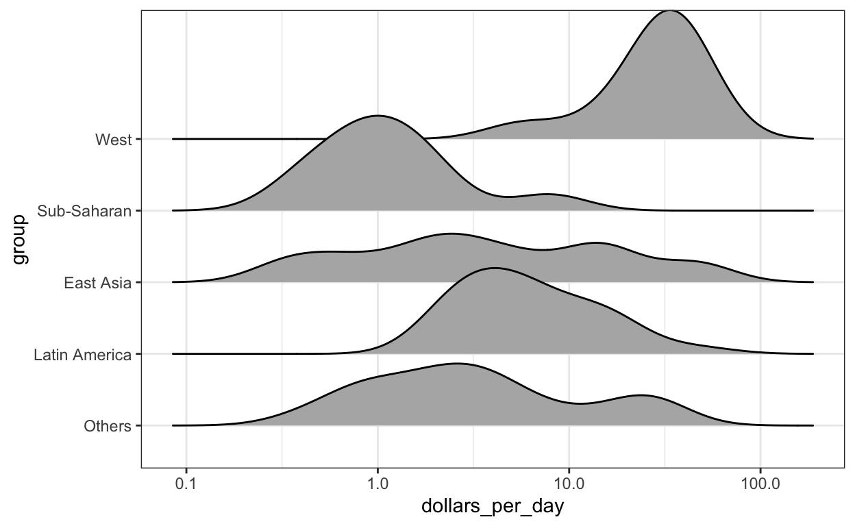
Ridge Plots
An extended example of faceting with data summaries.
Concatenation and Repetition
Adapting the small multiples principle to fields that are not exactly parallel.
Faceting (Part 2)
A look at faceting in vega-lite.
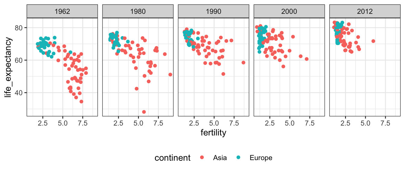
Faceting (Part 1)
Using small multiples to create information dense plots.
A Vocabulary of Marks
Examples of marks and their encodings in both ggplot2 and vega-lite.
Types, Marks, and Encodings
Tying together the introductions to ggplot2 and vega-lite, using the common language of encodings.
Introduction to Vega-Lite
Learn the basic concepts for creating vega-lite plots, and see how the library supports interactivity.
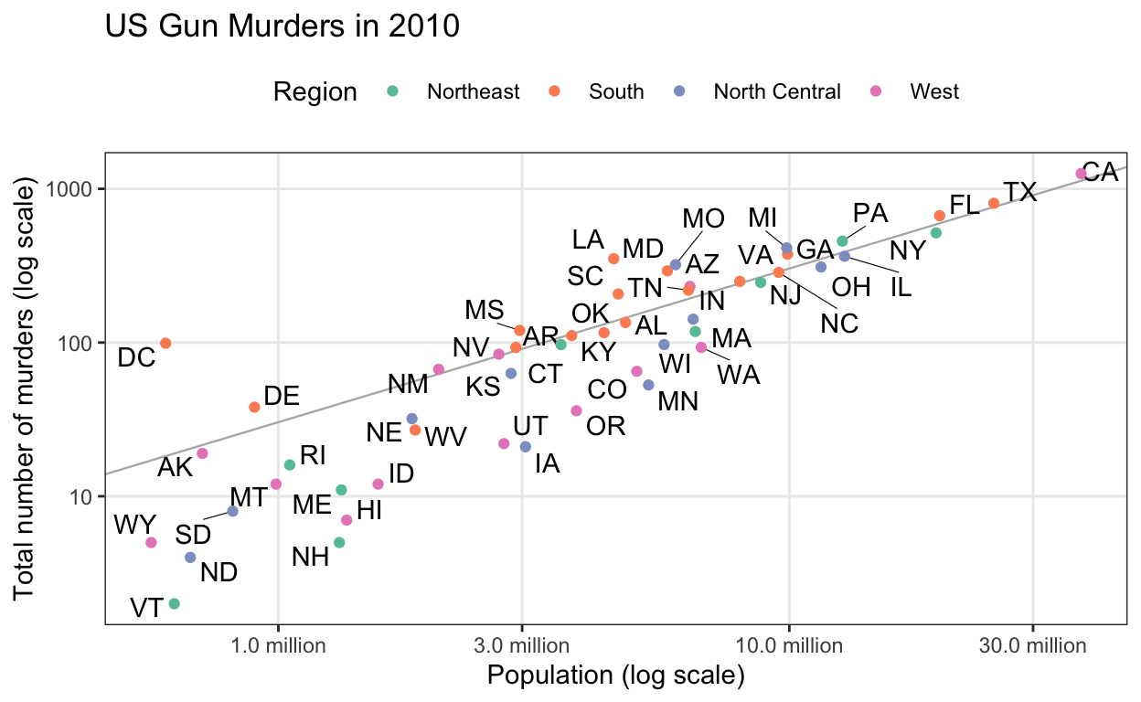
Introduction to ggplot2
A discussion of ggplot2 terminology, and an example of iteratively refining a simple scatterplot.
Orientation
How this course is structured, and how to follow along.