Visualization Portfolio - STAT 479 Spring 2022

Uber and Lyft
Author: Supraja Battula
Read the portfolio by clicking here.
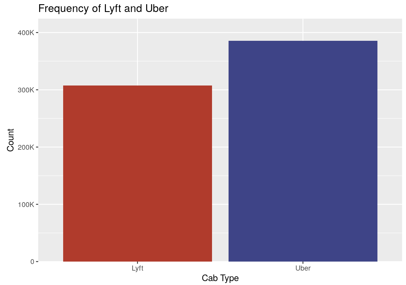
Uber and Lyft have grown extremely popular, and my visualizations aim to show the differences between the two major companies to see which is more affordable. On the top, the left graph shows which service is more widely used and, on the right, the plot shows the relationship between price and distance across various Boston locations. On the bottom, the left graph shows how price and distance are related for the various car types offered and the right shows a heatmap of how the surge multiplier is affected at various hours and destinations.