Visualization Portfolio - STAT 479 Spring 2022

Meteorite Landings
Author: Haoxuan Sun
Read the portfolio by clicking here.
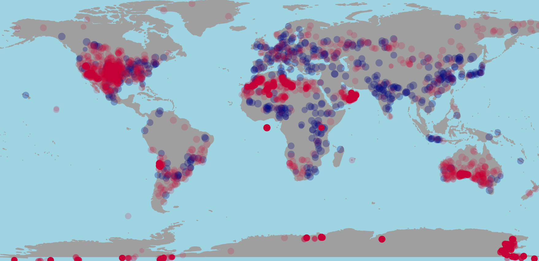
My interest of this visualization is to find out the pattern within meteorite landing across the world and in the U.S. The dataset is from Kaggle and containing name, id, type, class, mass, whether the landing is observed, year, and coordinates. My visualization contains two parts: Visualization of Meteor Landing Spatial Data, and Visualization of Meteor Landing Time Series Data.
Visualization of global spatial data help answers two questions; whether the meteors’ landing is seen by people, and what is the mass of each meteor. I convert the data frame into an sf object and plot out the points on the world to answer the first question. I encoded the size of points with mass of the meteors to visualize their mass. My visualization of U.S. meteor data answers where and when did the meteors landed on the U.S. mainland, and what is the mass of them. I encoded the points’ size with mass and color with year, so the larger points show larger mass, deeper color shows more recent landings.
Visualization of meteorite landing time series data helps answer the question
that how the number of meteors landings on Earth changes over time is, and how
is the number of observed and found meteors differ. I convert original data
frame into a time series and visualizing it with geom_line() with faceting by
its landing is seen or not. Since there are far more meteors that are found than
seen, I choose the free scales to make the height of the graph visible.