Visualizing Distributions
Uncertainty through distributions
library(tidyverse)
library(ggdist)
library(distributional)
library(patchwork)
theme_set(theme_bw())
-
In the last notes, we recommended frequency framing plots as a default approach for visualizing uncertainty. If you have ever skimmed through scientific publications, though, you might have been surprised by this choice — in technical literature, the overwhelming majority of uncertainty visualizations are based on error bars.
-
In many of these publications, frequency framing would likely be prefereable, because they give a richer view of the distribution of possible outcomes. However, there are two scenarios where error bars are hard to beat: when we need to compactly represent uncertainty for many units and when we want to combine them with other plots.
-
Since error bars take up so little space, they can be included in highly information dense views. For example, the intervals cover 66, 90, and 95% of the central area for each of 10 normal distributions.
n <- 10
estimate <- tibble(id = seq_len(n), mean = rnorm(n), sd = rgamma(n, 4, 12))
ggplot(estimate) +
  geom_errorbarh(aes(mean, id, xmin = mean - 1.9 * sd, xmax = mean + 1.9 * sd))  +
  labs(title = "95% Confidence Intervals (Randomly Generated)")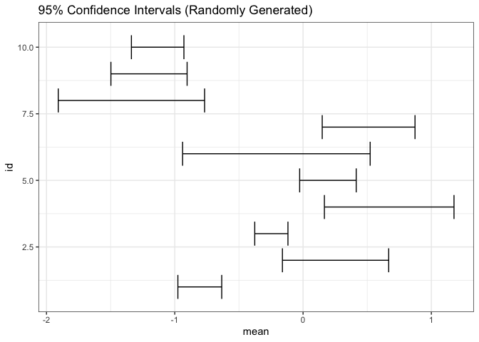
-
Since they are so compact, it is relatively easy to incorporate error bars into other visualizations. For example, we can replace points in a scatterplot with crosses that summarize uncertainty in each dimension.
points <- tibble(
  x = rnorm(n),
  y = rnorm(n),
  sd_x = rgamma(n, 3, 24),
  sd_y = rgamma(n, 3, 24)
)

ggplot(points, aes(x, y)) +
  geom_errorbar(aes(ymin = y - 1.9 * sd_y, ymax = y + 1.9 * sd_y)) +
  geom_errorbarh(aes(xmin = x - 1.9 * sd_x, xmax = x + 1.9 * sd_x)) +
  coord_fixed() +
  labs(title = "95% Error Bars")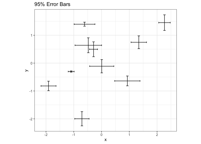
-
One difficulty with error bars is that their interpretations are not self-evident from their appearance — they need to be included in the title or caption to the figure. For example, 90 and 99% confidence intervals have different meanings, and this needs to be explained clearly.
level_compare <- tibble(mean = rnorm(1), sd = rexp(1), level = c(0.66, 0.9, 0.95, 0.99)) %>%
  mutate(
    scaling = qnorm(level + 0.5 * (1 - level)),
    lower = mean - scaling * sd,
    upper = mean + scaling * sd
  )

ggplot(level_compare) +
  geom_errorbarh(aes(mean, as.factor(level), xmin = lower, xmax = upper)) +
  labs(x = "CI for Mean", y = "Significance Level")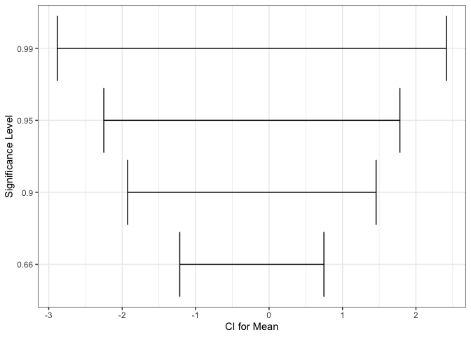
-
A variation on error bars that pack a little more information in nearly as little space is the graded error bar. This is a type of error bar where different levels of thickness are matched with different interpretations. In the example below, we are simultaneously showing 90, 95, and 99% confidence intervals for a mean.
ggplot(estimate) +
  stat_pointinterval(aes(xdist = dist_normal(mean, sd), y = id)) +
  labs(title = "Graded CIs (66 and 95%)")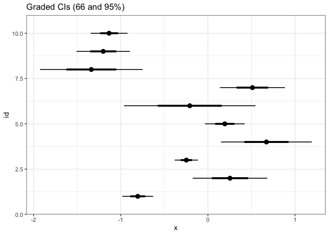
-
These graded error bars can be combined with distribution plots to create eye or half-eye plots. This approach benefits from the advantages of both the distribution and graded error approaches. From the distribution component, we can see the full distribution of uncertainty, not simply summaries. Using the error bar, we can tell whether specific values are above or below important cutoffs.
p1 <- ggplot(estimate) +
  stat_halfeye(aes(xdist = dist_normal(mean, sd), y = id)) +
  labs(title = "Half Eye Plot")

p2 <- ggplot(estimate) +
  stat_dotsinterval(aes(xdist = dist_normal(mean, sd), y = id)) +
  labs(title = "Dot Interval Plot")

p1 + p2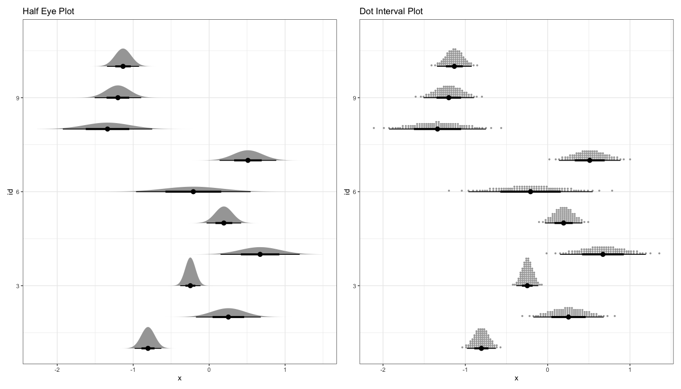
-
A related approach is to fill in subsets of a distribution plot according to more interpretable cutoffs.
ggplot(estimate) +
  stat_halfeye(aes(xdist = dist_normal(mean, sd), y = id, fill = stat(level)), .width = c(0.66, 0.9, 0.95)) +
  scale_fill_brewer(na.value = "#f7f7f7")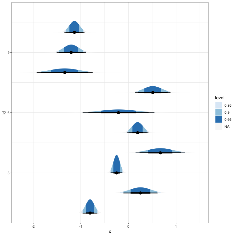
-
Two other encodings are worth knowing, but are harder to fit into the rest of this discussion. In interval plots, the fill opacity is used to encode probability. It is harder to evaluate the exact probability values, but it is a very compact representation.
p1 <- ggplot(estimate) +
  stat_interval(
    aes(xdist = dist_normal(mean, sd), y = id, color_ramp = stat(level)),
    .width = c(0.66, 0.9, 0.95),
    col = "#64798C"
  )

p2 <- ggplot(estimate) +
  stat_gradientinterval(
    aes(xdist = dist_normal(mean, sd), y = id),
    fill_type = "segments",
    col = "#64798C"
  )

p1 + p2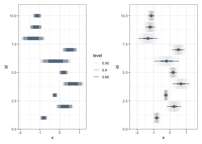
-
A second encoding is the complementary cumulative distribution (CCDF) plot. It represents the probability that the data will lie above a particular value. Some studies have found that nontechnical audiences often have better inferences when they are presented distributional uncertainty via CCDFs.
ggplot(estimate) +
  stat_ccdfinterval(
    aes(xdist = dist_normal(mean, sd), y = id),
    col = "#64798C",
    fill = "#d4dae0"
  ) +
  scale_x_continuous(expand = c(0, 0))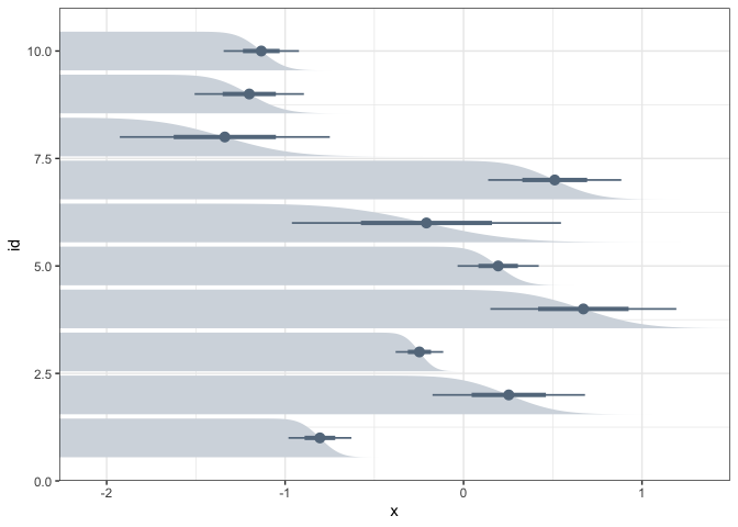
-
All the examples we’ve worked with in these notes have used the means and standard deviations from hypothetical normal distributions. However, they can all be created using the data itself. For example, here are
point_intervalandslab_eyeintervals for a datasetrandom_drawswhere we draw 100 samples from 10 different gamma distributions.random_draws <- map_dfr( 1:10, ~ tibble(x = rgamma(1000, runif(1, 2, 8), runif(1, 5, 10))), .id = "id" ) p1 <- ggplot(random_draws) + stat_pointinterval(aes(x, id)) p2 <- ggplot(random_draws) + stat_halfeye(aes(x, id, fill = stat(level))) + scale_fill_brewer(na.value = "#f7f7f7") p1 + p2