Frequency Framing
More evocative uncertainty visualization
library(tidyverse)
library(ggdist)
library(distributional)
library(patchwork)
library(ungeviz)
theme_set(theme_bw())
-
Whenever we analyze a dataset, it’s worth keeping in mind that our observations could have turned out differently. Different participants might have enrolled in the study, the sensor might be affected by measurement noise, the author might have chosen a different word. Consequently, all inferences we draw from data are accompanied by some degree of uncertainty. One of the basic ideas of statistics is that we can precisely measure and honestly communicate this uncertainty.
-
Yet, for most of this class, we’ve simply displayed the data as they are. When most of us see a visualization like this, we don’t automatically wonder about the hypothetical alternatives. Therefore, if we want our visual designs to communicate uncertainty, we need clear ways of representing them graphically. This will be our subject for the last few weeks.
-
For events with discrete outcomes (e.g., win the lottery or not), it is possible to visualize the probabilities directly. For example, if there are just two outcomes, we can plot the probability on along a line; if there are multiple outcomes, a stacked bar chart can achieve the same effect.
sample_grid <- function(p = 0.5) {
  expand.grid(seq_len(25), seq_len(25)) %>%
    mutate(response = sample(0:1, n(), replace = TRUE, prob = c(1 - p, p)))
}

true_prob <- c(0.01, 0.1, 0.4)
outcomes <- map(true_prob, ~ sample_grid(.)) %>%
  bind_rows(.id = "p") %>%
  mutate(true_prob = true_prob[as.integer(p)])

outcomes %>%
  group_by(p) %>%
  summarise(empirical_prob = mean(response)) %>%
  ggplot() +
    geom_col(aes(as.factor(true_prob), empirical_prob)) +
    scale_y_continuous(expand = c(0, 0, 0, 0.1)) +
    labs(x = "True Probability", y = "Empirical Probability")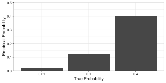
-
However, there is experimental evidence that humans are poor at judging probabilities represented in this way. A more effective alternative is frequency framing. The idea is simple: create marks that represent the potential outcomes, and ensure the frequency of the types reflects the underlying probabilities. For example, the displays below represent the probabilities of events with 1, 10, and 40% probability of occurring.
ggplot(outcomes) +
  geom_tile(aes(Var1, Var2, fill = as.factor(response)), col = "white", size = 0.6) +
  facet_wrap(~ true_prob) +
  scale_y_continuous(expand = c(0, 0)) +
  scale_x_continuous(expand = c(0, 0)) +
  coord_fixed() +
  labs(fill = "Outcome", col = "Outcome") +
  scale_fill_manual(values = c("#D9D9D9", "#595959")) +
  theme(
    axis.text = element_blank(),
    axis.ticks = element_blank(),
    axis.title = element_blank()
  )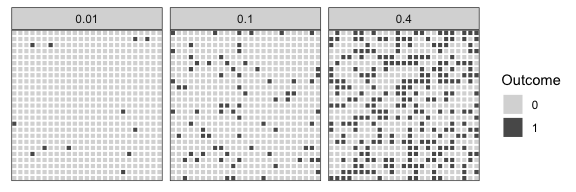
-
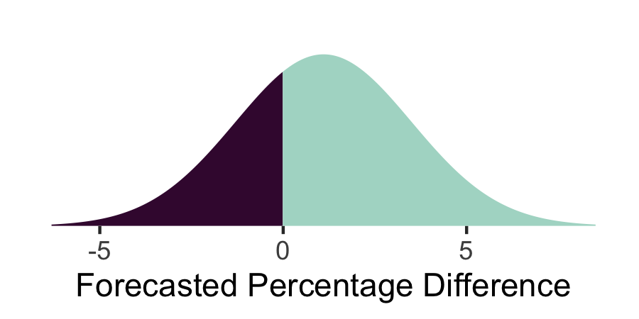
How can we generalize this idea to continuous outcomes? For example, in an upcoming election, party A might defeat party B by X%. We might believe that X is distributed normally with mean 1.1 and standard deviation 2.4. One approach is to visualize this using the density plot below.
-
We created this density using the
ggdistpackage with thedist_normaldistribution aesthetic. We split the colors between parties using thefillargument.estimate <- tibble(mean = c(1.1), sd = c(2.4)) ggplot(estimate) + stat_slab(aes(xdist = dist_normal(mean, sd), y = 0, fill = after_stat(x > 0))) + scale_y_continuous(expand = c(0, 0, 0, 0.1)) + scale_fill_manual(values = c("#400D3C", "#ADD9CC")) + labs(x = "Forecasted Percentage Difference") + theme( axis.text.y = element_blank(), axis.title.y = element_blank(), axis.ticks.y = element_blank(), legend.position = "none", panel.grid = element_blank(), panel.border = element_blank() ) -
This visualization suffers from the same limitations as directly representing probabilities in the discrete outcome case. The frequency framing version creates a dotplot for hypothetical outcomes at locations proportional to their probability. It seems like a simple change, but it is often better perceived, since judging counts is often easier than comparing areas.

-
We created this dotplot using the
geom_dotplotlayer fromggdist. Like in ordinary ggplot2, ggdist allows us to compose layers. For example, we can create a combined dot and density plot (this is called a rain cloud plot).ggplot(estimate) + stat_dots(aes(xdist = dist_normal(mean, sd), y = 0, fill = after_stat(x > 0)), col = "white") + scale_y_continuous(expand = c(0, 0, 0, 0.1)) + scale_fill_manual(values = c("#400D3C", "#ADD9CC")) + labs(x = "Forecasted Percentage Difference") + theme( axis.text.y = element_blank(), axis.title.y = element_blank(), axis.ticks.y = element_blank(), legend.position = "none", panel.grid = element_blank(), panel.border = element_blank() ) -
We can compactly display the uncertainties for many inferences by stacking dotplots or intervals. For example, in the plot below, we show chocolate quality across many countries. More than simply describing the average quality of chocolate bars across countries, it helps answer the more nuanced question, “If I were in a grocery store and randomly picked a chocolate bar from country X, what would I expect its quality to be?” That said, it can still be helpful to include summary intervals showing the mean +/- 1 and two standard deviations (right plot).
cacao_small <- cacao %>%
  filter(location %in% c("Ecuador", "Australia", "Belgium", "Switzerland", "Germany"))

p <- ggplot(cacao_small, aes(rating, reorder(location, rating))) + theme(axis.title.y = element_blank())
p1 <- p + stat_dots(dotsize = .3, binwidth = .2, fill = "#6894A6")
p2 <- p + stat_dotsinterval(dotsize = .3, binwidth = .2, fill = "#6894A6")

p1 + p2
-
A variation of stacked dotplots are called ridgeline plots. This no longer uses dots to support frequency framing, but it’s much easier to view partially overlapping density plots than dot plots.
p + stat_slab(height = 2, col = "black", fill = "#6894A6")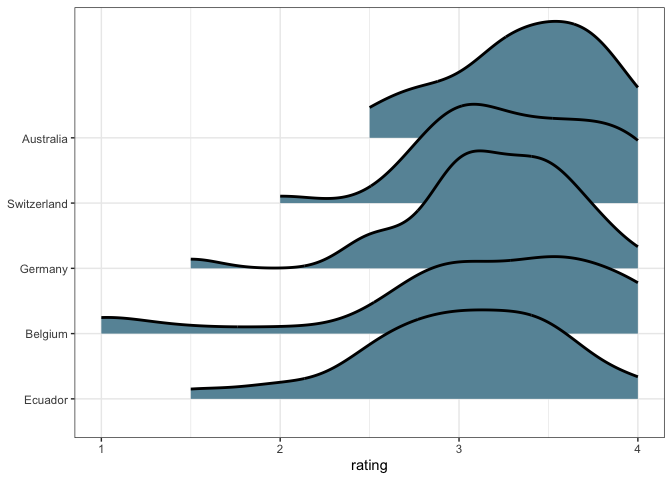
Since these are densities, it also isn’t important for the different countries to have approximately the same counts. When working with a larger subset of countries, this makes a big difference.
data(cacao)
p <- cacao %>%
  group_by(location) %>%
  filter(n() > 12) %>%
  ggplot(aes(rating, reorder(location, rating))) +
  theme(axis.title.y = element_blank())

p1 <- p +
  stat_slab(height = 2, col = "black", fill = "#6894A6") +
  labs(title = "Legible :)")
p2 <- p +
  stat_dots(dotsize = 0.3, binwidth = 0.2, col = "#6894A6") +
  labs(title = "Illegible :(")
p1 + p2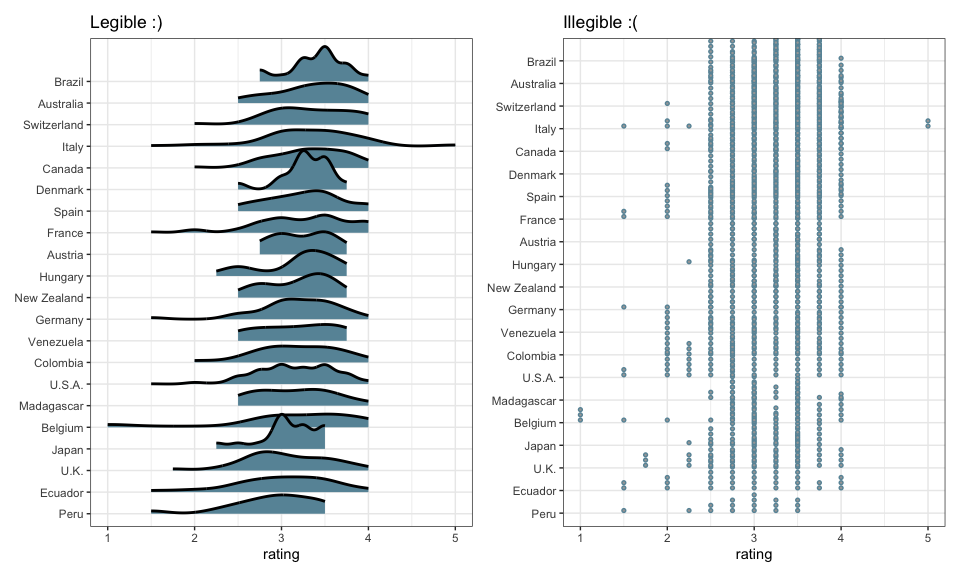
-
Frequency framing is a reasonable default strategy for representing uncertainty. However, there are many other ways to visually encode distributions over outcomes, and they can be worth knowing for more specialized visualization problems. For example, if we had many more countries in our chocolate bar ratings plot, we need a more compact way of representing uncertainty. Our next few notes explore alternatives for this and other situations.