Structured Graphs
Representing known structure in graphs
-
Graph layouts can often benefit from additional information known about the structure of the graph or purpose of the visualization. These notes describe a few of the situations that arise most frequently in practice.
-
When there is no additional structure / specific purpose, a reasonable default for node-link diagrams uses force-directed layout, as discussed previously. In this layout, we think of nodes as particles that want to repel one another, but which are tied together by elastic edges.
-
One common situation where we can go beyond force-directed graphs is when we have additional information about the nodes that can be used to constrain their position. For example, the Royal Constellations visualization, attempts to visualize the family trees of royal families. On the y-axis, the nodes are constrained to be sorted by year, and across the x-axis, nodes are constrained according to the country of the royal family.
-
More generally, we can define x and y-axis constraints and then use a force-directed algorithm to layout the nodes, subject to those constraints. These can be implemented by combining D3 with the cola library. For example, we’ve simulated data that are known to fall into three tight clusters, but using a naive force-directed layout leads to clusters that cross one another.
-
To resolve this, we can explicitly tell the layout algorithm to constrain the x-coordinates for nodes within each cluster.
To accomplish this, we defined an array of objects specifying pixel constraints between pairs of nodes; e.g.,
{"axis":"y", "left":0, "right":1, "gap":25}says that node 1 should be (at least) 25 pixels above node 0.let constrained = cola.d3adaptor() .nodes(nodes) .links(links) .constraints(constraints) .groups(groups) .start() -
Another common situation is that the nodes can be organized into a hierarchy of subgraphs. That is, nodes can be partitioned into non-overlapping sets. These sets can themselves be merged together to define a coarser partition.
-
This hierarchical structure can be encoded in either node-link or adjacency matrix visualizations. For example, in node-link views, we can draw shapes enclosing the sets,
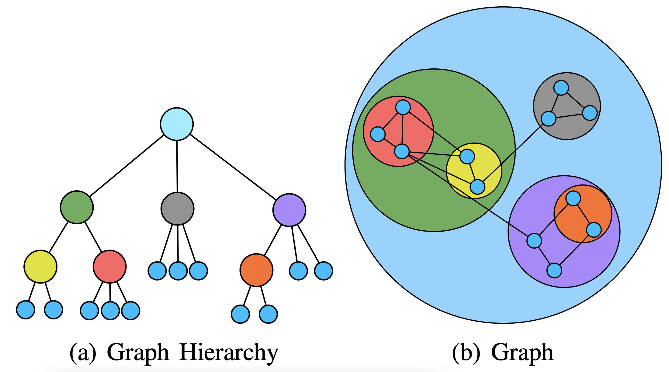
and in adjacency matrices, we can draw trees specifying the hierarchy.
 Here is an example implementation, again using the Cola
library.
Notice how nodes across groups always remain separated from one
another.
Here is an example implementation, again using the Cola
library.
Notice how nodes across groups always remain separated from one
another. -
Here is a simplified implementation that draws a boundary around groups of nodes without the help of the cola library. In addition to drawing nodes and links, it adds (and fills in) paths that contain the separate sets.
-
Specifically, each time the
d3.force()simulation ticks, it calculates the convex hull of the set of nodes within each group usingconvex_hull(), which is a light wrapper we have prepared around the existingd3.polygonHullfunction. This returns an array ofxandycoordinates for the group boundary. This is then use to draw a path that loops in on itself. We fill in the loops according to which group number it corresponds to.d3.select("#hulls") .selectAll("path") .data(convex_hull(nodes)) .attrs({ d: path_generator, fill: (d, i) => scales.fill(i) }) -
In some graphs, we have clustering structure. Within each cluster, nodes are densely connected, but between clusters, there are only a few links. In this case, it’s natural to use adjacency matrices to visualize the clusters and then draw links for connections between adjacency matrices. The reasoning is that adjacency matrices are better suited in densely connected graphs (they don’t have the edge crossing problem) but node-link encodings are better when we want to follow longer paths across clusters. Below, I’ve included a screenshot from the paper that introduced this layout approach,
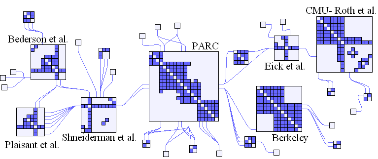
Though it would be a nontrivial implementation, I hope you can at least get a rough idea about how we could begin to implement something like this using D3. We already know how to draw adjacency matrices as collections of appended rectangles. We could imagine appending each of these rectangles to separate group elements. If we knew the links between groups, we could run a
d3.force()simulation to arrange groups in a nice layout. We could then append lines between the groups (or, if we want to more completely emulate the smooth links of figure, we could try a kind of curve or link generator). -
This is just one example of a larger class of “hybrid” matrix encodings. It’s possible to solve a variety of visual problems, just by cleverly combining the elementary visual encodings discussed last week.
-
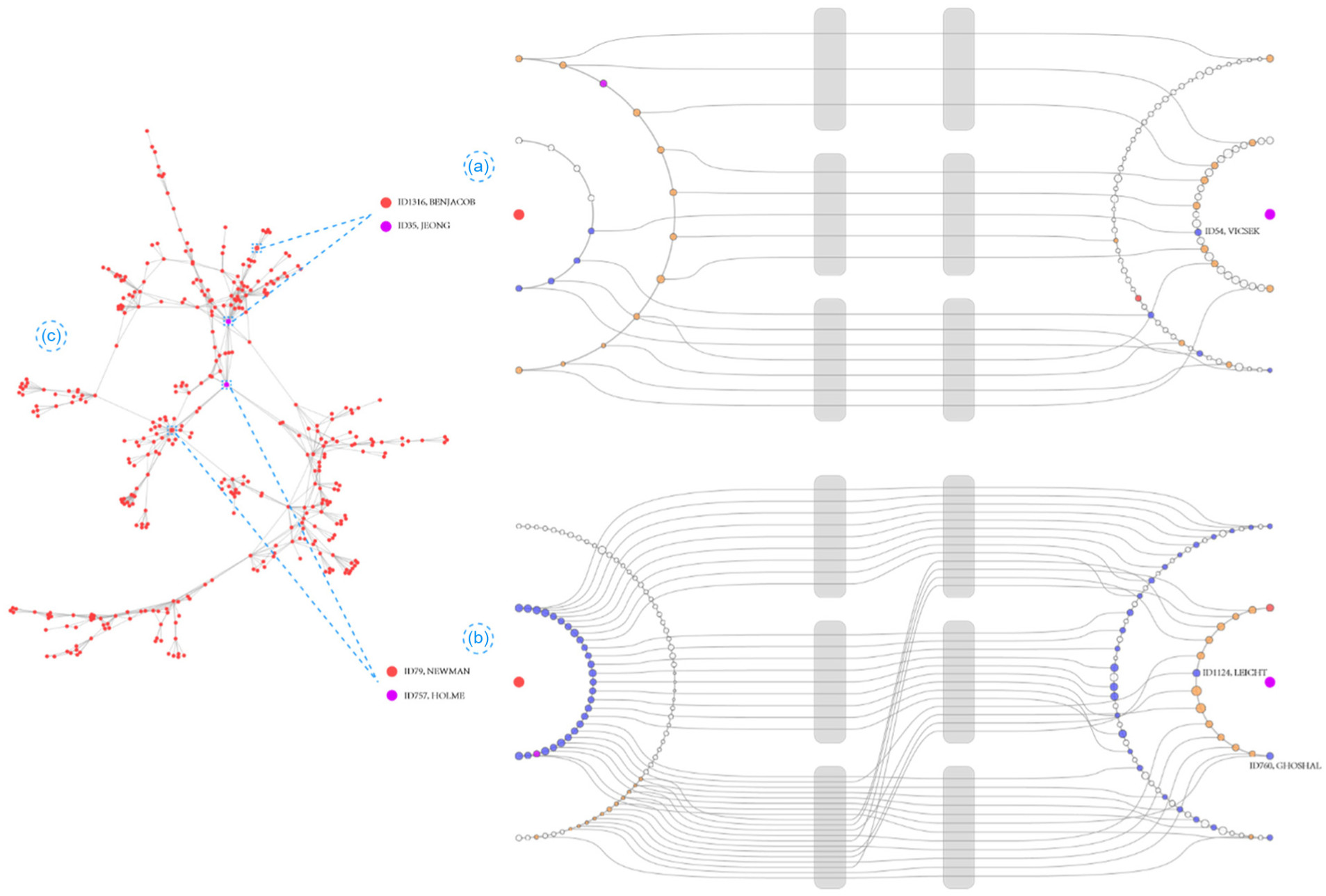
So far, we have focused on high-level properties of the graph that can be accounted for in visualization. Sometimes, the intended function of the visualization warrants thinking at a low-level instead. For example, in many problems, we are interested in studying ego-networks — the small neighborhoods that surround specific nodes of interest.
-
One example of a layout that was designed to support ego-network visualization is the egoCompare system. This is a kind of overview + detail graph visualization where users can select pairs of nodes to compare within an overview graph. The 2-nearest-neighbor graphs for each of these selected nodes are then shown (and linked together, if applicable). The subgraphs are arranged in a way that minimizes the amount of crossing.
-
The last type of graph we’ll consider in these notes are dynamic graphs. These are graphs where the sets of nodes and links are evolving over time. For example, the interactions between proteins in a protein interaction network may change when a cell is exposed to environmental stress, like the presence of a virus. There is no single way to visualize these networks, but common strategies include use of animation, faceting over time, combined encodings (like time series within nodes), or dynamic linking between coordinated views.
-
For example, here is an animated view of conflicts between countries over time,
and here is a combined encoding of time series arranged along a graph, from the pathvis paper.

-
In these notes, we’ve see some academic literature on visualization. Even if you are more practically oriented, this literature can be worth being familiar, if only because it can be a treasure trove of visual problem solving devices.