Graph Representations
Visual marks for general graphs
library(tidyverse)
library(jsonlite)
library(tidygraph)
library(ggraph)
theme_set(theme_bw())
-
In these notes, we’ll discuss how to implement a few types of general graph visualizations using R and D3. For R, we’ll focus on ggraph, and for D3, we’ll use force-directed and adjacency matrix layouts.
-
The goal of the ggraph package is to provide ggplot2-like design iteration for graph structured (rather than tabular) data. Like ggplot2, visualizations are built by composing layers for separate visual marks. Scale and labeling functions are also available to customize the appearance of these marks. For example, to build a node-link visualization, we can use the
geom_nodeandgeom_edge_linklayers. Note thatggraphexpects atbl_graphas input, not simply adata.frame.G <- as_tbl_graph(highschool) ggraph(G) + geom_edge_link(width = 0.2) + geom_node_point()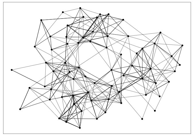
-
Attributes of nodes and edges can be encoded using size (node radius or edge width) or color. The node-link representation is especially effective for the task of following paths. It’s an intuitive visualization for examining the local neighborhood of one node or describing the shortest path between two nodes.
G <- G %>%
  mutate(log_degree = log(local_size(), 10))
ggraph(G) +
  geom_edge_link(width = 0.2) +
  geom_node_point(aes(col = log_degree, size = log_degree))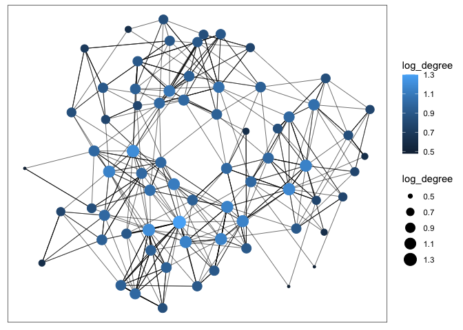
-
Let’s make the analogous graph in D3. We first write the data into a JSON object with node and edge attributes – this can be read in using
d3.json.nodes <- G %N>% as_tibble() %>% mutate(id = row_number()) %>% select(-name) edges <- G %E>% filter(year == 1957) %>% as_tibble() %>% mutate(value = 1) %>% rename(source = from, target = to) write_json(list(edges = edges, nodes = nodes), "~/Desktop/teaching/stat679_code/examples/week9/week9-4/highschool.json")We can then use d3’s force-directed layout algorithm to compute a layout of the nodes given a connectivity structure. The algorithm simulates forces that try to repel nodes from each other, while tension on the edges keeps connected pairs close to one another. Specifically, the function below runs a small simulation for 100 time steps. Crucially, the running the simulation modifies the
nodesandlinksobjects in place, ensuring that they include the finalxandypixel coordinates. You can try tinkering with the repulsion and attraction forces to see how it changes the final graph layout.function setup_simulation(data) { let nodes = data["nodes"], links = data["edges"]; let simulation = d3.forceSimulation(nodes) .force("link", d3.forceLink(links).id(d => d.id)) // attracts linked nodes .force("charge", d3.forceManyBody().strength(-8)) // repels all nodes .force("center", d3.forceCenter(300, 300)) // center of the canvas .tick(100); // how long to run the graph layout return {simulation: simulation, nodes: nodes, links: links} } -
Once we have run the simulation, we can access the
xandycoordinates for each node and edge and use it to draw the graph. The first block below appends circles corresponding to nodes, and the second block draws lines that define each link.let {simulation, nodes, links} = setup_simulation(data); d3.select("#nodes") .selectAll("circle") .data(nodes).enter() .append("circle") .attrs({ cx: d => d.x, cy: d => d.y }) d3.select("#links") .selectAll("line") .data(links).enter() .append("line") .attrs({ x1: d => d.source.x, y1: d => d.source.y, x2: d => d.target.x, y2: d => d.target.y }) -
More than simply showing the layout after 100 simulation iterations, we can redraw the visualization after every tick. The idea is that, when we run the simulation, the
nodesandlinksdata objects will be changing after each tick. After running one step of the simulation, we can update the circle and lineattrsto reflect new simulation locations. The function below encapsulates this update.function ticked() { d3.select("#nodes") .selectAll("circle") .attrs({ cx: d => d.x, cy: d => d.y }) d3.select("#links") .selectAll("line") .attrs({ x1: d => d.source.x, y1: d => d.source.y, x2: d => d.target.x, y2: d => d.target.y }) } simulation.on("tick", ticked) -
The addition of a
d3.drag()listener makes it possible to manipulate the simulation by clicking and dragging on nodes. Specifically, we can define functions that “reheat” the simulation every time a drag event is started,function drag_start(simulation, event) { if (!event.active) { simulation.alphaTarget(0.9).restart(); } }and which update the simulation forces depending on the mouse’s drag speed,
function dragged(event) {
  event.subject.fx = event.x;
  event.subject.fy = event.y;
}
Passing these functions into a
d3.drag()object allows us to interact with the simulation as it is laying out the nodes.let drag = d3.drag() .on("start", (e) => drag_start(simulation, e)) .on("drag", dragged); d3.select("#nodes") .selectAll("circle") .call(drag) -
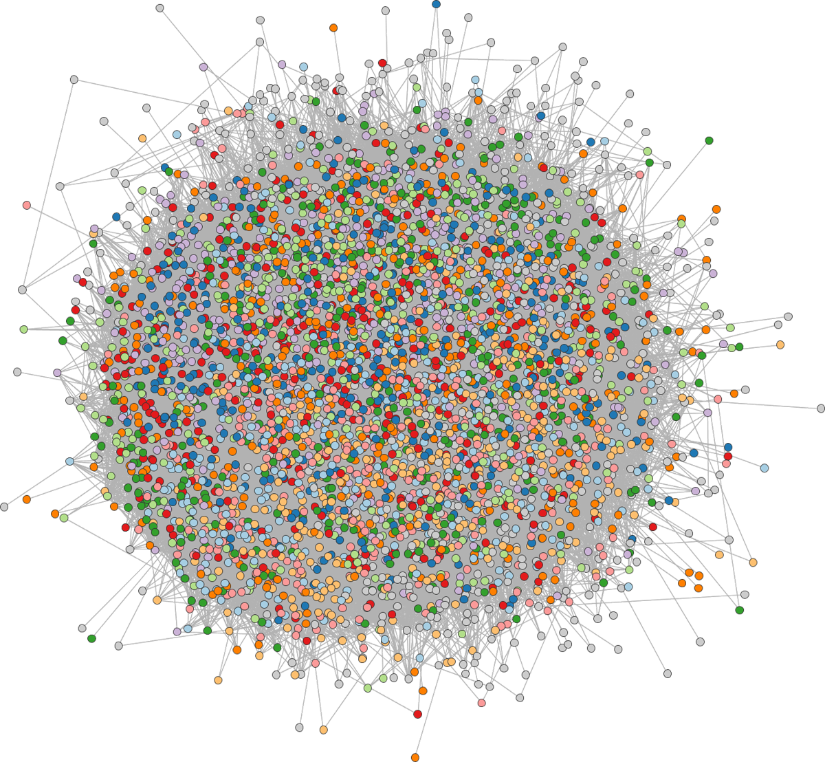
The key drawback of node-link diagrams is that they do not scale well to networks with a large number of nodes or with a large number of edges per node. The nodes and edges begin to overlap too much, and the result looks like a “hairball.”
-
In this case, it’s often useful to try filtering or aggregating nodes. For example, aggregation works by replacing the original nodes with metanodes representing entire clusters. This is especially powerful if the degree of filtering or aggregation can be adjusted interactively — we’ll explore this strategy when we go into more depth on graph interactivity next week.
-
Alternatively, another way to solve the hairball problem is to use another layout. We’ll discuss how to use an adjacency matrix encoding instead. The adjacency matrix of a graph is the matrix with a 1 in entry
ijif nodesiandjare linked by an edge and 0 otherwise. It has one row and one column for every node in the graph. Visually, these 1’s and 0’s can be encoded as a black and white squares. The example below shows the adjacency matrix associated with the high-school student friendship network from last lecture. We use the “matrix” layout with ageom_edge_tilelayer to draw adjacency matrices in ggraph.ggraph(G, layout = "matrix") + geom_edge_tile() + coord_fixed() + geom_node_text(aes(label = name), x = -1, nudge_y = 0.5) + geom_node_text(aes(label = name), y = -1, nudge_x = -0.5)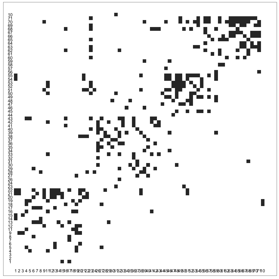
-
In D3, an adjacency matrix visualization is simply a collection of appropriately placed SVG
rects. For example, if we had an arraymatrixwith elements like[source, target, edge_type], then we could draw the adjacency matrix usingd3.select("#graph") .selectAll("rect") .data(matrix).enter() .append("rect") .attrs({ x: d => scales.x(d[0]), y: d => scales.x(d[1]), width: scales.x.bandwidth(), height: scales.x.bandwidth(), fill: d => scales.fill(d[2]) })where
scales.xis ascaleBandobject mapping the network node names to pixel coordinates andscales.fillis ascaleOrdinalobject that maps edge types to colors. We used exactly this code to draw the adjacency matrix below, which visualizes interactions between characters in Les Miserables. -
Note that we have to associate each node with
xandycoordinates, and the visualization is dependent on the choice of ordering. There are a variety of algorithms available for ordering nodes in an adjacency matrix, but implementing this manually can be tedious. Fortunately, there is a javascript package,reorder.js, that specifically supports these algorithms. For example, the last line below returns an array giving the sorted node names using a spectral algorithm. The details of how the algorithm works are not important – the main point is that nodes with highly overlapping neighborhoods will be placed next to one another in the adjacency matrix.let graph = reorder.graph() .nodes(data["nodes"]) .links(data["links"]) .init(); reorder.spectral_order(graph) -
The key advantage of visualization using adjacency matrices is that they can scale to large and dense networks. It’s possible to perceive structure even when the squares are quite small, and there is no risk of edges overlapping with one another.
-
The key disadvantage of adjacency matrix visualization is that it’s challenging to make sense of the local topology around a node. Finding the “friends of friends” of a node requires effort. For this reason, a number of hybrid methods which blend node and adjacency matrix algorithms have been proposed. We’ll review a few of these next week.