Time Series Visualization (II)
Specialized representations for time series problems
library(tidyverse)
library(tsibble)
library(tsibbledata)
library(ggHoriPlot)
library(ggstream)
library(colorspace)
library(ggalluvial)
library(scales)

theme679 <- theme_bw() +
  theme(
    panel.background = element_rect(fill = "#f7f7f7"),
    panel.grid.minor = element_blank()
  )
theme_set(theme679)
-
In these notes, we continue our tour of static time series visualization techniques, with a special emphasis on collections of time series.
-
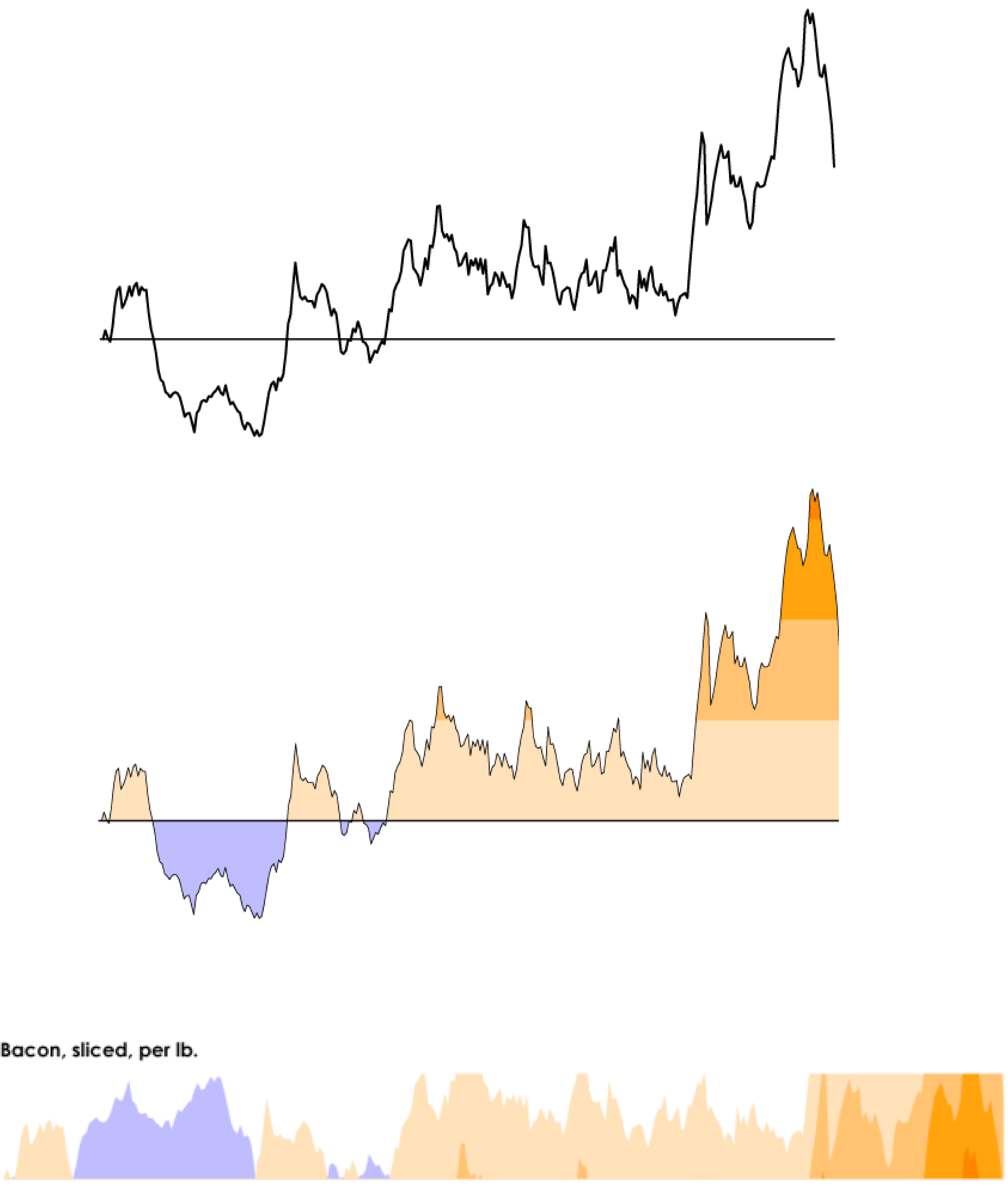
Our first more advanced method is called the horizon plot. Below, I’ve created a horizon plot of the Australian tourism data, along with the line plot we made last time for comparison.
-
This figure isn’t yet standard, so let’s walk through how to read it. We’ve taken the explanation below from the FlowingData blog. The main idea is to split the time series into a few horizontal bands, each of which will be assigned to a separate color. A special dividing line (the horizon line) is used to split between two colors in a diverging color scheme.

-
Once the bands are defined, the components are all collapsed on top of one another. In this way, even though there may be a large range in the realized y-values, the amount of space needed to display them all is relatively small. We’re able to decide which overall band we are in (and hence the overall value of y) based on color.
tourism <- tourism %>%
  filter(Purpose == "Holiday")

region_totals <- tourism %>%
  as_tibble() %>%
  group_by(Region) %>%
  summarise(total = sum(Trips)) %>%
  arrange(-total)

cutpoints <- seq(0, 1000, by = 100)
tourism %>%
  filter(Region %in% region_totals$Region[1:16]) %>%
  ggplot() +
  geom_horizon(aes(Quarter, Trips, fill = ..Cutpoints..), origin = 350, horizonscale = cutpoints) +
  scale_fill_hcl(palette = 'RdBu') +
  facet_grid(reorder(Region, -Trips) ~ .) +
  theme(
    strip.text.y = element_text(angle = 0),
    axis.text.y = element_blank(),
    axis.ticks.y = element_blank()
  )
-
We created the figure above using the
ggHoriPlotpackage. We have to specify both the horizon line (origin) and the cutoffs that separate the bands (horizonscales). The..Cutpoints..term creates the color legend. -
Overall, the horizon plot gives a reasonable compromise between faceting and heatmaps — it preserves some of the advantages of using y-position to encode value while having some of the compactness of heatmaps. The advantages of taking this middle ground has been documented in research. However, the approach is not very intuitive, and for a general audience, we typically will have to explain how to read these figures.
-
What if we are interested more in totals and composition (i.e., values divided by total) across a collection? A few approaches make it especially easy to answer these types of queries.
-
To illustrate, we’ll consider the X-men appearances dataset. This includes the number of times each character appeared on the page across all the issues of the comic (as well as whether they were dressed normally or as superheroes during each appearance). We’ve filtered down to just the most common characters, to make comparison easier.
xmen <- read_csv("https://raw.githubusercontent.com/krisrs1128/stat679_code/main/examples/week7/week7-1/x-men.csv") head(xmen) ## # A tibble: 6 × 6 ## character char_popular costume issue rank depicted ## <chr> <chr> <chr> <dbl> <dbl> <dbl> ## 1 Gambit = Name Unknown Gambit Costume 97 4 0 ## 2 Gambit = Name Unknown Gambit Costume 98 4 0 ## 3 Gambit = Name Unknown Gambit Costume 99 4 0 ## 4 Gambit = Name Unknown Gambit Costume 100 4 0 ## 5 Gambit = Name Unknown Gambit Costume 101 4 0 ## 6 Gambit = Name Unknown Gambit Costume 102 4 0 -
One way to visualize how the total number and composition of character appearances change over issues is to use a stacked area plot. This is the analog of an area plot, but where multiple areas are stacked on top of one another.
# custom color palette
pal <- c(
  "#8E038E", lighten("#8E038E", .2, space = "HLS"),
  "#C20008", lighten("#C20008", .2, space = "HLS"),
  "#13AFEF", lighten("#13AFEF", .25, space = "HLS"),
  "#595A52", lighten("#595A52", .15, space = "HLS"),
  "#FFB400", lighten("#FFB400", .25, space = "HLS")
)

ggplot(xmen) +
  geom_area(aes(issue, depicted, col = interaction(costume, char_popular), fill = interaction(costume, char_popular))) +
  scale_fill_manual(values = pal) +
  scale_color_manual(values = pal) +
  scale_x_continuous(expand = c(0, 0)) +
  scale_y_continuous(expand = c(0, 0, 0.1, 0)) +
  theme(legend.position = "bottom")
-
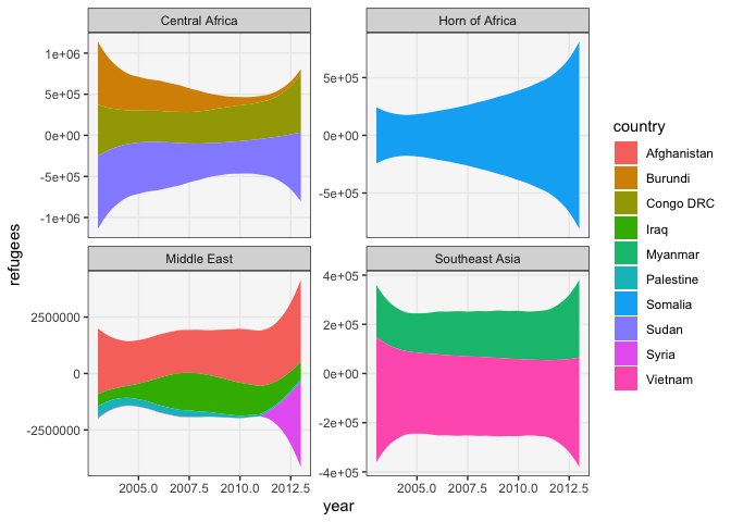
An alternative is the stream graph (also sometimes called “Theme River”). It is like a stacked area chart, but oriented around a central (rather than base) line. These are also almost always smoothed slightly, so that the transitions are not too jarring.
ggplot(xmen) +
  geom_stream(aes(issue, depicted, col = interaction(costume, char_popular), fill = interaction(costume, char_popular)), bw = 0.4) +
  scale_fill_manual(values = pal) +
  scale_color_manual(values = pal) +
  theme(legend.position = "bottom")
-
There has been some controversy about whether approaches like streamgraphs are actually more effective than area plots. Broadly speaking, one camp focuses on functionality, evaluating approaches by user experiments on formal tasks. Another allows aesthetic appeal to factor into decision-making. It’s not necessary to take up any particular position in this course, but it’s good when speaking with others in the visualization community to know that these positions exist (and that your designs might elicit certain reactions).
-
Even though both stacked area and stream graphs make it easier to tell how the totals at any timepoint breakdown across groups, they don’t necessarily make it easy to rank the groups by their relative contribution (groups with similar contributions might be hard to rank).
-
For example, consider the dataset below, which describes the number of refugees leaving countries around the world between 2000 and 2010. The stacked area graph shows that there was a clear increase in refugees from Iraq starting in 2004, but it’s unclear whether this overtook Afghanistan.
refugees <- read_csv("https://raw.githubusercontent.com/krisrs1128/stat679_code/main/examples/week7/week7-1/refugees.csv")
ggplot(refugees) +
  geom_stream(aes(year, refugees, fill = country), bw = 1) +
  facet_wrap(~ region, scale = "free_y")
-
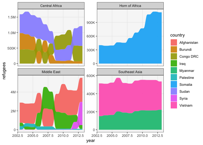
If we want to explicitly rank the groups, we can use an alluvial plot. It is a hybrid between a bump chart and streamgraph. It is read like a stream graph, but at each timepoint, the groups are sorted from largest to smallest contribution. Applying it to the dataset above shows that Iraq did indeed become the largest source of refugees within the Mideast starting around 2004.
ggplot(refugees) +
  geom_alluvium(aes(year, refugees, fill = country, alluvium = country), decreasing = FALSE, alpha = 0.9) +
  facet_wrap(~ region, scale = "free_y") +
  scale_y_continuous(labels = label_number(scale_cut = cut_long_scale()))