Time Series Visualization (I)
Basic tasks and visual strategies for temporal data
-
Time often has a special role in data analysis. In the next few notes, we’ll study some of the types of time-related questions that can be answered through visualization. We’ll also tour some familiar (as well as some more obscure) visualizations strategies. Throughout, we’ll restrict attention to static views — next week, we’ll consider some interactive approaches to understanding temporal data.
-
When we get into the details, there is no single type of time series visualization — all designs should be tailored to the specifics of both the data and the purpose at hand. For example, the data can vary across these characteristics,
- Is there one series of interest? Or are there multiple series moving together?
- How is time recorded? Is it qualitative (e.g., early, middle, late) or quantitative (specific hour timestamp)?
- What types of variables are measured at each timepoint? E.g., are they categorical, quantitative, geographic?
- Are the data measured at regular temporal frequencies, or is it available on an unevenly spaced grid?
- Are the data expected to include strong cyclic or seasonal patterns?
-
In addition to variation across datasets, there is variation across tasks. The most basic questions are direct lookups,
- Identification: Given a timepoint of interest, what was the value of some variable?
- Localization: Given the value of some variable, which timepoints achieved it?
-
Instead of a direct lookup, we may instead be interested in comparison. This can include comparison of multiple variables at a fixed timepoint or comparison of multiple timepoints / ranges for a fixed variable. Further, we might be interested in more than queries for specific values, we might want a “synoptic” view of the time series, looking for higher-level trends or patterns that aren’t visible when restricting attention to any narrow range of timepoints or variable values.
-
In fact, there have been several efforts to systematically taxonomize the types of queries that time series visualizations have been used for, like the example from this week’s reading,

-
It can be useful to have this theory in mind, if only because it helps clarify the wide range of design decisions that are implicitly made anytime we make a time series visualization. An approach that streamlines one type of lookup / comparison might come at the cost of another, and it’s helpful to have language to express the trade-offs involved.
-
That said, this will be enough theory for now. Let’s make some plots. First, we begin with the simple line plot. A notable aspect of this approach is that it highlights change. Our eyes immediately pick up the steepness, shallowness, or roughness of different parts of the curve.
library(tsibble) library(tsibbledata) library(tidyverse) theme679 <- theme_bw() + theme( panel.background = element_rect(fill = "#f7f7f7"), panel.grid.minor = element_blank() ) theme_set(theme679) -
For example, in the figure below, we’re showing the amount of trade in Canadian Lynx pelts near the beginning of the 20th century. We can immediately recognize the seasonal structure.
ggplot(pelt) +
  geom_line(aes(Year, Lynx)) +
  scale_x_continuous(expand = c(0, 1))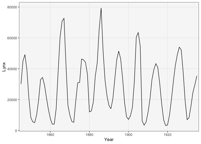
-
We made this figure using the
geom_linegeometry in ggplot2. Thexandyarguments are used to encode time and trade volume, respectively. Alternatively, we can emphasize the fact that these are amounts (they must be nonnegative) by drawing this as an area plot. This uses thegeom_areamark.ggplot(pelt) + geom_area(aes(Year, Lynx)) + scale_x_continuous(expand = c(0, 1)) + scale_y_continuous(expand = c(0, 0, 0.1, 0))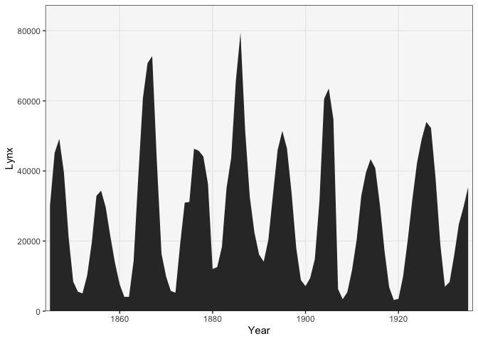
-
What if we had a larger collection of time series? For example, the dataset below includes the number of tourists in different states in Australia, measured quarterly. We are interested in questions like, which destinations are more popular, and when? Have there been periods when one (or several) regions were especially popular / avoided? Is there any strong seasonal structure or are there (upward or downward) trends?
# filter to most popular regions
data(tourism)
tourism <- tourism %>%
  filter(Purpose == "Holiday")

region_totals <- tourism %>%
  as_tibble() %>%
  group_by(Region) %>%
  summarise(total_trips = sum(Trips)) %>%
  arrange(-total_trips)

filter_regions <- function(x, K = 6) {
  x %>%
    filter(Region %in% region_totals$Region[1:K])
}

ggplot(filter_regions(tourism)) +
  geom_line(aes(Quarter, Trips, col = Region))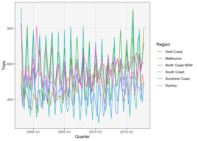
-
To approach these questions, we can try some simple modifications of the lineplot. A first attempt is to include all the lines in one frame, with color used to distinguish each state. The result is almost impossible to read, though.
- Aside: If we hadn’t included color in our mapping, the figure
would look like this. This happens because each timepoint has
multiple y-values. To tell ggplot2 to create separate lines for
each state, we have to use the
groupargument.
ggplot(filter_regions(tourism)) +
  geom_line(aes(Quarter, Trips))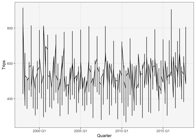
ggplot(filter_regions(tourism)) +
  geom_line(aes(Quarter, Trips, group = Region))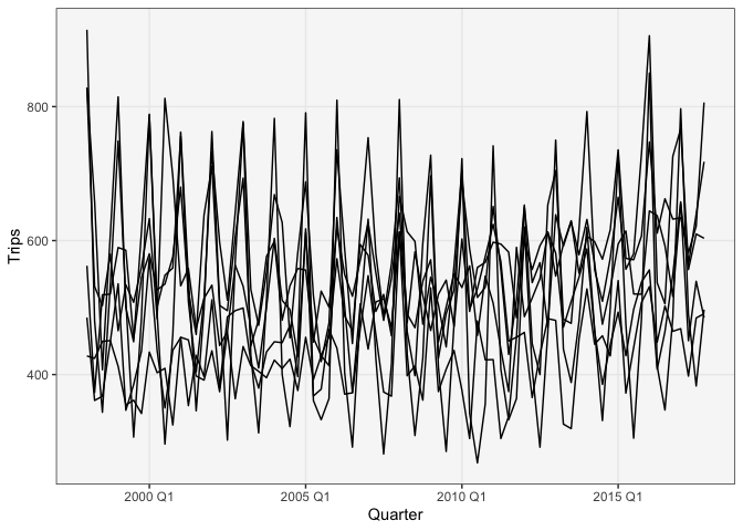
- Aside: If we hadn’t included color in our mapping, the figure
would look like this. This happens because each timepoint has
multiple y-values. To tell ggplot2 to create separate lines for
each state, we have to use the
-
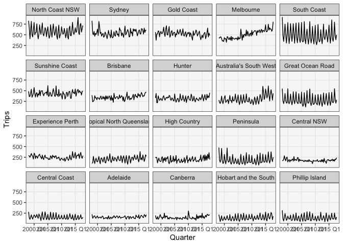
Another variation on the line plot is to use faceting. This works better, but can take up quite a bit of space when there are many regions. Another downside of this approach is that it’s hard to exactly compare the y-values for pairs of series, since they no are no longer overlapping. Also, as soon as we have to start scrolling up and down to compare different states, the value of the small multiples starts dropping.
ggplot(filter_regions(tourism, 20)) +
  geom_line(aes(Quarter, Trips)) +
  facet_wrap(~ reorder(Region, -Trips))
-
To address this, we could consider dropping line plots entirely. The approach below uses a heatmap, with each state on its own line. This approach is very compact and relatively accessible, but we no longer see trends so clearly: differences in color are harder to evaluate than differences in y-position.
ggplot(filter_regions(tourism, 18)) +
  geom_tile(aes(Quarter, reorder(Region, Trips), fill = Trips, col = Trips)) +
  scale_fill_distiller(direction = 1) +
  scale_x_yearquarter(expand = c(0, 0)) +
  scale_y_discrete(expand = c(0, 0)) +
  scale_color_distiller(direction = 1)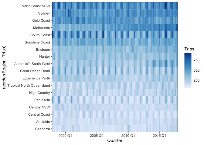
-
We made this using the
geom_tilelayer. Notice that we gave values for both the fill and color arguments — without color, there would be small gaps along the borders of each tile. Also, we reordered theRegioncolumn so that rows were sorted from those with the most to the least tourism. -
These notes have reviewed the more familiar approaches to time series visualization. In the next lecture, we’ll consider some more obscure (but often useful) approaches.