A Vocabulary of Marks
Encodings available in ggplot2.
library(tidyverse)
library(scales)
theme_set(theme_minimal())
-
The choice of encodings influences (1) the types of comparisons that a visualization suggests and (2) the accuracy of the conclusions that readers leave with. With this in mind, it’s in our best interest to build a rich vocabulary of potential visual encodings. The more kinds of marks and encodings that are at your fingertips, the better your chances are that you’ll arrive at a configuration that helps you achieve your purpose.
-
Point marks can encode data fields using their x and y positions, color, size, and shape. Below, each mark is a country, and we’re using shape and the y position to distinguish between country clusters.
    gapminder <- read_csv("https://uwmadison.box.com/shared/static/dyz0qohqvgake2ghm4ngupbltkzpqb7t.csv", col_types = cols()) %>%
      mutate(cluster = as.factor(cluster)) # specify that cluster is nominal
    gap2000 <- gapminder %>%
      filter(year == 2000) # keep only year 2000
    ggplot(gap2000) +
      geom_point(aes(x = fertility, y = cluster, shape = cluster))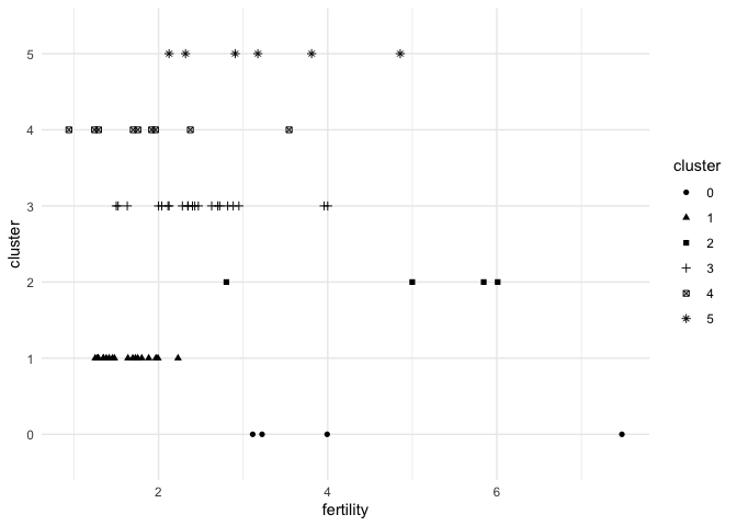
-
Bar marks let us associate a continuous field with a nominal one.
ggplot(gap2000) +
  geom_col(aes(country, pop))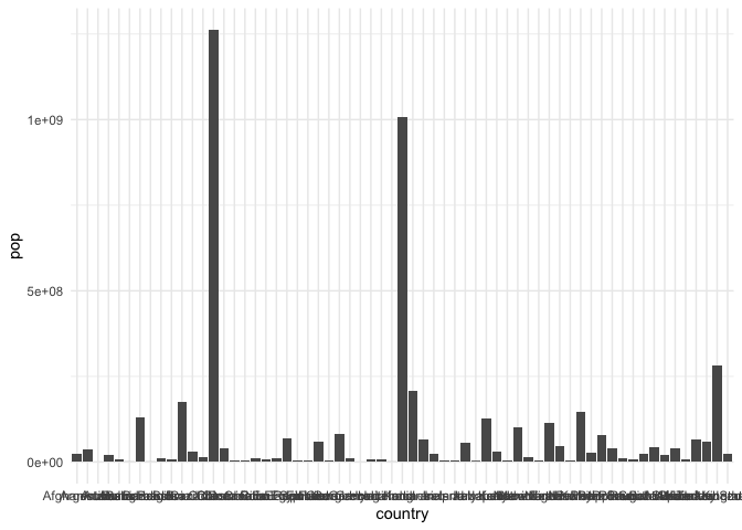
-
This plot can be improved. The grid lines and tick marks associated with each bar are distracting and the axis labels are all running over one another. We resolve this by changing the theme and turning the bars on their side[1]
    ggplot(gap2000) +
      geom_col(aes(pop, country)) +
      theme(
        panel.grid.major.y = element_blank(),
        axis.ticks = element_blank() # remove tick marks
      )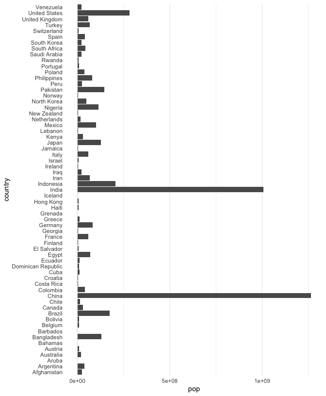
-
To make comparisons between countries with similar populations easier, we can order them by population (alphabetical ordering is not that meaningful). To compare clusters, we can color in the bars.
ggplot(gap2000) +
   geom_bar(aes(pop, reorder(country, pop), fill = cluster), stat = "identity") +
   theme(
     axis.ticks = element_blank(),
     panel.grid.major.y = element_blank()
   )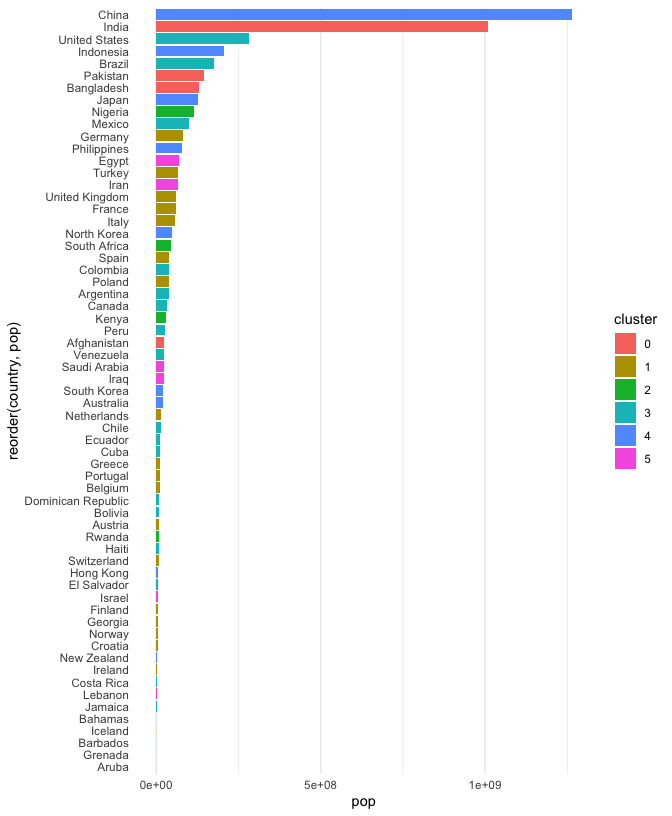
-
We’ve been spending a lot of time on this plot. This is because I want to emphasize that a visualization is not just something we can get just by memorizing some magic (programming) incantation. Instead, it is something worth critically engaging with and refining, in a similar way that we would refine an essay or speech. Philosophy aside, there are still a few points that need to be improved in this figure,
- The axis titles are not meaningful.
- There is a strange gap between the left hand edge of the plot and the start of the bars.
- I would also prefer if the bars were exactly touching one another, without the small vertical gap.
- The scientific notation for population size is unnecessarily technical.
- The color scheme is a bit boring…
-
I’ve addressed each issue in the block below. Can you tell which piece of code makes which change? Try removing different components to verify your guesses.
cols <- c("#80BFA2", "#7EB6D9", "#3E428C", "#D98BB6", "#BF2E21", "#F23A29")
    ggplot(gap2000) +
       geom_col(
         aes(pop, reorder(country, pop), fill = cluster),
         width = 1
       ) +
       scale_x_continuous(label = label_number_si(), expand = c(0, 0, 0.1, 0.1)) +
       scale_fill_manual(values = cols) +
       labs(x = "Population", y = "Country", fill = "Country Group", color = "Country Group") +
       theme(
         axis.ticks = element_blank(),
         panel.grid.major.y = element_blank()
       )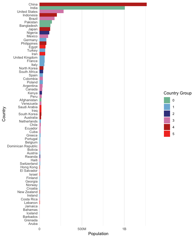
-
Segment marks. In the plot above, each bar is anchored at 0. Instead, we could have each bar encode two continuous values, a left and right. To illustrate, let’s compare the minimum and maximimum life expectancies within each country cluster. We’ll need to create a new data.frame with just the summary information. For this, we
group_byeach cluster, so that a summarise call finds the minimum and maximum life expectancies restricted to each cluster.# find summary statistics life_ranges <- gap2000 %>% group_by(cluster) %>% summarise( min_life = min(life_expect), max_life = max(life_expect) ) ggplot(life_ranges) + geom_segment( aes(min_life, reorder(cluster, max_life), xend = max_life, yend = cluster, col = cluster), size = 5, ) + scale_color_manual(values = cols) + labs(x = "Minimum and Maximum Expected Span", col = "Country Group", y = "Country Group") + xlim(0, 85) # otherwise would only range from 42 to 82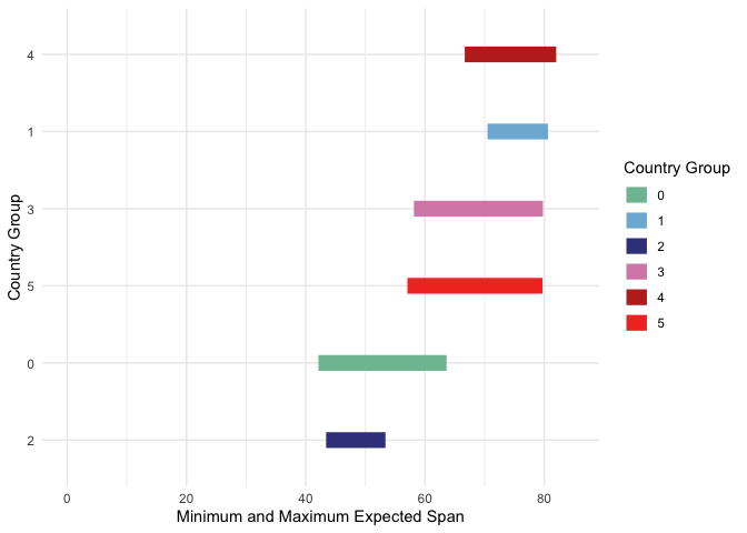
-
Line marks are useful for comparing changes. Our eyes naturally focus on rates of change when we see lines. Below, we’ll plot the fertility over time, colored in by country cluster. The group argument is useful for ensuring each country gets its own line; if we removed it, ggplot2 would become confused by the fact that the same x (year) values are associated with multiple y’s (fertility rates).
    ggplot(gapminder) +
      geom_line(
        aes(year, fertility, col = cluster, group = country),
          alpha = 0.7, size = 0.9
      ) +
      scale_x_continuous(expand = c(0, 0)) +  # same trick of removing gap
      scale_color_manual(values = cols)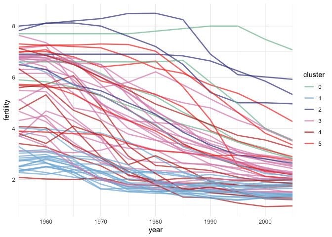
-
Area marks have a flavor of both bar and line marks. The filled area supports absolute comparisons, while the changes in shape suggest derivatives.
population_sums <- gapminder %>%
  group_by(year, cluster) %>%
  summarise(total_pop = sum(pop))

ggplot(population_sums) +
  geom_area(aes(year, total_pop, fill = cluster)) +
  scale_y_continuous(expand = c(0, 0, .1, .1), label = label_number_si()) +
  scale_x_continuous(expand = c(0, 0)) +
  scale_fill_manual(values = cols)
-
Just like in bar marks, we don’t necessarily need to anchor the y-axis at 0. For example, here the bottom and top of each area mark is given by the 30% and 70% quantiles of population within each country cluster.
population_ranges <- gapminder %>%
  group_by(year, cluster) %>%
  summarise(min_pop = quantile(pop, 0.3), max_pop = quantile(pop, 0.7))

ggplot(population_ranges) +
  geom_ribbon(
    aes(x = year, ymin = min_pop, ymax = max_pop, fill = cluster),
    alpha = 0.8
  ) +
  scale_y_continuous(expand = c(0, 0, .1, .1), label = label_number_si()) +
  scale_x_continuous(expand = c(0, 0)) +
  scale_fill_manual(values = cols)
[1] An alternative is to turn rotate the labels by 90 degrees. I prefer to turn the whole plot this, because this way, readers don’t have to tilt their heads to read the country names.