Visual Encodings
Choosing visual encoding.
-
Visualizations link abstract data with the physical, geometric marks,
- Each observation (row) within a dataset corresponds to a geometric mark in a visualization.
- Important attributes (columns) of an observation within a dataset can be encoded by properties of visual marks.
This encoding of rows as marks and columns as properties of the marks is illustrated in the toy diagram below.

-
A good visualization makes it easy to visually compare the relevant attributes across observations. A challenge is that there are often many possible marks and encodings for any given comparison. It’s also difficult to know which comparisons are actually of interest. For these reasons, we’re going to want to build up a vocabulary of marks and encodings.

-
To identify good encodings, it can often help to first what the types of each field are.
- Nominal: These are fields that allow identity comparisons
between observations (is A = B?), but don’t come with any
notion of order.
- City region, country name, movie genres, file types, …
- Ordinal: These are fields that allow ordering comparisons
between observations (is A > B?), but don’t let you
quantify the degree of difference.
- Shirt size, sports team rankings, order of appearance of characters on TV show
- Quantitative: These are field types that let you make distance
comparisons between observations. For interval data, absolute
comparisons can be made (A − B), while for ratio data, only
relative ones (A/B) are possible.
- Temperature, stock price, number of drinks sold in a coffee shop per day
- Nominal: These are fields that allow identity comparisons
between observations (is A = B?), but don’t come with any
notion of order.
-
This is not an exhaustive list, and there are subtleties,
- The same field could be treated as nominal, ordinal, or quantitative depending on the context. Age could be nominal (underage or overage), ordinal (gen Z, millenial, …), or quantitative.
- A given field might be thought of hierarchically. There might be interesting patterns at the city, county, or region level – what seems like a single column can become the source for multiple derived fields.
- Even though temporal fields can be thought of as quantitative, they come with their own conventions. For example, the hour - week - month hierarchy is a natural one for temporal data.
-
It’s worth highlighting that, even if a particular encoding could be used for a given data type, different encodings have different effectiveness. When trying to encoding several data fields at once, a choice of one encoding over another will implicitly prioritize certain comparisons over others.
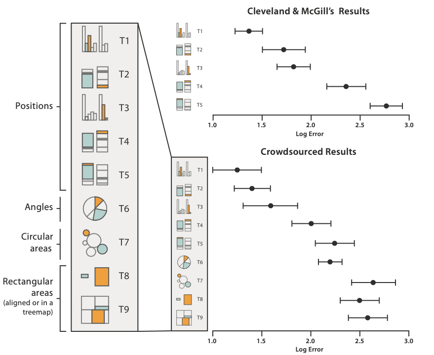
For example, in the figure below (Figure 5.8 here), the same two numbers are encoded using many different visual properties – position on a shared y-axis, position on distinct y-axes, etc. – and study participants were asked to gauge the difference in the numbers. People were best at comparing positions on a common scale, and worst at distinguishing differences in areas.
-
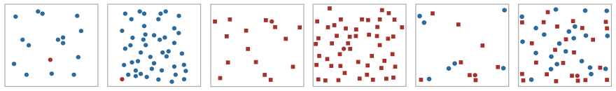
Here is a similar example. In the left four panels, a nominal field is encoded using color (left two) and shape (middle two). The red circles are easiest to find in the left two. In the right two panels, two nominal fields are encoded, using both shape and color. It’s much harder to find the red circle – you have to scan over the entire image to find it, which you didn’t have to do at all for the first two panels.
-
Implicit in this discussion is that there is never any “perfect” visualization for a given dataset – the quality of a visualization is a function of its intended purpose. What comparisons do you want to facilitate? The choice of encoding will strongly affect the types of comparisons that are easy to perform.