Introduction to ggplot2
Design principles from the grammar of graphics.
library(tidyverse)
library(ggrepel)
library(scales)
library(dslabs)
-
ggplot2 is an R implementation of the Grammar of Graphics. The idea is to define the basic “words” from which visualizations are built, and then let users compose them in original ways. This is in contrast to systems with prespecified chart types, where the user is forced to pick from a limited dropdown menu of plots. Just like in ordinary language, the creative combination of simple building blocks can support a very wide range of expression.
-
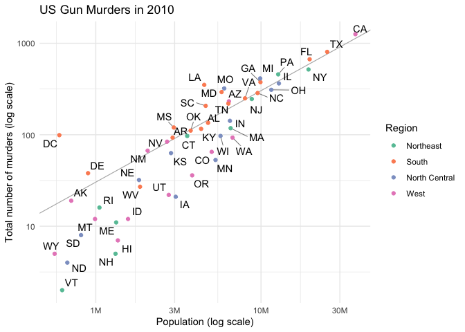
In these notes, we’ll create this plot.
-
But before writing any code, let’s review the main ideas of ggplot2. Every ggplot2 plot is made from three components,
- Data: This is the data.frame that we want to visualize.
- Geometry: These are the types of visual marks that appear on the plot.
- Aesthetic Mapping: This links the data with the visual marks.
-
Data. Each row is an observation, and each column is an attribute that describes the observation. This is important because each mark that you see on a ggplot – a line, a point, a tile, … – had to start out as a row within an R data.frame. The visual properties of the mark (e.g., color) are determined by the values along columns. These type of data are often referred to as tidy data.
-
Here’s an example of the data above in tidy format,
data(murders)
head(murders)

##        state abb region population total
## 1    Alabama  AL  South    4779736   135
## 2     Alaska  AK   West     710231    19
## 3    Arizona  AZ   West    6392017   232
## 4   Arkansas  AR  South    2915918    93
## 5 California  CA   West   37253956  1257
## 6   Colorado  CO   West    5029196    65
This is one example of how the same information might be stored in a non-tidy way, making visualization much harder.
non_tidy <- data.frame(t(murders))
colnames(non_tidy) <- non_tidy[1, ]
non_tidy <- non_tidy[-1, ]
non_tidy[, 1:6]

##             Alabama   Alaska  Arizona Arkansas California Colorado
## abb              AL       AK       AZ       AR         CA       CO
## region        South     West     West    South       West     West
## population  4779736   710231  6392017  2915918   37253956  5029196
## total           135       19      232       93       1257       65
Often, one of the hardest parts in making a ggplot2 plot is not coming up with the right ggplot2 commands, but reshaping the data so that it’s in a tidy format.
-
Geometry The words in the grammar of graphics are the geometry layers. We can associate each row of a data frame with points, lines, tiles, etc., just by referring to the appropriate geom in ggplot2. A typical plot will compose a chain of layers on top of a dataset,
ggplot(data) + [layer 1] + [layer 2]
-
For example, by deconstructing the plot above, we would expect to have point and text layers. For now, let’s just tell the plot to put all the geom’s at the origin. You can see all the types of geoms in the cheat sheet. We’ll be experimenting with a few of these in a later lecture.
ggplot(murders) +
  geom_point(x = 0, y = 0) +
  geom_text(x = 0, y = 0, label = "test")
-
Aesthetic Mapping Aesthetic mappings make the connection between the data and the geometry. It’s the piece that translates abstract data fields into visual properties. Analyzing the original graph, we recognize these specific mappings.
- State Population → x-axis coordinate
- Number of murders → y-axis coordinate
- Geographical region → color
-
To establish these mappings, we need to use the aes function. Notice that column names don’t have to be quoted – ggplot2 knows to refer back to the data.frame in ggplot(murders).
ggplot(murders) +
  geom_point(aes(x = population, y = total, col = region))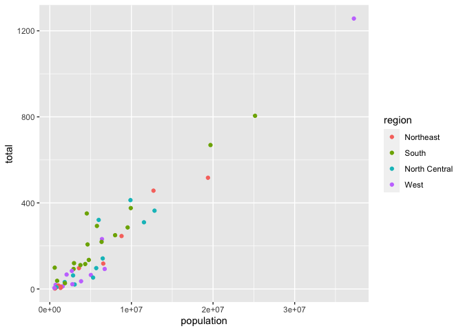
-
The plot at the start of these notes used a log-scale. To transform the x and y axes, we can use scales.
ggplot(murders) +
  geom_point(aes(x = population, y = total, col = region)) +
  scale_x_log10() +
  scale_y_log10()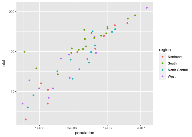
One nuance is that scales aren’t limited to x and y transformations. They can be applied to modify any relationship between a data field and its appearance on the page. For example, this changes the mapping between the region field and circle color.
ggplot(murders) +
  geom_point(aes(x = population, y = total, col = region)) +
  scale_x_log10() +
  scale_y_log10() +
  scale_color_manual(values = c("#6a4078", "#aa1518", "#9ecaf8", "#50838c"))
-
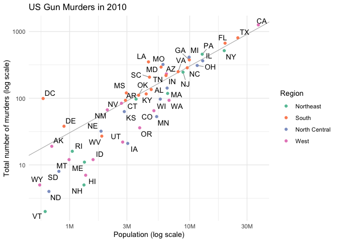
A problem with this graph is that it doesn’t tell us which state each point corresponds to. For that, we’ll need text labels. We can encode the coordinates for these marks again using aes, but this time within a
geom_textlayer.ggplot(murders) + geom_point(aes(x = population, y = total, col = region)) + geom_text( aes(x = population, y = total, label = abb), nudge_x = 0.08 # what would happen if I remove this? ) + scale_x_log10() + scale_y_log10()
Note that each type of layer uses different visual properties to encode the data – the argument label is only available for the
geom_textlayer. You can see which aesthetic mappings are required for each type of geom by checking that geom’s documentation page, under the Aesthetics heading. -
It’s usually a good thing to make your code as concise as possible. For ggplot2, we can achieve this by sharing elements across aes calls (e.g., not having to type population and total twice). This can be done by defining a “global” aesthetic, putting it inside the initial ggplot call. We can also use the fact that the first two arguments of
aesare always thexandypositional mappings.ggplot(murders, aes(population, total)) + geom_point(aes(col = region)) + geom_text(aes(label = abb), nudge_x = 0.08) + scale_x_log10() + scale_y_log10()
-
How can we improve the readability of this plot? You might already have ideas,
- Prevent labels from overlapping. It’s impossible to read some of the state names.
- Add a line showing the national rate. This serves as a point of reference, allowing us to see whether an individual state is above or below the national murder rate.
- Give meaningful axis / legend labels and a title.
- Move the legend to the top of the figure. Right now, we’re wasting a lot of visual real estate in the right hand side, just to let people know what each color means.
- Use a better color theme.
-
For each of the problems above, we have the corresponding solution techniques,
- The ggrepel package. This tries to find better label positions, using lines when necessary.
- Use
geom_ablineto encode the national murder rate as the slope and intercept in a line graph. All states would lie on this line if their murder rate was equal to the national average. - Add a labs layer to write labels and a theme to reposition the
legend. I used
label_numberfrom the scales package to change the scientific notation in the x-axis labels to something more readable. - I find the gray background with reference lines a bit
distracting. We can simplify the appearance using
theme_minimal. I also like the colorbrewer palette, which can be used by calling a different color scale.
-
Putting all these modifications together yields
r <- murders %>%
  summarize(rate = sum(total) /  sum(population)) %>%
  pull(rate)

ggplot(murders, aes(population, total)) +
  geom_abline(intercept = log10(r), size = 0.4, col = "#b3b3b3") +
  geom_text_repel(aes(label = abb), segment.size = 0.2) +
  geom_point(aes(col = region)) +
  scale_x_log10(labels = label_number(scale_cut = cut_short_scale())) +
  scale_y_log10() +
  scale_color_brewer(palette = "Set2") +
  labs(
    x = "Population (log scale)",
    y = "Total number of murders (log scale)",
    color = "Region",
    title = "US Gun Murders in 2010"
  ) +
  theme_minimal()