Hypothetical Outcomes
Imagining alternatives in complex data structures
library(tidyverse)
library(ggdist)
library(ungeviz)
library(mgcv)
library(tidymodels)
library(gganimate)
theme_set(theme_bw())
-
From our previous discussions, we now have a rich set of techniques for representing uncertainty for either discrete or continuous random values. But often, we hope to support inferences for more complex objects, like curves, compositions, or networks. How can we visualize uncertainty in these more richly structured objects?
-
For example, in linear regression, it’s possible to visualize the uncertainty associated with the fit using a confidence band. The guarantee is that, across many random samples from the same population, the line will usually fall entirely within the band.
supernova <- read_csv("https://raw.githubusercontent.com/krisrs1128/stat679_code/main/examples/week13/supernova.csv")
intervals <- gam(Magnitude ~ E9, data = supernova) %>%
  confidence_band(newdata = supernova %>% select(E9))

ggplot(intervals) +
  geom_point(data = supernova, aes(E9, Magnitude)) +
  geom_line(aes(E9, Magnitude)) +
  geom_ribbon(aes(E9, ymin = lo, ymax = hi), alpha = 0.2) +
  scale_x_continuous(expand = c(0, 0))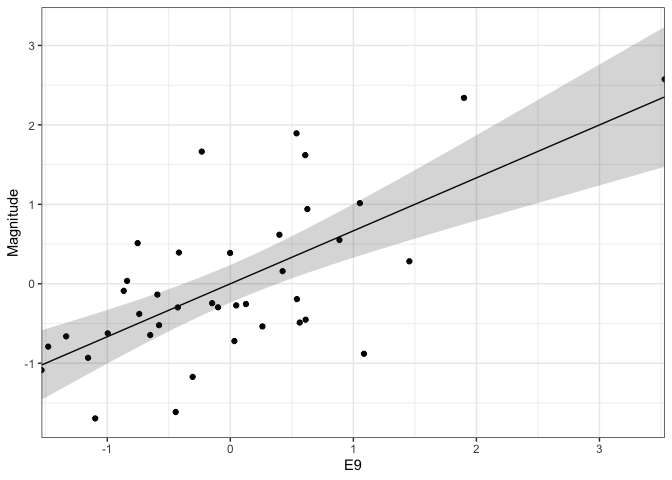
-
Have you ever wondered why the band is shaped in the way that it is? The curvature comes from the fact that there is uncertainty in both the intercept and the slope for the fitted line. This is easy to understand by overlaying the regression lines obtained from several versions of the same dataset. Formally, we’ve applied the bootstrap to resample the original data, though we could have just as well drawn from the posterior distribution of a fitted bayesian linear regression.
gam(Magnitude ~ E9, data = supernova) %>%
  sample_outcomes(newdata = supernova %>% select(E9), times = 150) %>%
  ggplot(aes(E9, Magnitude)) +
  geom_line(
    aes(group = .draw),
    col = "#d3d3d3", alpha = 0.5, size = 0.6
  ) +
  geom_point(data = supernova) +
  scale_x_continuous(expand = c(0, 0))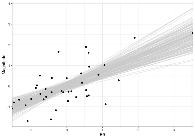
-
We can generalize this idea to nonlinear fits. For example, below, we are using multiple draws to represent the uncertainty of a smoothing spline regression between supernova Magnitude and another oen of the predictor variables. One nice aspect of showing multiple realizations is that it shows uncertainty in the “turns” of individual curves, which is not reflected in the confidence bands alone.
outcomes <- gam(Magnitude ~ s(E3, sp = c(.2)), data = supernova) %>%
  sample_outcomes(newdata = supernova %>% select(E3), times = 150) %>%
  mutate(.draw = as.integer(.draw))

ggplot(outcomes, aes(E3, Magnitude)) +
  geom_line(
    aes(group = .draw),
    col = "#d3d3d3", alpha = 0.5, size = 0.6
  ) +
  geom_point(data = supernova) +
  scale_x_continuous(expand = c(0, 0))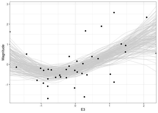
-
When we show multiple outcomes overlaid like this, our attention tends to focus on the area taken up by the multiple lines. In a true hypothetical outcome plot, we animate each outcome one at a time. This draws attention to the line-to-line uncertainty, rather than the area taken up by the ensemble. We can create a hypothetical outcome version of the plots above using the
gganimatepackage. This extends ggplot to allow transitions across subsets of data.p <- ggplot(outcomes, aes(E3, Magnitude)) + geom_line( aes(group = .draw), col = "#d3d3d3", size = 1.5 ) + geom_point(data = supernova) + scale_x_continuous(expand = c(0, 0)) + transition_time(.draw) + ease_aes("sine-in-out") anim_save("gam_hypo.gif", p, renderer = gifski_renderer())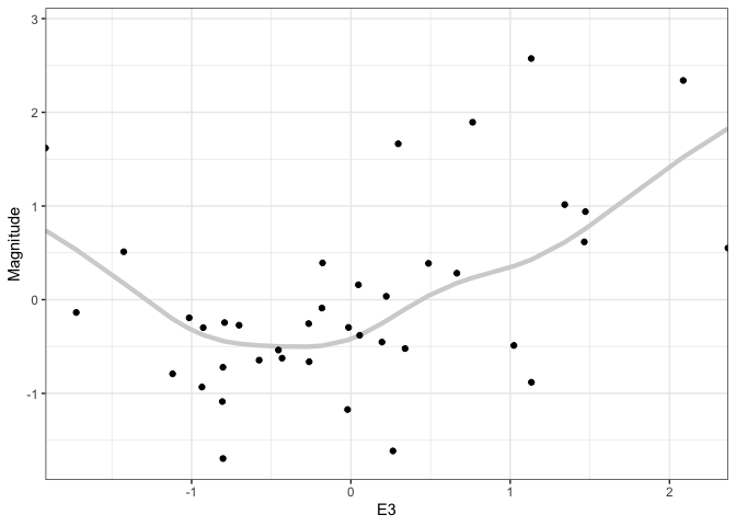
-
Alternatively, we can animate individual events while displaying the full distribution in the background.
p <- ggplot(outcomes, aes(E3, Magnitude)) +
  geom_line(
    data = rename(outcomes, .draw2 = .draw),
    aes(group = .draw2),
    col = "#d3d3d3", alpha = 0.5, size = 0.6
  ) +
  geom_line(
    aes(group = .draw),
    col = "red", size = 1.5
  ) +
  geom_point(data = supernova) +
  scale_x_continuous(expand = c(0, 0)) +
  transition_states(.draw)

anim_save("gam_hypo2.gif", p, renderer = gifski_renderer())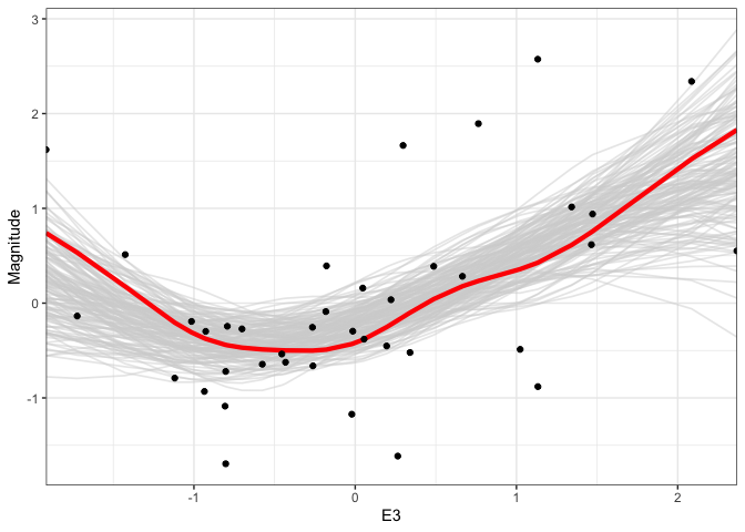
-
A somewhat less standard, but more interactive, approach would be to use dynamic linking. For example, in the dotplot to the right, each point is associated with one hypothetical outcome. We can hover over individual outcomes or brush the region below to highlight the corresponding fits in the original display.
draw_similarity <- outcomes %>% arrange(.draw, E3) %>% mutate(ix = rep(1:39, 150)) %>% select(-E3) %>% pivot_wider(names_from = ix, values_from = Magnitude) draw_coords <- draw_similarity %>% recipe(~ ., data = .) %>% update_role(.draw, new_role = "id") %>% step_normalize(all_numeric()) %>% step_pca(all_numeric()) %>% prep() %>% bake(draw_similarity) %>% mutate(id = row_number()) -
One aspect of hypothetical outcomes is that they represent uncertainty in the data space, not the parameter space. For example, in the regression above, we could have simply drawn error bars for the intercept and slope parameters of the fit. This would be a representation of uncertainty in the parameter space. The data space representation, however, is much more evocative, and preliminary experimental evidence suggests that this leads to better inferences in practical applications.
-
Though we have focused on hypothetical outcomes for relative simple settings, the idea is applicable quite generally. For example, there has been research on visualizing hypothetical outcomes on spatial and network data (NetHOPS and Visualizing geospatial information uncertainty).
-
A final observation: hypothetical outcome plots can natural build up to distributional visualizations. By layering the outcomes on top of one another, we can see the distribution emerge over time.