Graph Interactivity II
Encoding and data interaction in graphs
-
These notes continue our tour of graph interactivity. We’ll explore how certain graph queries can be more easily answered by allowing users to modify visual encodings (Encoding Interactivity) and the form of the data that are displayed (Data Interactivity).
-
Let’s begin with encoding interactivity. One simple example of this type of interactivity is highlighting. This changes the visual appearance of different nodes or edges based on user interest. For example, in either node link or adjacency matrix views, we can highlight one-step neighborhoods based on the position of the user’s mouse. For example, here is an example for node-link views,
and here is one for adjacency matrix views,
-
In both of these examples, we first build a data structure containing the neighbors of each node in the graph. For example the array following
0:gives the indices of all nodes that are neighbors with node0,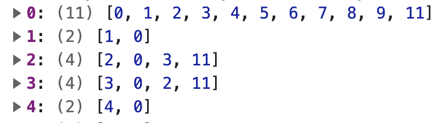
Once we have this data structure, we can quickly look up neighbors every time we hover over a node (or matrix tile in the adjacency matrix view). We then update the graphical marks to reflect these neighborhoods. In the node-link view, we highlight the neighbors in red using the following update,
d3.select("#nodes")
  .selectAll("circle")
  .attrs({
    fill: d => neighbors[ix].indexOf(d.index) == -1 ? "black" : "red"
  })
and similarly, for the adjacency matrix visualization, we change the x-label font size and opacity using this so that only the neighbors are visible,
d3.select("#xlabels") .selectAll("text") .attrs({ "font-size": d => d.index == target? 14 : 10, "opacity": d => neighbors[source].indexOf(d.index) == -1? 0 : 1 }) -
Conceptually, there is nothing unique about this interactivity code, compared to what we already have used for more basic plots (e.g., for scatterplots), and many of the techniques we learned earlier apply here. For example, if want to allow the user to select a node without placing their mouse directly over it, we can adapt the Delaunay lookups that we have previously used in scatterplot interaction. Here is an implementation of this idea by Alex Macy,
-
Brushing and linking is often used for encoding interactivity. Properly coordinated views can be used to highlight nodes or edges with a particular property. For example, suppose we wanted to a simple way of highlighting all the hubs in a network (i.e., nodes with many neighbors). One idea is to link a histogram of node degrees with the actual node-link diagram. In principle, we could modify a variety of node and edge attributes based on user interactions (size, color, line type, …).
-
Next, let’s consider data interactions. Two common types of data interactions are user-guided filtering and aggregation. In filtering, we remove data from view — this can be determined by UI inputs, dynamic queries, or direct manipulation of marks on the screen. For example, here we filter edges based on their edge-betweeness-centrality (a measure of how many paths go through that edge). This is helpful for isolating the “backbone” of the network.
-
To implement this view, we use the standard enter-update-exit pattern. We used the brush selection to change the subset of edges that should be bound to the SVG lines defining the links. We had precomputed the edge centralities in advance, so updating the displayed marks is simply a matter of determining which edge array elements to display.
-
Pruning reduces the number of marks on the display by removing some. In contrast, aggregation reduces the number of marks by collapsing many into a few. One approach to aggregation is to clump tightly connected clusters of nodes into metanodes. This is a special case of “semantic zooming” — instead of simply resizing a static collection of elements, semantic zooming modifies the elements that are shown so that additional details are shown on demand.
-
For example, a semantic zoom with two zoom levels would allow the user to collapse and expand metanodes based on user interest. Here is an implementation by @rymarchikbot. The construction of the enclosing paths is similar to our
convex_hull-based compound graph visualization from the first set of notes for this week. -
Both filtering and aggregation work by refocusing our attention on graph structures, either from the top down (removing less interesting elements) or from the bottom up (combining similar ones). An intermediate strategy is based on graph navigation.
-
The main idea of graph navigation is to start zoomed in, with only a small part of the graph visible. Then, based on user interest, we can visually signal those directions of the graph that are especially worth moving towards. Concretely, it is possible to define a degree-of-interest function across the collection of nodes, as formalized by (Van Ham and Perer 2009). This function can update based on user inputs. The encoding of the graph can then be modified to suggest that certain regions be focused in on.

-
Note that this is different from the overview-plus-detail principle that we have used in many places. It is helpful when attempting to overview the entire network may not be necessary and exploring local neighborhoods is enough to answer most questions.
-
Together, view, encoding, and data interaction provide a rich set of techniques for exploring graph data. Moreover, many of the techniques we described here are still areas of active research, and perhaps in the future, it will be easier to design and implement graph interactions suited to specific problems of interest.