Graph Visualization Tasks
What are typical queries for graph data?
-
Graphs are common across a wide range of fields — for example, biochemistry (metabolic networks), sociology (friendship networks), digital humanities (letter-writing networks), evolution (phylogenetic trees), transportation (logistical routing), gastronomy (recipe networks) and cybersecurity (inter-computer communication). In each of these fields, it’s common to try to visualize the network. But why is visualization ever useful in this context? We’ll explore a few answers in these notes, along with some criteria that can be used to evaluate the quality of a graph visualization.
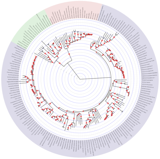
An evolutionary tree, from the Interactive Tree of Life.
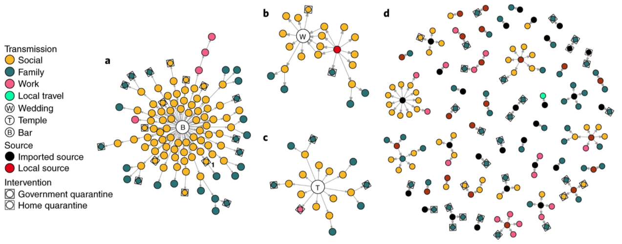
A COVID-19 transmission network, from ‘Clustering and superspreading potential of SARS-CoV-2 infections in Hong Kong.’
-
Viewed narrowly, there are two basic types of queries for graph data: Topological and attributional. In topological queries, we ask questions about how nodes are linked with one another. For example, is node A within three steps of node B? On the other hand, attributional queries are related to the attributes associated with nodes and edges. For example, which nodes (or edges) have an attribute value above X?
-
More broadly, we often visualize graphs with the goal of developing a more holistic view. There may be salient global or local structures of interest — for example, we may discover the existence of,
- Clusters: Nodes that are tightly linked with one another, but not with nodes outside of the cluster.
- Hubs: Nodes with many more neighbors than others.
- Central nodes: Nodes that lie on the shortest paths between many pairs of nodes.
- Connections: Links between nodes or clusters of interest. though there are probably far more possibilities than these.
-
What distinguishes a good from a bad graph visualization? As in all data visualization, effectiveness is closely tied to function. The representation / interaction should make sure information needed to support the intended task is easily accessible, and that superfluous information does not occupy too much of the reader’s attention.
-
For example, if a visualization has too many edge crossings, then we will have trouble answering any topological queries — crossings can make it impossible to follow edges. As an alternative, consider either edge bundling or adjacency matrix views. Both highlight the key connectivity structure and minimize the overlap that comes with more naive visualizations. Both can be made using either ggraph [1, 2] or D3 layouts [3, 4], which we’ll be getting more practice with over the next few lectures.
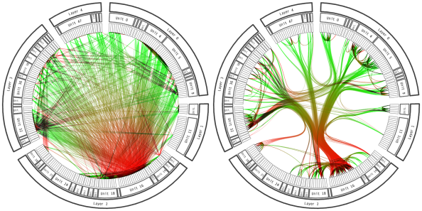
An edge bundled view of a network is much easier to read.
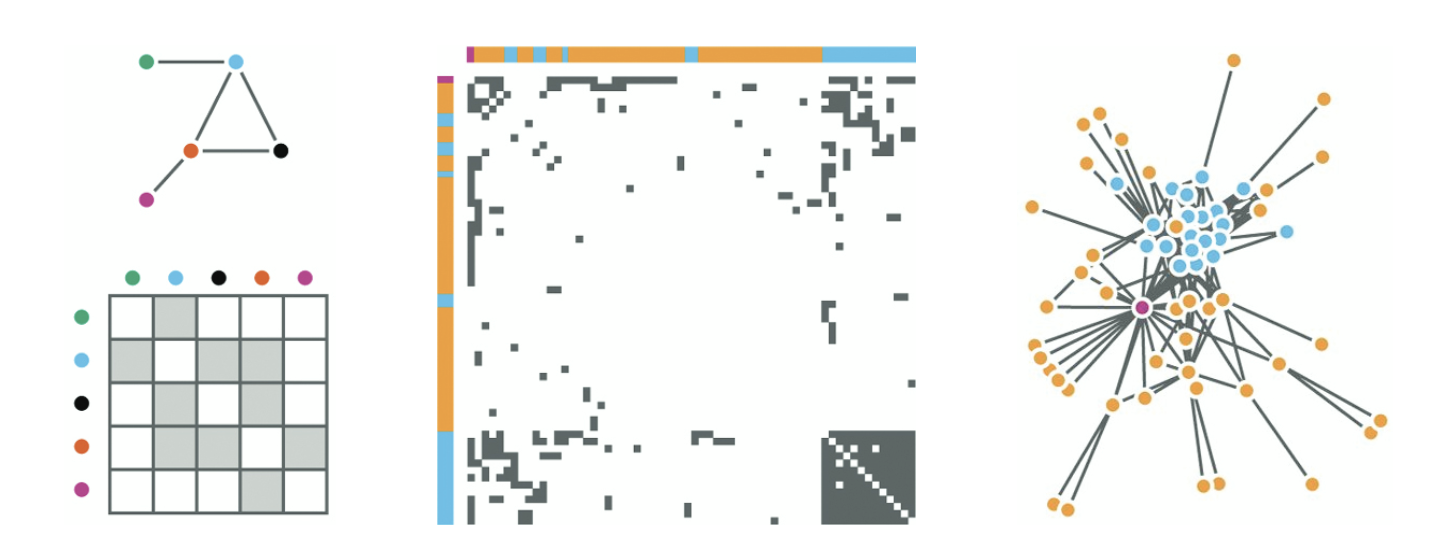
A comparison between node-link and adjacency matrix views of a network, from Munzner’s Visualization Analysis and Design.
-
In interactive graphs, we should aim to minimize the amount of change in the positions of the nodes and edges given any user input — too much movement creates confusion. The same lesson applies to dynamic graphs. It is hard to make sense of an evolving graph if the same nodes and edges are unnecessarily jumping around.