STAT 436 (Spring 2024)

Hierarchical Clustering
Clustering data at multiple scales using trees.
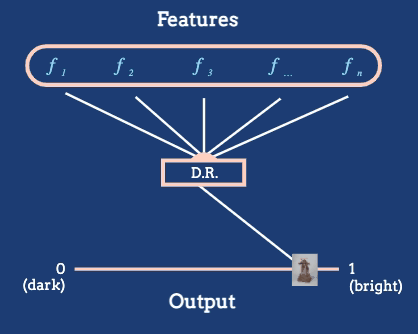
Introduction to Dimensionality Reduction
Examples of high-dimensional data.

Principal Components Analysis I
Linear dimensionality reduction using PCA.

Principal Components Analysis II
Visualizing and interpreting PCA.

Uniform Manifold Approximation and Projection
An overview of the UMAP algorithm.

PCA and UMAP Examples
More examples of dimensionality reduction using PCA and UMAP.

Introduction to Networks and Trees
Typical tasks and example network datasets.

Collections of Time Series
Navigating across related time series.
Graphical Queries - Click Events
An introduction to click events in Shiny
Graphical Queries - Brush Events
An introduction to brush events in Shiny.

Linked Brushing
More examples defining brush queries using Shiny and `ggplot2`.
Linking using Crosstalk
Linking in web-based visualizations.
Elements of a Shiny App
Vocabulary used by the R Shiny Library, and a few example apps.
Introduction to Reactivity
Viewing shiny code execution as a graph.
IMDB Shiny Application
Using Shiny to explore a movies dataset

Spatial Data Formats
An overview of common formats, with illustrative examples.

Introduction to ggplot2
A discussion of ggplot2 terminology, and an example of iteratively refining a simple scatterplot.

A Vocabulary of Marks
Examples of encodings and sequential refinement of a plot.

Tidy Data
The definition of tidy data, and why it's often helpful for visualization._

Pivoting
Tools for reshaping data into tidy format.
Deriving Variables
Using `separate`, `mutate`, and `summarise` to derive new variables for downstream visualization.
Tidy Data Example
An extended example of tidying a real-world dataset.

Ridge Plots
An extended example of faceting with data summaries.

Compound Figures
Showing different variables across subpanels.

Patchwork
Implementing compound figures in R
tsibble Objects
A data structure for managing time series data.

Time Series Patterns
Vocabulary for describing visual structure in time series.

Seasonal Plots
Approaches for visualizing seasonality.

Cross and Auto-Correlation
Summaries of relationships between and within time series.

Vector Data
Manipulating and visualizing spatial vector data.

Raster Data
Storing spatially gridded information in rasters.

Coordinate Reference Systems
The projection problem, and how to check your CRS.
Geospatial Interaction
Idioms for interacting with geographic data.

Node - Link Diagrams
The most common network visualization strategy.

Adjacency Matrix Views
A scalable network visualization strategy.

Enclosure
Visualization of hierarchical structure using containment.

K-means
An introduction to clustering and how to manage its output.

Heatmaps
Visualizing table values, ordered by clustering results.

Silhouette Statistics
Diagnostics for the quality of a clustering.

Cluster Stability
How reliable are the results of a clustering?

Introduction to Topic Models
An overview of dimensionality reduction via topics.
Fitting Topic Models
Data preparation and model fitting code for topics.

Visualizing Topic Models
Once we've fit a topic model, how should we inspect it?

Topic Modeling Case Study
An application to a gene expression dataset.

Partial Dependence Profiles I
An introduction to partial dependence profiles.

Partial Dependence Profiles II
Discovering richer structure in partial dependence profiles.

Visualization for Model Building
The relationship between exploratory analysis and model development.

Prior and Posterior Predictives
Simulating data to evaluate model quality.

Pointwise Diagnostics
Evaluating the fit at particular observations in Bayesian models.

Introduction to Feature Learning
An introduction to compositional feature learning.

Visualizing Learned Features
A first look at activations in a deep learning model.

Collections of Features
Analyzing feature activations across datasets

Optimizing Feature Maps
Interpreting neurons by finding optimal inputs
Final Takeaways
Some major themes from STAT 436, in a nutshell.

Design Process Case Study
Tracing the refinement of questions and design.

Asking Better Questions
What is the purpose of data analysis?

A History of Data Visualization up to 1900
A look at the origins of the field.

Faceting
Using small multiples to create information dense plots.