Visualization Portfolio - STAT 479 Spring 2022

Analysis of Terrorist Attacks
Author: Jina Yang
Click here to visit the interactive app.
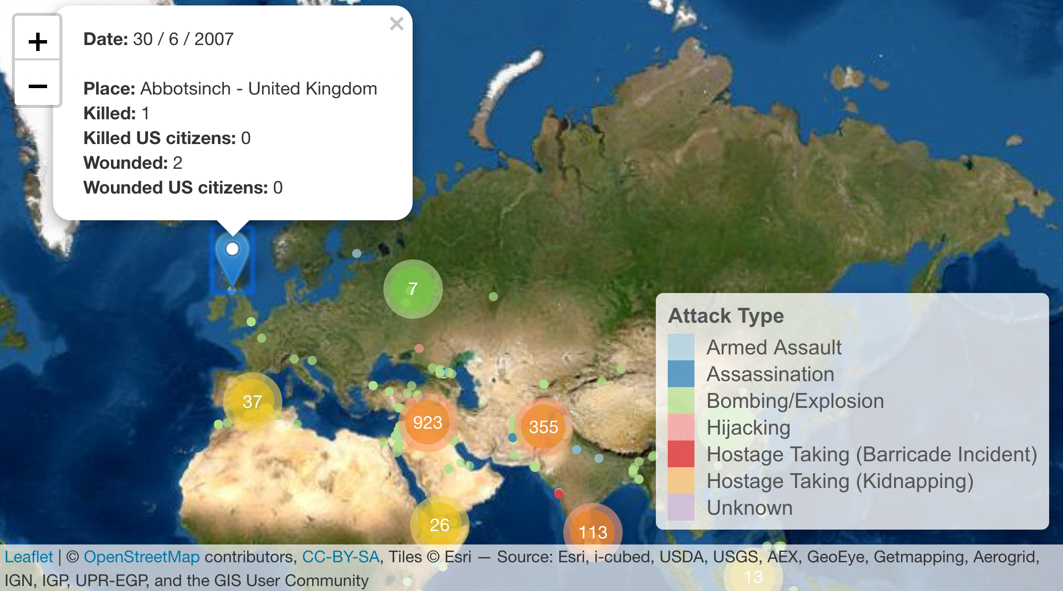
(Figure 1) The type of attacks that led to deaths in each country are aligned by the number (or percent) of deaths on the y-axis. Select a specific two years and compare them. It is possible to know which type of attack caused the death toll in the year. (Figure 2) On the world map, the location of the terrorist attack are marked in different colors depending on the type of attack. The area that has been attacked a lot has a darker cluster color, and if you click the cluster, the map will be zoomed in. Click a specific point in the enlarged area to pop up additional information.