Visualization Portfolio - STAT 479 Spring 2022

Spotify Trends
Author: Evan O’Keefe
Read the portfolio by clicking here.
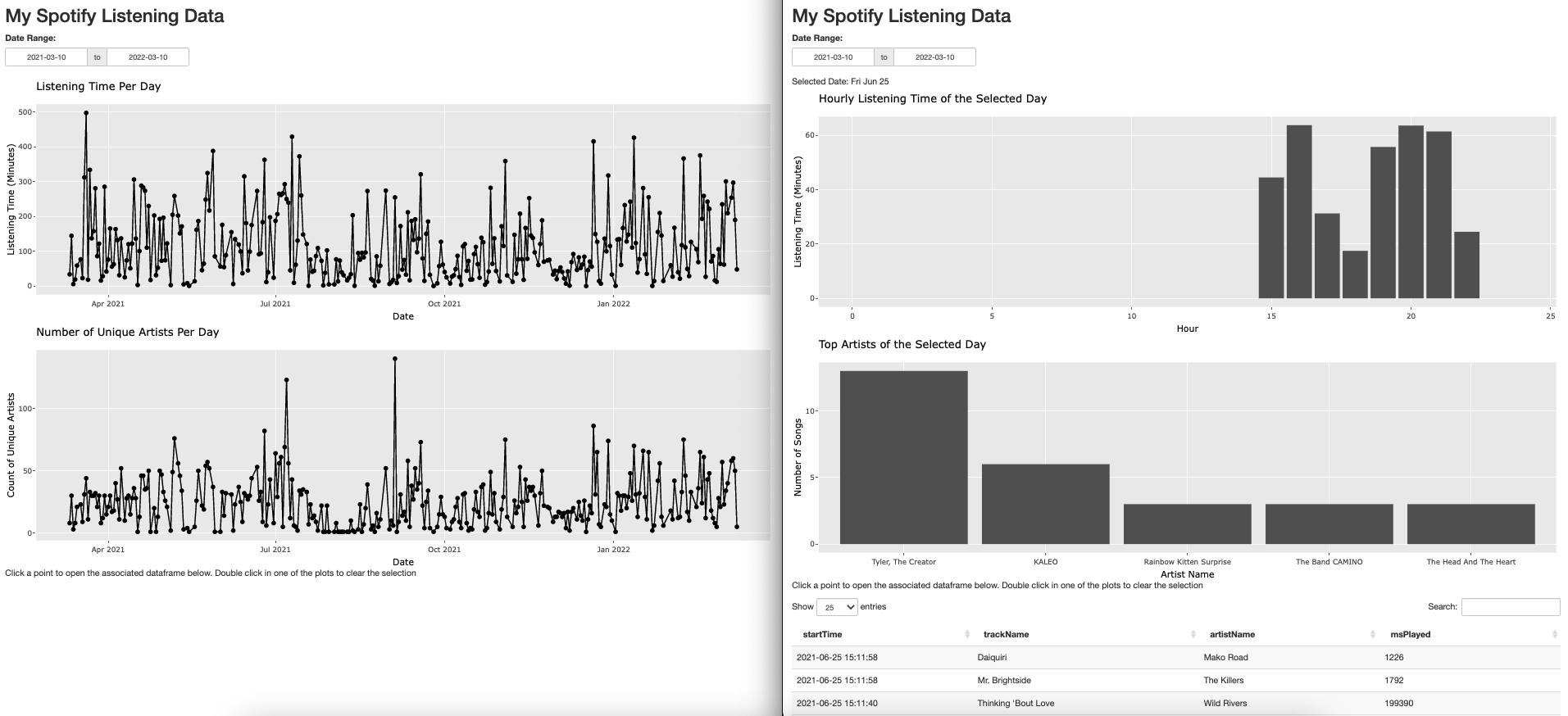
The goal of this visualization was to view trends in my Spotify data over the period I was able to download from their site – Mar 10, 2021 through Mar 10, 2022. The initial view shows two graphs one displaying the listening time per day (with tooltips for the date, top artist, songs played, and listening time) while the second shows the number of unique artists for each day. When a data point is clicked on either graph the selected day is displayed at the top, the top graph switches to hourly listening times, the bottom graph switches to the top artists of the day, and a data table is displayed with all of the data for the day.