In these notes, we’ll visualize some of the predictions from our trained model. This will help us develop a more nuanced understanding of model quality, rather than average test set error alone. Indeed, while training and test errors are useful for diagnosing whether a model is over or underfitting a dataset, they alone don’t tell us when a model is most likely to make mistakes.
As usual, our first step is to load libraries that will be useful in this analysis. By this point, we have seen most of this mix of spatial and tidy data analysis packages. We use the
reticulatepackage to read the raw predictions, which were saved asnumpyarrays, into R arrays.
library("RStoolbox")
library("raster")
library("dplyr")
library("ggplot2")
library("gridExtra")
library("purrr")
library("reticulate")
library("sf")
library("stringr")
library("tidyr")
use_condaenv("notebook")
np <- reticulate::import("numpy")
source("data.R")
source("metrics.R")
theme_set(theme_minimal())
- We will download predictions that would have been saved by the
save_preds.ipynbscript, if we had let it run for a few more minutes. The download still takes time (the file is over 600MB), but it is still faster than waiting for the predictions to be saved.
preds_dir <- params$preds_dir
dir.create(preds_dir)
preds_file <- file.path(preds_dir, "preds.tar.gz")
download.file("https://uwmadison.box.com/shared/static/5s7sqvh50iy5p2yl2basfdzgss9lgnxr.gz", preds_file)
untar(preds_file, exdir = params$preds_dir)
unlink(preds_file)
- The downloaded data include more than the predictions
y_hat– they also include the saved patchesxand ground truth labelsy. We have this for both training and test regions. To manage all these different files, let’s create a data frame that helps keep track of which types of files are where.
paths <- prediction_paths(preds_dir)
head(paths)
                                            path split  type ix
1     /Users/kris/data/predictions//test/x-1.npy  test     x  1
2     /Users/kris/data/predictions//test/y-1.npy  test     y  1
3 /Users/kris/data/predictions//test/y_hat-1.npy  test y_hat  1
4     /Users/kris/data/predictions//test/x-2.npy  test     x  2
5     /Users/kris/data/predictions//test/y-2.npy  test     y  2
6 /Users/kris/data/predictions//test/y_hat-2.npy  test y_hat  2
How good are the predictions? Our setting is a little trickier than the usual regression or classification settings. This is because (i) for each sample, we make predictions at every single pixel and (ii) we have several classes of interest. For (i), the idea is to evaluate the precision and recall associated with the entire patch as we vary the thresholds used to demarcate classes. See the next point. For (ii), we make sure to compute these precision and recall statistics for every single class.
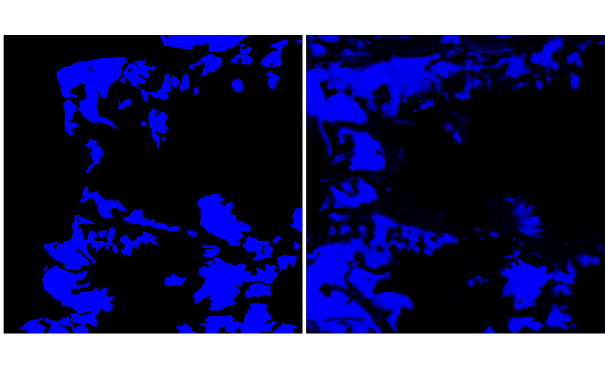
To illustrate (i) from the previous point, consider the two images below, giving the ground truth and predicted probabilities for the clean-ice glacier class, for one patch.
y <- load_npy(paths$path[2])
y_hat <- load_npy(paths$path[3])
p <- list(
  plot_rgb(y, 1, r = NULL, g = NULL, b = 1),
  plot_rgb(y_hat, 1, r = NULL, g = NULL, b = 1)
)
grid.arrange(grobs = p, ncol = 2)

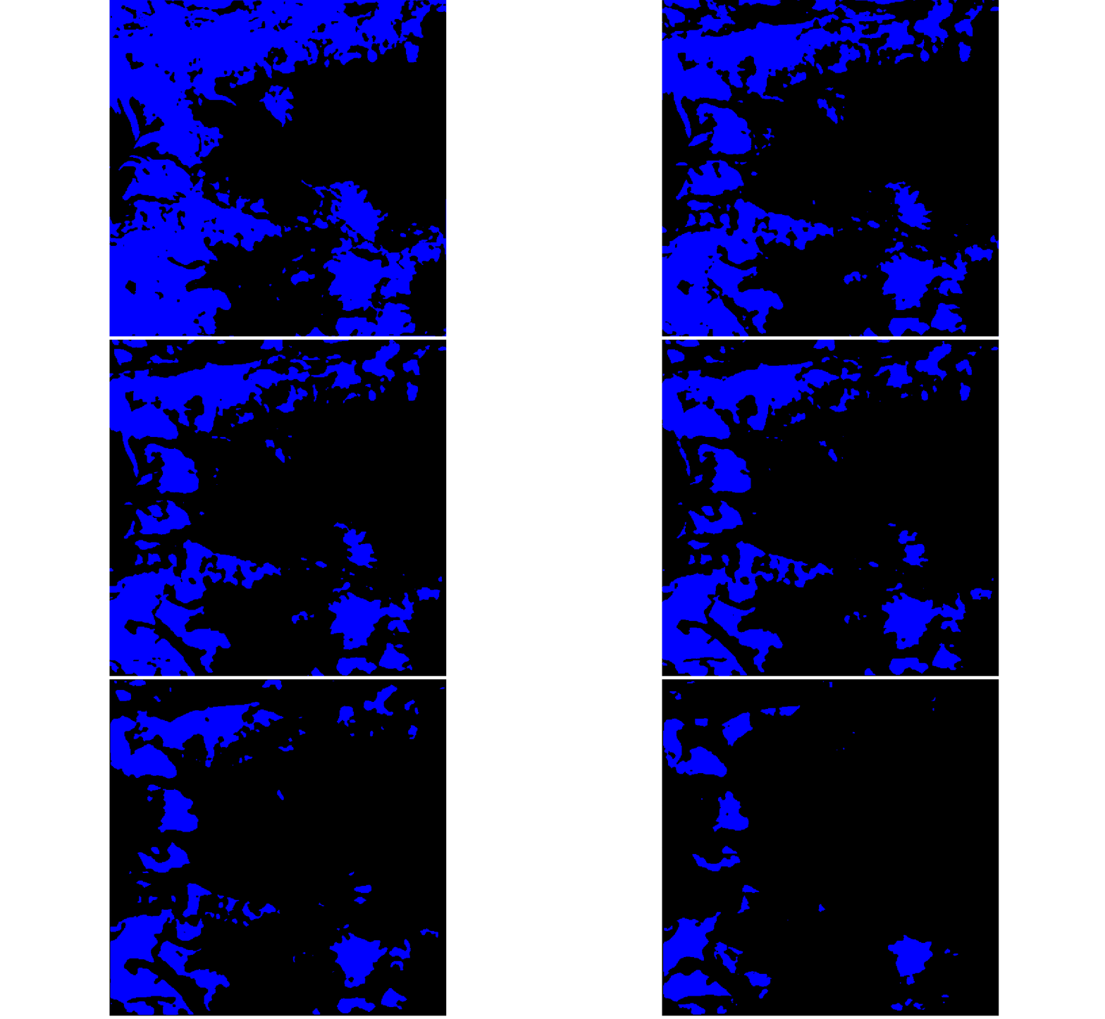
To assign a class to every pixel, we would need to declare probability thresholds, above which the pixel belongs to the target class (e.g., clean ice glacier) and below which it is considered background. The for loop below varies the threshold, going from lenient (high glacier recall, but low precision) to strict (low glacier recall, but high precision).
thresholds <- c(seq(0.05, 0.90, 0.01), rep(0.90, 10))
for (i in seq_along(thresholds)) {
  print(plot_rgb(y_hat > thresholds[i], 1, r = NULL, g = NULL, b = 1))
}

- The block below computes precision and recall across a range of thresholds, for each sample in the training and test splits. This generates new diagnostic data at the level of individual samples, allowing us to make more fine-grained assessments of where the model does and does not perform well.
metrics <- paths %>%
  split(.$split) %>%
  map(~ metrics_fun(.)) %>%
  bind_rows(.id = "split")
head(metrics)
# A tibble: 6 x 7
  split threshold precision recall class    ix path
  <chr>     <dbl>     <dbl>  <dbl> <int> <int> <chr>
1 test      0.1       0.428  0.762     1     1 /Users/kris/data/predi…
2 test      0.178     0.447  0.691     1     1 /Users/kris/data/predi…
3 test      0.256     0.458  0.650     1     1 /Users/kris/data/predi…
4 test      0.333     0.470  0.619     1     1 /Users/kris/data/predi…
5 test      0.411     0.479  0.593     1     1 /Users/kris/data/predi…
6 test      0.489     0.487  0.569     1     1 /Users/kris/data/predi…
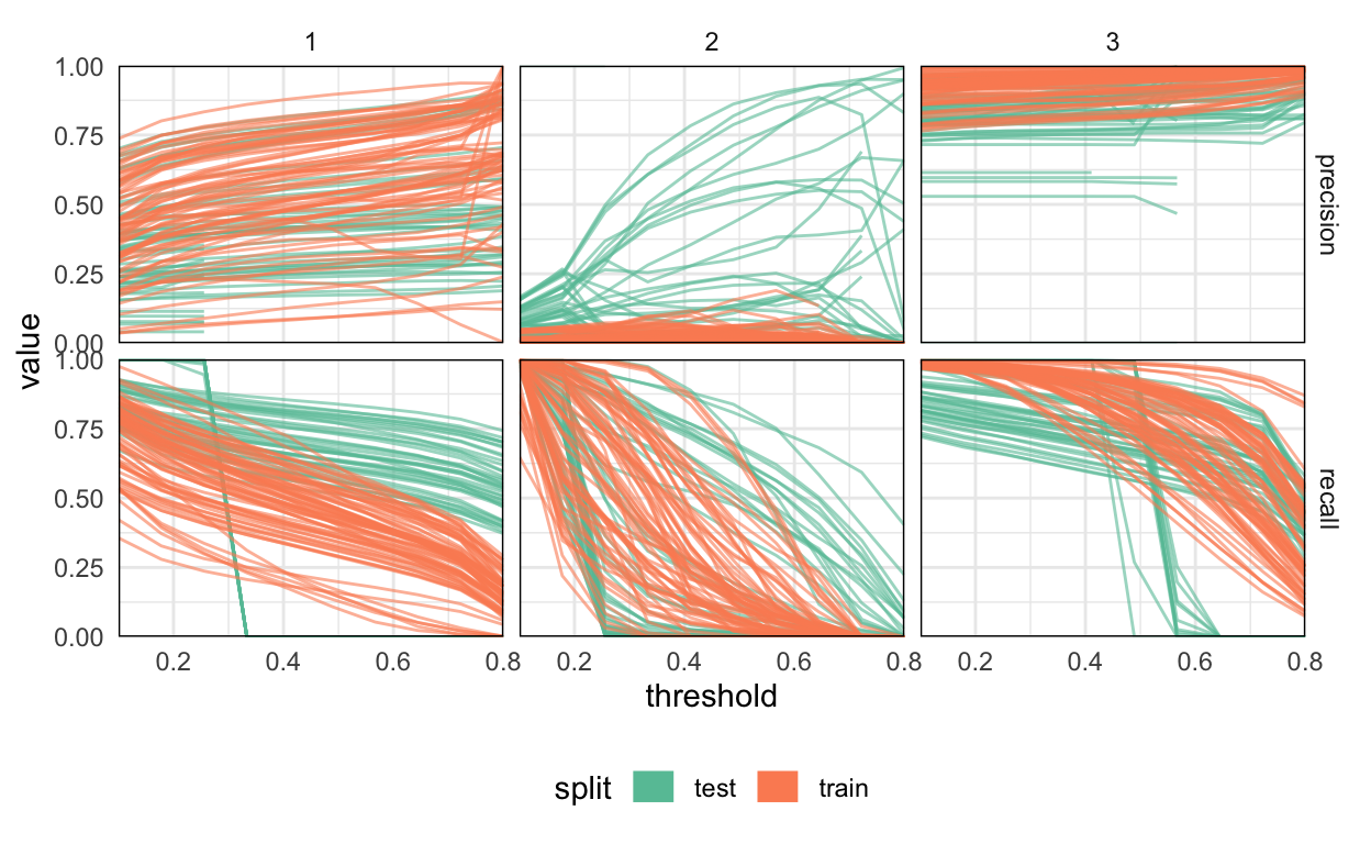
The block below plots the metrics across samples. Each line corresponds to one training or test sample for a given class. The three classes are arranged in the separate columns – from left to right, they are clean-ice, debris-covered, and background class. No one threshold seems to stand out, with precision and recall curves varying smoothly across thresholds.
Performance on the debris-covered glaciers is noticeably worse than on the clean-ice ones. A few examples from each class are uniformly easier than others, but generally, the samples within a given class have comparable difficulty with one another.
It seems like, not only have we avoided overfitting the glacier classes – the test performance on the debris-covered class is superior to the performance on the clean-ice glacier class! This seems to be a consequence of the fact that the training and test data are not independent and identically distributed. In fact, the Dudh Koshi basin was chosen for testing because it’s known to have a high density of debris-covered glaciers, and they are likely more clearly visually defined than the glaciers present across different training basins.
metrics_ <- metrics %>%
  pivot_longer(precision:recall, names_to = "metric")

ggplot(metrics_, aes(x = threshold, y = value, col = split)) +
  geom_line(aes(group = path), size = 0.5, alpha = 0.6) +
  guides(col = guide_legend(override.aes = list(size = 5, alpha = 1))) +
  scale_color_brewer(palette = "Set2") +
  scale_x_continuous(expand = c(0, 0)) +
  scale_y_continuous(expand = c(0, 0)) +
  facet_grid(metric ~ class) +
  theme(
    legend.position = "bottom",
    panel.border = element_rect(fill = "NA", size = .5)
  )

- Let’s visualize a few samples that have especially good and bad predictions. To identify them, we compute the average precision and recall across all tested thresholds and then sort samples from best to worst.
metrics_ %>%
  group_by(metric, path, class) %>%
  summarise(mean = mean(value, na.rm = TRUE)) %>%
  arrange(class, metric, desc(mean))
# A tibble: 768 x 4
# Groups:   metric, path [256]
   metric    path                                          class  mean
   <chr>     <chr>                                         <int> <dbl>
 1 precision /Users/kris/data/predictions//train/y_hat-36…     1 0.872
 2 precision /Users/kris/data/predictions//train/y_hat-9.…     1 0.819
 3 precision /Users/kris/data/predictions//test/y_hat-7.n…     1 0.818
 4 precision /Users/kris/data/predictions//train/y_hat-30…     1 0.816
 5 precision /Users/kris/data/predictions//train/y_hat-49…     1 0.800
 6 precision /Users/kris/data/predictions//train/y_hat-56…     1 0.791
 7 precision /Users/kris/data/predictions//test/y_hat-20.…     1 0.788
 8 precision /Users/kris/data/predictions//train/y_hat-32…     1 0.784
 9 precision /Users/kris/data/predictions//train/y_hat-64…     1 0.781
10 precision /Users/kris/data/predictions//test/y_hat-15.…     1 0.781
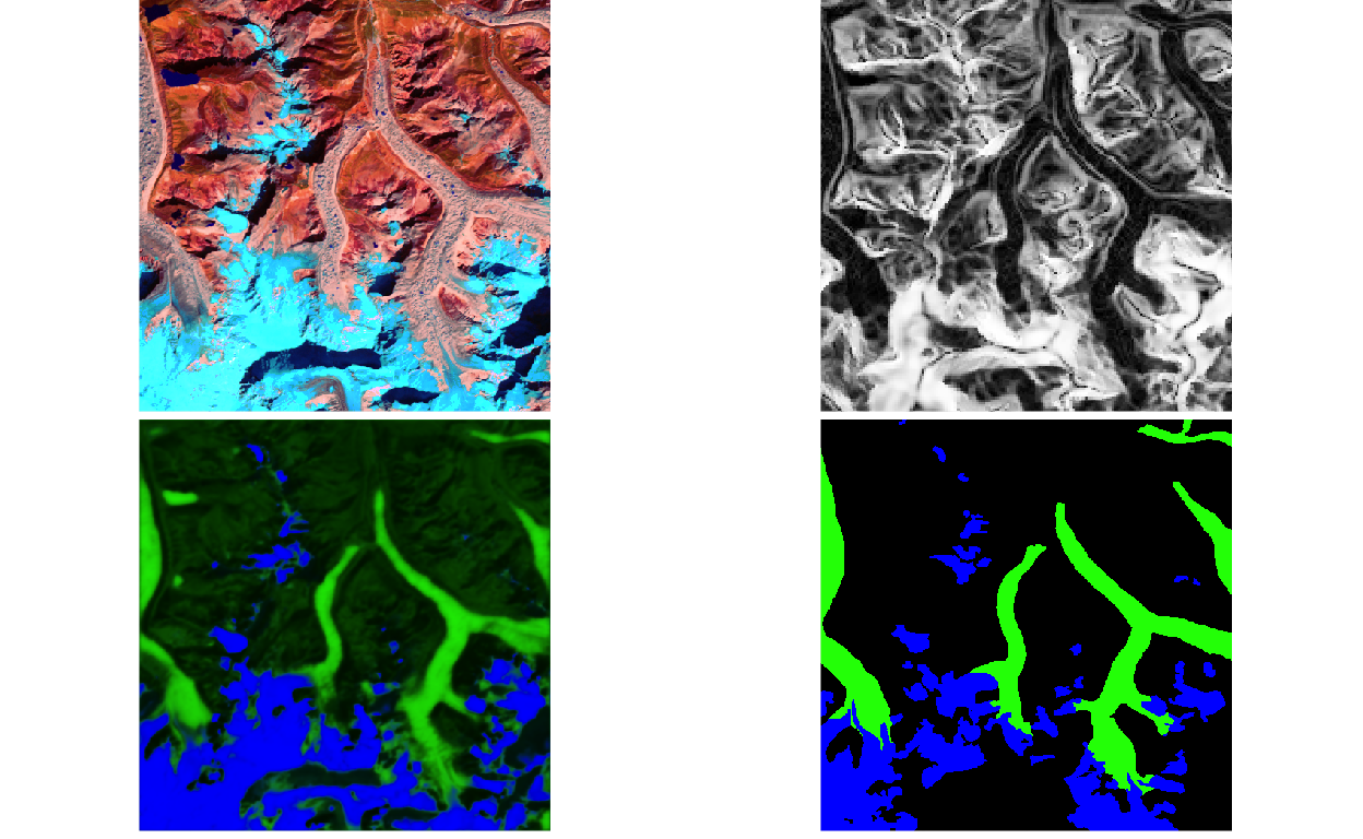
# … with 758 more rows- It seems like sample 29 in the test split is one of the better ones for the debris-covered class. How does it look like? The block pulls the paths for
x,y, andy_hatfor this example and visualizes them. Try fiddling with theixandsplitparameters to look at a few different examples.
ims <- paths %>%
  filter(ix == 29, split == "test") %>% # try a few other examples
  split(.$type) %>%
  map(~ load_npy(.$path[1]))

p <- list(
  plot_rgb(ims[["x"]], c(5, 4, 2), r = 1, g = 2, b = 3),
  plot_rgb(ims[["x"]], c(13, 13, 13)),
  plot_rgb(ims[["y_hat"]], r = NULL),
  plot_rgb(ims[["y"]], r = NULL)
)
grid.arrange(grobs = p, ncol = 2)
