In this notebook, we take a first look at the glacier data. We’ll download the raw annotations and images, using visualization to gain familiarity with the structure of the problem.
We’ll be using the R packages below.
dplyr,ggplot2, andtidyrare part of R’s tidy data ecosystem.gdalutils,raster, andsfare packages for general spatial data manipulation.RStoolboxgives useful functions for spatial data visualization specifically.
- In the block below, we’ll create a directory structure to store the data in our analysis. If you’re working on your own computer, you can change the directory to which files are written by modifying the
paramsblock in the header of this rmarkdown file.
data_dir <- params$data_dir
dir.create(params$data_dir, recursive = TRUE)
- Next, we download the actual imagery. The data are currently stored on a UW Madison Box folder. We first download a file containing all the raw data links1, and then loop over just those links. This step can take some time, because the files are relatively large.
- Often, we’ll want to find the image associated with a particular point on the earth. In the current form, this is quite hard to do: we’d have to check image by image, until we found the one that had the geographic coordinate that we’re looking for. A much more convenient format is something called a ``Virtual Tiff.’’ This indexes all the imagery we had originally downloaded, letting us look up imagery just by specifying the geographic coordinates. This means we can hide all the complexity of working with many imagery files and pretend we had a single (very large) image.
x_paths <- dir(data_dir, "*tiff", full.names = TRUE)
vrt_path <- file.path(data_dir, "region.vrt")
gdalbuildvrt(x_paths, vrt_path, ot="float64")
NULL- Time for our first visualization! The
glaciers_small.geojsonfile demarcates the boundaries for two types of glaciers that are common in the Hindu Kush Himalayas region. The full version, available in the box folder, gives coordinates for glaciers across the whole region, which spans many countries, but reading this into Binder would put us against some of the compute limits. Instead, let’s pick one a small patch from one of 63 basins in the region and visualize its glacier boundaries.
y <- read_sf(file.path(data_dir, "glaciers_small.geojson")) %>%
  filter(
    Sub_basin == "Dudh Koshi",
    Longitude < 86.91, Longitude > 86.1,
    Latitude < 27.81, Latitude > 27.7
  )

head(y)
Simple feature collection with 6 features and 20 fields
geometry type:  MULTIPOLYGON
dimension:      XY
bbox:           xmin: 86.58008 ymin: 27.69711 xmax: 86.8944 ymax: 27.80701
geographic CRS: WGS 84
# A tibble: 6 x 21
     ID Longitude Latitude GLIMS_ID Glaciers Elv_min Elv_mean Elv_max
  <int>     <dbl>    <dbl> <chr>    <chr>      <int>    <int>   <int>
1   193      86.9     27.8 G086869… Debris …    4885     5035    5366
2    23      86.6     27.8 G086590… Debris …    4893     4969    5367
3     5      86.6     27.7 G086578… Debris …    4430     4627    5216
4   197      86.9     27.8 G086851… Debris …    5349     5434    5509
5   210      86.9     27.7 G086865… Debris …    4472     4589    4698
6   176      86.8     27.8 G086796… Debris …    4344     4659    5015
# … with 13 more variables: Slope_min <int>, Slope_mean <int>,
#   Slope_max <int>, Aspect <int>, Area_SqKm <dbl>, Thickness <dbl>,
#   Reserve <dbl>, Basin <chr>, M_Basin <chr>, Region <chr>,
# Country <chr>, Sub_basin <chr>, geometry <MULTIPOLYGON [°]>ggplot(y, aes(fill = Glaciers)) +
geom_sf() +
scale_fill_manual(values = c("#93b9c3", "#4e326a")) +
theme(legend.position = "bottom")
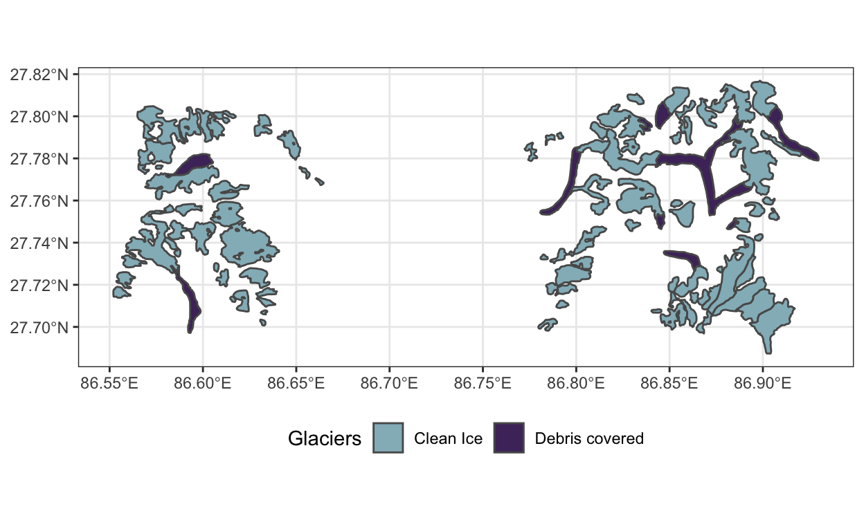
From a technical perspective, there are two points worth noting. First, we were able to use dplyr’s
filterfunction on these glaciers, as if they were stored in an ordinary data frame (they’re in fact stored in a spatial data frame). Being able to use concepts of tidy data manipulation in spatial problems can make our lives much easier. Second, notice that we’re usingtm_shapefrom thetmappackage – this package makes much nicer spatial data visualizations than simply callingplot()from base R. It also implements a grammar of graphics for spatial data, allowing us to layer on different visual encodings in a flexible way.Next, let’s visualize the satellite imagery in that region. The satellite images are not like ordinary images from a camera – they have many sensors. In our case, each pixel is associated with 15 measurements. For example, the block below first plots the RGB colors associated with the region before showing a composite that turns all the glaciers blue.

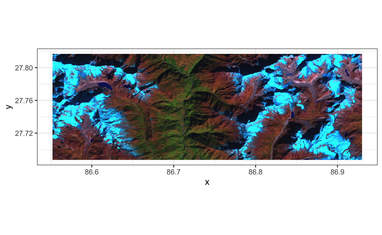
Notice the similarities with the outlines in the
glaciers.geojsonfile. We can more or less distinguish the clean ice and debris-covered glaciers from the rest of the image. Looking a bit more carefully, though, we realize that there are lots of areas that fall into the bluish regions but which aren’t labeled as clean ice glacier. We might hope that some of the other channels make the difference more visible, but it seems like there might be some danger of false positives. Also, it seems like the debris-covered glaciers are only a subtley different color from the background – their tendril-like shape is a much better visual clue.We’ve managed to use
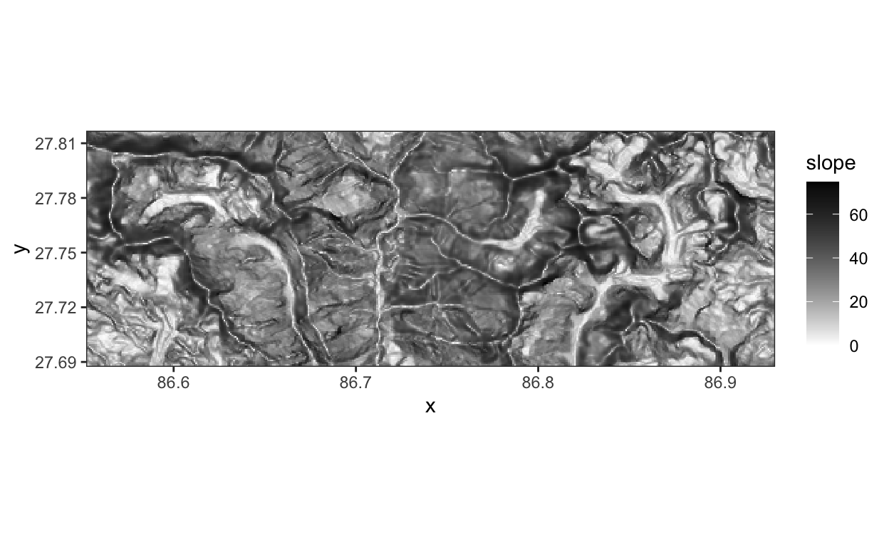
geom_sfandggRGBto avoid having to convert the raw data to standard R data frames. There are some situations, however, when it can be useful to make that conversion. The code below provides an example that extracts the slope channel from the satellite image and visualizes it using standard ggplot2. It seems like the debris-covered glaciers are relatively flat.
slope <- subset(x, 15) %>%
  as.data.frame(xy = TRUE)

ggplot(slope, aes(x = x, y = y)) +
  geom_raster(aes(fill = slope)) +
  scale_fill_gradient(low = "white", high = "black") +
  coord_fixed() +
  scale_x_continuous(expand = c(0, 0)) +
  scale_y_continuous(expand = c(0, 0))
rm(slope) # save space
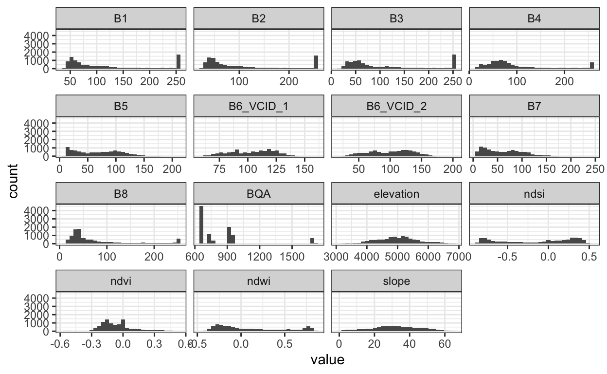
- Let’s make a few histograms, one for each satellite sensor. From this view, it becomes clear that we’re going to have to preprocess these data before modeling. First, the ranges across sensors can vary substantially. Second, the BQA channels is not actually a sensor measurement – it’s a quality assignment, which is why it takes on so few values.
sample_ix <- sample(nrow(x), 100)
x_df <- x[sample_ix, sample_ix, ] %>% # subset pixels
  as.data.frame()
x_longer <- x_df %>%
  pivot_longer(cols = everything())

ggplot(x_longer) +
  geom_histogram(aes(x = value)) +
  facet_wrap(~ name, scale = "free_x")
- For our final view, let’s make a scatterplot of a few channels against one another. We’ll bin using
geom_hex, because otherwise the points overlap too much. This visualization makes it clear how the twoB6channels are nearly copies of one another, so we can safely drop one of them from our visualization. For reference, we also plot the first two channels,B1andB2, against one another.
ggplot(x_df, aes(x = B6_VCID_1, y = B6_VCID_2, fill = log(..count..))) +
  geom_hex(binwidth = 2) +
  scale_fill_viridis_c() +
  coord_fixed()

ggplot(x_df %>% filter(B1 != 255, B2 != 255), aes(x = B1, y = B2, fill = log(..count..))) +
  geom_hex(binwidth = 2) +
  scale_fill_viridis_c() +
  coord_fixed()

- We haven’t made too many plots, but we’ve already gained some valuable intuition about (i) the types of visual features that might be useful for identifying the two types of glaciers and (ii) some properties of the data that, if not properly accounted for, could be disastrous for any downstream modeling (no matter how fancy the model).
It’s very meta.↩︎